| Image |
Comment |
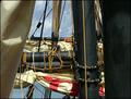
| 07/15/2005 05:50:43 AM |
Sailing across the worldby carlosComment: good sharp detail have no idea how this goes with communication. one thing i noticed is the mast seams to be tilted to the left a bit. there is a litle clutter but i think the sky helps alot by giving it a simple yet good background. framing really helped with this too. This is a pretty common mistake but one alot of people including myself make a ton is shooting in the midle of the day in your photo it cast shadows directly down onto the sail. I think sunset or rise would have given the sails a warmer feel. |
 Photographer found comment helpful. Photographer found comment helpful. |
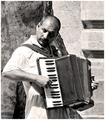
| 07/15/2005 05:04:21 AM |
The Accordion Playerby cheekymunkyComment: Great shot for a candid. The shirt is overexposed and his face has a really hard shadow which is unatractive on pics especially since the photo goes off both ends im sure it would show on the levels. Good background for the subject it really shows that he is a street preformer. |
| Photographer found comment helpful. |
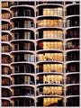
| 07/15/2005 04:35:20 AM |
Corn cob buildingby puzzledComment: I like the pattern this abstract view creates. I'm assuming that we are seeing the suns reflection in the windows which is a great addition to this photo. nice use of a frame it helps end the pattern without feeling like your missing somthing. |
| Photographer found comment helpful. |
| 07/15/2005 02:25:18 AM |
Welcome Gate Printby jpochardComment: I like this one too I would like to see more of the gate. the photo looks like you tryed to age it I don't know what it is but there are light spots on the door and bottom of gate. maybe it just my screen coputers not mine kinda cheap but good job framing both of these, you used good text to complement each photo. Message edited by author 2005-07-15 02:26:00. |
| Photographer found comment helpful. |
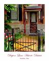
| 07/15/2005 02:20:58 AM |
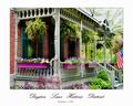
Dayton Lane Homeby jpochardComment: Great colors on the front of the house' the roof and sky are really overexposed. A litle more view on the right would be nice so you can see the whole flag. |
| Photographer found comment helpful. |
| 07/13/2005 10:32:19 PM |
Fufanu by Burger_BMXComment: great photo you should consider sending it in to a couple mags |
| Photographer found comment helpful. |
| 07/13/2005 05:16:53 PM |
golfby supermaxComment: i think it would be beter to have placed the golfer to the left using the thirds rule |
| 07/13/2005 05:15:43 PM |
|
| Photographer found comment helpful. |
| 07/13/2005 04:27:29 PM |
Conjoinedby CorySmithComment: there are vary harsh shadows on the wall behind them i find it really distracting |
| 07/10/2005 02:13:40 AM |
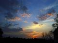
Color Me Beautifulby tcrock41Comment: Good shot what would make this a great shot is to include some interesting elements into it beside the sky. |
Home -
Challenges -
Community -
League -
Photos -
Cameras -
Lenses -
Learn -
Help -
Terms of Use -
Privacy -
Top ^
DPChallenge, and website content and design, Copyright © 2001-2025 Challenging Technologies, LLC.
All digital photo copyrights belong to the photographers and may not be used without permission.
Current Server Time: 08/19/2025 12:17:18 AM EDT.