| Image |
Comment |
| 02/07/2006 08:02:15 PM |
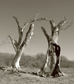
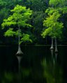
dos centinelos (inspired by Manuel alvarez Bravo)by AzCKellyComment: :: Critique Club ::
I wasn't familiar wit the photographer at first so I googled him and am impressed with your tribute. It is very fitting to some of his photo I saw.
technical side I think your biggest problem here was your highlights. They seem to be blown out in a few spots. other then that I think you did a good job in the duo tone usage here. Your shadows could be lightened a bit on the tree to the right as well.
A different day where there are clouds or something in the sky to add more, that is one of the few things lacking interest here.I think it would help define some of the branch's that seem to fade into the sky now.
|
 Photographer found comment helpful. Photographer found comment helpful. |
| 02/05/2006 01:14:41 PM |
Imogenby sarrobiComment: :: Critique Club ::
You did a great job on this photo it has a simple yet elegant feel to it. The noise adds allot to the photo giving it even more character. One thing I think would have helped allot would be a little different lighting to add depth to the photo it looks flat without it. You really did a great Job on the D-Sat I love the white, grays, and black in it. It does appear to be over sharpened. But overall a great photo.
One more quick note I don't know how you do your borders but this one isn't even all the way around. The white border on the left looks a little thinner then the rest.
Here is a good tutorial on the subject that makes it real easy to get a perfect border.
Let me know if you have any questions on my critique feel free to PM me. |
| Photographer found comment helpful. |
| 02/05/2006 12:56:46 PM |
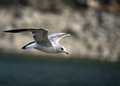
Birdby srdanzComment: :: Critique Club ::
This will be my first critique in awhile so I apologize if it doesn't cover everything. First I wanted to say this is an awesome capture great subject sharpness and shallow DOF. It looks lick a couple spots on his head and in front of his wing are blown out a bit but not so bad it hurts the overall picture. while i love the shallow DOF it feels like the bird blends into the background a little because of the light bird on the tan color background. Great positioning of the subject, I like how his wing leads you to him. Over all I say this is an above average photo that should have scored better than id did. Keep up the good work, let me know if you have any questions or comments about what I said. |
| Photographer found comment helpful. |
| 08/29/2005 09:32:21 AM |
Bluff 6by LeeDComment: This isn't my favorite shot out of the bunch not bad though it is a little overprocessed the sky and leaves are what show this. |
| Photographer found comment helpful. |
| 08/29/2005 09:30:56 AM |
Green on Blackby LeeDComment: great shot I really love the color and softness of it. Love the reflections and the steps on the tree. |
| Photographer found comment helpful. |
| 08/27/2005 04:33:54 AM |
Come Again Some Other Dayby jpochardComment: :: Critique Club ::
I like the softness in this photo it works well with the subject, her expression is priceless for this moment. The light is good it cast nice soft dramatic shadows on her face. The muted colors work great too, now with that being said.
Her arms are distracting from her face and look too big for her. Along with the shadows under them are extremely harsh. The highlights really hurt here as well; they take away from the somber mood.
Over all I would say this is a just above average photo, around a 6 or 7. You can tell you put thought into it and that is great. Keep up the good work.
Nick
|
| Photographer found comment helpful. |
| 08/23/2005 06:31:18 AM |
1937 (Southern Right Whales became a protected species)by docpjvComment: :: Critique Club ::
The timing on this photo is great, I really like the capture. One thing that really bothered me is the overwhelming blue in this photo. I love the water coming off the tail but in the background it�s too much. I am not sure what would have helped break it up, especially since it looks like you�re at an aquarium, maybe even darkening it would have helped.
Good sharp subject the only complaint I had was the color not that it was off but what I stated above. The angle is great, but a little more room on both sides would be nice but it didn't hurt it very much.
I hope all this was helpful let me know if you have any questions for me. Sorry it didn�t place higher this is really a good photo.
Nick
|
| Photographer found comment helpful. |
| 08/18/2005 06:50:58 AM |
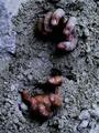
cementedby dragonladyComment: :: Critique Club ::
Great idea, I like that you put effort and creativity into this photo.
You did a good job with the composition. The texture of the sand is outstanding. I would have liked to see this in landscape instead of portrait. with the cement I would do one of two things, I would either smooth the sand to give it a hardened look or what would look even better is to use more of a side light to give longer shadows. Don�t forget one of the photographer�s best friends is a reflector in this photo it would have helped soften the shadows under the hands.
Color is great for this photo it really gives a cold feel to it which really works for this.
Feel free to PM me if you have any questions on anything I said hopefully this helped. Thank you.
Nick
|
| Photographer found comment helpful. |
| 08/02/2005 06:06:01 AM |
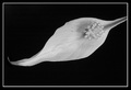
3 Textures for Texture III: Just a drop in the sea of timeby sallyplantComment: :: Critique Club ::
Hi, one thing I find really distracting in this photo is all the stuff in the water it really pulls attention away from the feather. The base of the feather is a little overexposed and the bottom right corner is under exposed as well.
Remember to use the rule of thirds I would use the extra space to show the color and ripples in the water. I wish the feather was a little smoother, I think the bottom half of the feather is unattractive.
To wrap up I really like the water in this photo but stuff in it is distracting. Remember not to place your subject in the center of the frame, it leaves nowhere for your eyes to go. If you have any questions for me feel free to PM me.
Nick
|
| 07/29/2005 06:00:36 AM |
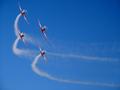
High Flyersby HeavyComment: :: Critique Club ::
Usually I start off by telling what is wrong with the photo but there is very little here. So I will start by telling you what I think would have made this photo better.
The placement of the subjects is good but I would prefer that you give a little more room above the top plane the cropping is just a tad to tight. The smoke does a great job of leading you eyes good use of it. The red and white work well with the clear sky.
I believe that it would help to see a little more of the planes as well. Maybe just wait a second till they turned more. Over all this is a technically good photo I would say well above average.
Feel free to PM me if you have any questions for me thanks for your time.
Nick
|
| Photographer found comment helpful. |
Home -
Challenges -
Community -
League -
Photos -
Cameras -
Lenses -
Learn -
Help -
Terms of Use -
Privacy -
Top ^
DPChallenge, and website content and design, Copyright © 2001-2025 Challenging Technologies, LLC.
All digital photo copyrights belong to the photographers and may not be used without permission.
Current Server Time: 08/24/2025 11:31:47 AM EDT.