| Image |
Comment |
| 01/12/2005 06:07:13 PM |
|
 Photographer found comment helpful. Photographer found comment helpful. |
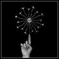
| 01/12/2005 06:04:14 PM |
Lone Starby artvetComment: wow, i love the simplicity offered by it's being in greyscale, but the star itself is so visually interesting. i really like how it's perched upon a person's finger. is it a christmas tree topper? |
| Photographer found comment helpful. |
| 01/12/2005 06:01:36 PM |
Harry Potterby photomayhemComment: yes he is! i applaud your creativity, and i can't help but like it ;-) the orange and green in an otherwise black-and-white environment add an interesting visual element. |
| Photographer found comment helpful. |
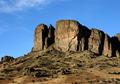
| 01/12/2005 05:59:55 PM |
Rockyby SammieComment: hmmm, seems this is a recurring theme, but not an idea that entered my mind, so way to be creative! i love the positioning of the rock formation, creating a horizon that's neither here nor there, and that bright blue sky offers excellent contrast. well done! |
| Photographer found comment helpful. |
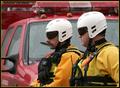
| 01/12/2005 05:57:43 PM |
The Rescuersby TelehubbieComment: those are men on a mission! i love how the background consists of only elements of the red truck, contrasting beautifully with the men's yellow suits and white helmets. also, their positioning in the frame is great. |
| Photographer found comment helpful. |
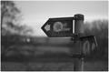
| 01/12/2005 05:56:10 PM |
Signs (2002)by MikeOComment: very nice composition, with good positioning of the subject as compared to the background. also, it's more emotive in greyscale. |
| Photographer found comment helpful. |
| 01/12/2005 05:54:48 PM |
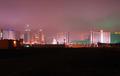
Casinoby JaxonComment: you had a good idea, and the positioning of the horizon is good, but all that black in the foreground detracts from the stunning architecture of the cityscape. |
| 01/12/2005 05:53:07 PM |
The age of inocenceby PicoComment: i like the idea you were working with, but if you know how, i would suggest trying out keeping the colour in just the kid's hat, though that wasn't allowed with basic editing (at least, i don't think so...). also, you've got a few spots of sepia in other places. you're better with photo editing than i am, but still need practice. |
| 01/12/2005 05:50:06 PM |
|
| Photographer found comment helpful. |
| 01/12/2005 05:49:18 PM |
A Clockwork Orange (Kubrick 1971)by FalcComment: very original!!! a lot of effort went into this photo, and i love that it's a gear made from an orange, rather than clockparts with an orange like some of the other entries. that background is so interesting, and definitely creates continuity with the orange. |
| Photographer found comment helpful. |
Home -
Challenges -
Community -
League -
Photos -
Cameras -
Lenses -
Learn -
Help -
Terms of Use -
Privacy -
Top ^
DPChallenge, and website content and design, Copyright © 2001-2025 Challenging Technologies, LLC.
All digital photo copyrights belong to the photographers and may not be used without permission.
Current Server Time: 08/02/2025 06:01:14 AM EDT.