| Image |
Comment |
| 09/15/2005 08:40:06 PM |
What We See Might Look Bad; Yet It Actually Nurtures Something Good : )by EarlySaturdayMorningComment: Hi From the Critique Club!
This is a very creative take on the challenge.
First of all, I applaud you for being so brave. If this were me, I wouldn�t even step outside the house let alone post an image in a contest! As women we are conditioned to cover up tiny flaws such as spots with make up. Models on the front of magazines have flawless skin and hair and this is seen as the standard we are judged by, regardless that it is an impossible standard. But here you are staring out at the world unbowed and proudJ
Also, I know that if I walked around in public with a black eye, people would be silently guessing how I got it. They might assume that I was in a violent relationship and would look at me with pity or look away because it makes them uncomfortable. They would write their own script of my life regardless of the truth. Perhaps your image had the same effect on the voters.
Whilst your image is creative, I feel you could have gone a step further and shot it in a more creative way. It looks like you simply held up the camera in front of you and pressed the shutter, and therefore looks like a snapshot. Perhaps a different angle or a more creative point of view would have changed the whole feel of the image. Moody lighting may have helped too, your image looks a little washed out.
On a site that tends to like �pretty� images this was a creative and brave attempt. Good luck in the future.
|
| 09/14/2005 11:18:35 PM |
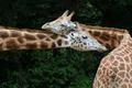
Necking In The Shadowsby sajinComment: Hi from the Critique Club!
This image really is appealing. It appears to capture an expression and emotion that we normally associate with people. It's hard to look at that expression and not believe that the giraffe is expressing 'love'.
The eye is led dynamically into the picture through that long neck. Almost like an arrow, it directs the viewer to the crux of the image - the entwined heads and that expression. It is this that really holds the viewer's attention.
I think the voting reflects the problem people had with the image fitting the challenge well. For me personally, there is contrast but not high contrast. Bumping up the saturation may have rectified this, but I feel something of the lovely simplicity and charm of the image may then have been lost.
You have,though, produced an image that is a pleasure to look at, and that is more important than scores in my opinion;) |
 Photographer found comment helpful. Photographer found comment helpful. |
| 09/13/2005 06:02:45 AM |
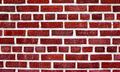
Beauty in the Mundaneby brianlhComment: Hi from the Critique Club!
One of the joys of doing these critiques is that it forces you to take the time and effort to really look at an image and bypass quick first impressions.
So here I am being forced to look at a brick wall;) As a high contrast study it works. But there is no focus point to satisfy the eye...until you are forced to stare at it. The brain, searching for something, anything, to focus on starts to notice subtle differences in each brick and area of the wall. Now it notices the colour differences in each brick. The way the light catches each one uniquely. Then you find Pink Floyd's 'Another Brick in the Wall' lyric going round and round your head...and you begin to think philisophical thoughts about how it relates to people and capitalism...and then you remember it's just an image of a brick wall:)) Message edited by author 2005-09-13 06:08:33. |
| Photographer found comment helpful. |
| 09/11/2005 08:55:39 PM |
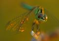
Dragon Lady (in honour of my 12th grade maths teacher!)by bhowieComment: Hello from the Critique Club!
I can look at a perfectly executed painting or even a photograph for that matter and it can often leave me cold. This image just makes me feel happy for some unknown reason.
Yes a different DOF might have made this image better technically, but I�m sure something very unique and important would have been lost in the process. THAT wing!! It�s like gossamer on fire � its like a fairy type elemental coming through from another dimension and laughing at the silliness of us humans�you could not capture that again if you tried for the next 100 years!
The colours in this image could have come from a painter�s palette � planned and perfect - perfect together.
This image just works for me and I�m glad your depth of field and focus were as they were. For that reason I can�t bring myself to find any faultJ Message edited by author 2005-09-12 02:26:10. |
| Photographer found comment helpful. |
| 09/11/2005 09:18:45 AM |
Dogs & Logsby owenComment: Hello from the Critique Club!
The first thing about this image is it s clarity � I feel like I just went to the opticians and he gave me back crystal clear 20/20 vision! It also evokes a feeling of childhood innocence and freedom � long hot summer holidays at the beach with family and pooches. The sun on your back, sand between your toes and a pet that just wants to have fun
The stick leads the eye into the image well, leading us to the dog�s head and through to the tail, creating a dynamic diagonal.
The change in colour from the sand to the blue of the water gives a nice sense of space and distance. I like the muted tones and I�m glad you weren�t tempted to up the saturation.
The detail and clarity of the water is what really makes this image: The water displaced by the dog almost looks 3D. The ripples in the water caused by falling droplets are really clear and you can almost make out what is on the seabed. Considering the dog was moving, this was an excellent capture. Exposure, depth of field and focus are all judged extremely well.
To me though the dog seems a tad over sharpened, but not so much to spoil the image. Message edited by author 2005-09-11 21:00:42. |
| Photographer found comment helpful. |
| 09/11/2005 01:57:32 AM |
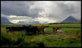
Diary & landscapeby gisliComment: Hello from the Critique Club!
This is a lovely landscape image that evokes calm and tranquility in the viewer. I can see just what it was that attracted you to the scene: The light on those distant hills is irresistible. The sky has those rolling clouds that create a moody, atmospheric feel. The light on the fields has brought out a myriad of green tones and shades. The cows seem oblivious to the beauty around them.
The foreground on the bottom left is darker than the right side. Whilst this is underexposed, the slight contrast between the two halves does seem to lead the eye into the image. The eye is than lead across the image in a diagonal to the hill on the far right. This creates the idea of perspective and distance. The viewer is then led back across the image across that range and sky. Mirroring the foreground, the top right of the image is lighter than the top left, which creates a sense of balance.
The depth of field and focus are excellent -even with my eyesight I can see detail on the hill in the middle in the far distance.
You have also used the rule of thirds well � even though it appears to be half land/half sky, the two larger hills on either side of the image make the land two-thirds of the image.
The only criticism I can find is the underexposure of the cows on the left hand side. There is heaps of information on DPC about how to remedy this, and I think a lot of voters would love to see this image reworked to bring out its full potential;)
A lovely image that has bags of potential.
|
| Photographer found comment helpful. |
| 09/09/2005 03:38:33 AM |
|
| Photographer found comment helpful. |
| 09/08/2005 06:34:18 AM |
|
| Photographer found comment helpful. |
| 09/08/2005 12:08:35 AM |
|
| Photographer found comment helpful. |
| 09/08/2005 12:02:11 AM |
|
| Photographer found comment helpful. |
Home -
Challenges -
Community -
League -
Photos -
Cameras -
Lenses -
Learn -
Help -
Terms of Use -
Privacy -
Top ^
DPChallenge, and website content and design, Copyright © 2001-2025 Challenging Technologies, LLC.
All digital photo copyrights belong to the photographers and may not be used without permission.
Current Server Time: 08/11/2025 03:10:22 AM EDT.