|
|
|
Showing 721 - 730 of ~1171 |
| Image |
Comment |
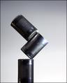
| 11/11/2005 03:16:32 AM | Spill the Beansby soupComment: Simple, clever and some really good prints that CSI would be proud of;) |  Photographer found comment helpful. Photographer found comment helpful. |
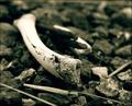
| 11/11/2005 03:07:48 AM | Bonesby JaimesonComment: I like the tones and textures here, as well as the shallow depth of field. | | Photographer found comment helpful. |
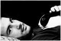
| 09/18/2005 08:24:34 PM | Friendsby CalliopeKelComment: Hi from the Critique Club!
I really did not want to get this one. I went to confession twice having voted on this one and my husband thinks it is our new screensaver!
And this is a first for me - I pulled this yesterday and decided to leave it till the morning. As a result I had a series of nightmares: I was working at a big company and left for a holiday. I forgot about the two rabbits in the cage by my desk. When I returned the rabbits had multiplied but were all thin and diseased from lack of food and water. When I tried to pick them up they fell through my fingers as there was nothing to hold on to! I tried to hide all this, but someone found out. EVERY one in the company shunned me, practicaly spitting at me in disgust when they passed. I decided to leave, got into the lift to go down 6 floors, only the lift kept going and speeded up. It just kept going down and down and I was convinced I was going to die. See what you did to me?:))
This is a lovely black and white image. It's one of the few that I don't have to think 'is it high contrast or not?'. It meets the challenge perfectly.
Compostionally, there is a lovely balance between the subject and negative space. The viewer's eye is led back and forth between the model's eyes and the rabbit's eye, ensuring the image is not static.
There is so much expression in the model's eyes that you can't fail to feel 'something' when you look at them. Blame the nightmare, but I can't help thinking of 'Fatal Attraction' when I look at it - when Glenn Close boils the rabbit in the pot. If you had her instead of Fetor in this image, it would have been the perfect publicity poster for the film:)
The blacks in the image are wonderful. I love the way the black body of the rabbit has melted into the black background.
To be honest I never even noticed the pillow before - too busy looking at...well you know...but changing it to white was simply the icing on the cake.
What more can I say? I'm off for a bit of counselling and another visit to the confessional;) Message edited by author 2005-09-18 20:43:02. | | Photographer found comment helpful. |
| 09/18/2005 03:58:57 AM | THE LOOKby gtp1164Comment: Hi from the Critique Club!
A really nice portrait and a lovely model.
The eyes dominate the image as they should and the eye is immediately drawn and held there. They give the impression of a warm and froendly person, who is relaxed and at ease with herself.
The model has lovely features but I feel that with a combination of high key and neat image(?) you have needlessly perhaps 'plasticised' her. I'm waiting for neat image to be made into a face cream, but until then, I'd like to see models with their 'warts and all':) But then again it is a matter of personal taste.
This is certainly high key, and had you made it even more high key you may have achieved more high contrast. You might have lost the soft quality though, so it's a balancing act.
The halter neck strap at the back of her neck is a little distracting.
A really nice portrait and a good score. |
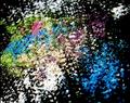
| 09/18/2005 02:57:19 AM | Radioactiveby angelComment: Hi from the Critique Club!
This certainly an intriguing image. I just wish I could see more of it. Entering images of this size will always generate lower scores, but I get the feeling that you don't mind that;)
From an artistic point of view it is very impressionistic and abstract, which I quite like. The brain tries to search for shapes and patterns in the make-up like an psychological ink blot test.
The vibrancy of the blue is in contrast to the other colours, but it is not enough to meet the challenge.
The effect of the mirror blurs the make-up in an interesting way, but that it is a mirror is only apparent after the challenge with your notes explaining. A bigger image would have totally altered the viewer's perception.
Conrgratulations on doing your own thing;) Message edited by author 2005-09-18 03:01:14. |
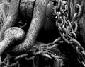
| 09/17/2005 11:35:50 PM | Linking Contrastby cmortonComment: Hi from the Critique Club!
I totally understand what drew you to this. There are lovely rich textures in there, with the metal links contrasting with the texture of the wood.
The eye is led into the image by that round bolt(?) on the left and up to the top middle of the picture. It then follows the links down and out of the image at bottom left. The eye naturally, though, by-passes the area in the middle.
The focus seems a little soft on the links at top right - a smaller aperture would have overcome that.
The contrast here, although fine for a normal study, is not quite high enough for this challenge. Perhaps the lighting that day was a little flat? I would be very tempted to go back a re-shoot with different lighting conditions. Or perhaps try some post processing techniques - Channel mixer, dodging and burning, gradients..etc to try and draw out its full potential?
|
| 09/17/2005 11:02:56 PM | HOT & COLDby usiaComment: Hi from the Critique Club!
This is another creative take on the challenge. The contrast between fire and ice is indeed high contrast and shows originality.
The execution though has let you down: Compositionally, you have missed what should be the main focus of the image - the words and the fire.The bottom half of your image is wasted space and adds nothing to the picture. Had you focused more on the words and the fire your image would have been dramatically improved. As it is, the main focus has been dissected, which changes the whole esence of the photograph.
The lighting is too harsh for your creative idea. You have blown highlights on the bottom of the ice bag, when what you really needed was dramatic lighting to bring out the fire, letting the fire itself, perhaps, highlight the words.
The focus too seems a little off - a smaller aperture (16 or 22) would give you a greater depth of field, bringing the whole image into sharper focus.
This is a very original, creative idea, but it's execution let you down. Message edited by author 2005-09-17 23:03:49. | | Photographer found comment helpful. |
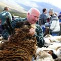
| 09/17/2005 10:29:14 PM | This one is unique.by djonsonComment: Hi from the Critique Club!
This is a creative take on the challenge! Speaking as the black sheep of my own family I can really empathise with this poor little guy.
The image has many layers of interest moving from front to back:
First the black sheep itself - you can almost feel that wool! His legs up in the air could be interpreted as an act of surrender or hopelessness.
Then we have the farmer, expertly handling the poor sheep. The physical exertion of lifting is shown to us by the redness of his face when compared to the paleness of his hands, adding another area of high contrast.
Next we have the white sheep who seem to blend into one, which protects the individual sheep from being picked on - unlike the poor black one.
Then there is the layer of people in the background that gives us a sense of the place and culture.
Finally, we have the mountain as the back-drop to the whole scene.
The viewer's eye is led into the picture by the black sheep's body on the bottom left. It then follows a nice diagonal up through the sheep's eye, the farmer's face and then to the two people on the right, giving a sense of depth and movement to the image.
There is a lovely balance of colour in the image, with tones of blue and white dominating. This also convey's a feeling of coldness to the viewer which matches the scene perfectly.
The white sheep on the right seem a little overexposed, but that seems to make sense in terms of them blending together, in total contrast to the black sheep. As that is the whole point of the image, the overexposure doesn't really matter;)
| | Photographer found comment helpful. |
| 09/17/2005 10:22:16 PM | |
| 09/16/2005 09:38:49 PM | |
|
Showing 721 - 730 of ~1171 |
Home -
Challenges -
Community -
League -
Photos -
Cameras -
Lenses -
Learn -
Help -
Terms of Use -
Privacy -
Top ^
DPChallenge, and website content and design, Copyright © 2001-2025 Challenging Technologies, LLC.
All digital photo copyrights belong to the photographers and may not be used without permission.
Current Server Time: 08/11/2025 03:10:48 AM EDT.
|