|
|
|
Showing 301 - 310 of ~1171 |
| Image |
Comment |
| 06/14/2006 07:56:47 AM | Farm Zenby tonyvComment: I like the saturation and the sinuous lines. I like the way the black is repeated at the edges, Seems a bit over sharpened, but I like it;) |  Photographer found comment helpful. Photographer found comment helpful. |
| 06/13/2006 04:13:53 AM | Serenity Revisitedby jeroweComment: Hi from the Critique Club!
In line with the challenge, I have looked at the original image too, which I loved by the way;)You have produced two wonderful images that would grace any wall;)
This retake has a totally different feel due the different lighting conditions; your first one having lovely soft orange hues and tones, and this one those gorgeous blues. The line of orange/yellow/red on the horizon contrasts beautifully against the blue, and is picked up in the rocks in the foreground.
The composition is a bold choice as you place your horizon in the middle, cutting the image in two. I am wondering if you did this to avoid replicating the first image too closely? I would have loved to have seen the horizon placed higher as in the first one. The horizon also looks a tad off to me, which seems to emphasize the cutting in half element. Don't get me wrong, it's lovely as it is, but I think the colours were different enough for you to get away with copying your other image's placement of the horizon,and perhaps have upped your already excellent score;)
The tree is wonderful and dramatic, I just wish it were a little closer to the foreground and filled the frame more, I guess I'm just greedy;)
You're obviously an expert at finding the right aperture and shutter speed for these lovely evening shots, and the image is clean and crisp.
A beautiful take two, can't wait to see 3 and 4;) Message edited by author 2006-06-14 00:41:50. | | Photographer found comment helpful. |
| 06/10/2006 06:38:04 AM | | | Photographer found comment helpful. |
| 06/10/2006 12:56:41 AM | Drive My Carby LERtasticComment: Hi from the Critique Club!
I'm not a car fan, so I'm sorry you got me:))
The first thing that stands out is the lovely iridescent blue of the car. It's a lovely, appealing colour.
The angle you have used is quite dynamic, but that front headlight is almost in the centre of the image; the eye is drawn there and tends to want to stop there, which leads to a static image.
The sky is washed out, but against the intense blue of the car, for me at least, it gives a graphic quality to the image which I like. But for most voters I suspect they marked you down for this. I think your camera struggled with all the bright areas in the image, particularly the sky;)
The tree is a distraction for many people - why didn't you go and chop it down?:)) But other than removing it from the image (which would be illegal) what more could you do?
I quite like the truck reflection on the car, it gives it more interest for someone who rarely salivates over 'boys toys'. Equally the sky reflected on the hood for me just adds to the graphic quality, but purists would not agree:)
I also love the fact that I can see YOU in the bumper...but again for others..'
An image that grew on me;) | | Photographer found comment helpful. |
| 06/10/2006 12:39:15 AM | Conceptionby tapeworm_jimmyComment: Hi from the Critique Club!
What a beautiful image! I want to put it on my wall!
It has a wonderful ethereal feel, or an elemental, fairy like quality to it. It makes me feel calm, serene, at peace, and otherworldly:)
The colours are so soft and light. Your lighting has really enhanced the image without dominating or overwhelming it...it's simply sublime.
The bubbles and chips in the glass ball/marble give a lovely balance to the softness of the rest of the image. And the green within the glass balances the blues that surround it.
What more can I say? What the Dickens is it doing at 82nd place!
| | Photographer found comment helpful. |
| 06/10/2006 12:28:36 AM | Wolverineby prenticeComment: Hi from the Critique Club!
Critiquing this challenge has me wondering about the mental health of DPCers:)) The incredible range of subjects chosen for Single Light Source leaves me fascinated. How on earth do you see the challenge title and then think 'Ahh! Wolverine!'. Not that I'm complaining...especially the way you have done it:)) I fell in love with him after the movie..so I am not complaining:))
I like the composition; the outstretched arms and the head back are perfect. But I'm not so sure about the crop...I want to love it but...You need, I think, some space above him for him to scream in to...not much..but more than here. If you had lifted your arms/hands a little higher, you could have cropped out the pants and increased the space at the top.
With low key, darker images like this, you always have to be aware that not all monitors are calibrated properly, and that what looks OK on yours or my screen, might be too dark on some of the voters screens...I say that, because I think you should have scored higher, and that this might be an explanation?
I like the subtle contrast and nice tones you have achieved with the lighting and post production, they enhance the emotion of the image. I also appreciate the effort and creativity that went into this.
A well executed image. | | Photographer found comment helpful. |
| 06/10/2006 12:09:25 AM | "A Taste of Honey"by freakin_hilariousComment: Hi from the Critique Club!
There is something really appealing about honey running off spoons, I think we can all associate it with childhood and feelings of home and security.
First of all the background;It's a nice mixture of muted colours, but there is blue line running from the top to the spoon handle that is quite distracting, it keeps pulling my eye away from the main focus. A plainer or darker background would obviously overcome this, but would also alter the whole feel of the image.
Ignoring the blue line, the eye is led into the image via the handle, moves down to that wonderful honey in the bowl of the spoon, and then we are led out the image via the lovely funnel of liquid. This creates lovely movement.
To be picky I find the blue line of honey being poured from above and the blob it makes a little distracting too. With just the honey dripping of the spoon alone, the image would have been cleaner and crisper and I think you would have scored even higher...but as I said I'm being picky;)
The golden orange colour of the honey contrasts well against the blue cast on the spoon and the 'funnel'. And the bubbles in the clear liquid give the image depth and texture.
A yummy image:)) | | Photographer found comment helpful. |
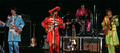
| 06/09/2006 11:49:45 PM | Sgt Pepper's Lonely Hearts Club Bandby ClickNSeeComment: Hi from the Critique Club!
Well done on finding the perfect subject for the challenge!
I appreciate how difficult it is to take an image in conditions of low light where you have little or no control over the subject or lighting conditions, or even where you can take the image from! So under those circumstances you have done really well.
The crop is a little severe, but had the image been lighter I think the crop would not matter so much. It's the fact that you have a tight crop and a fairly dark image together that has cost you score wise. The crop makes me feel claustrophobic, there's no space for the band..but I appreciate how hard it is to get them all in. Perhaps if you had focused on just Paul and John(?) but then the voters would ask where the other two were:)
Did you boost the saturation to bring the colours of the clothes out? Because whilst the clothes look bright, the faces are dark and a little too red. Paul's hair has disappeared into the dark background, as has Ringo's so it looks as if they have weird cut off faces with no hair or top to their heads:) Ringo also seems to be giving you the 'bird' with his drumstick - so rude!:) That hat on the guy in the middle looks like a pillow on his head - but that's not your fault;)
I'm curious to what post processing you did, and if you tried curves or dodging and burning to lighten the image? I think ANY lightning of the image would have improved your score.
A timely and appropriate image. |
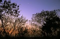
| 06/09/2006 10:33:05 PM | Good Morning Good Morningby arati_halbeComment: Hi from the Critique Club!
This is a really nice idea for the challenge. Low light shots like this are always difficult to get right. You usually need a tripod and a long exposure time to capture it correctly...you have achieved this with only 1/10s! As a result your image has suffered as the camera has struggled with the lighting conditions.
There are some wonderful colours in that sky, but it is so noisy that it is the noise that dominates, not the lovely graduated sky.
The moon and Venus (?)are well captured, but they are quite small and again, almost get lost in the noisy sky.
I like the way the trees seem to lean in to the image and they create some nice negative space. The land or horizon at the bottom of the image is quite distracting and it might have been better to crop that out.
To me this image gives an 'impression' of early morning and would have scored a little higher without the noise. | | Photographer found comment helpful. |
| 06/09/2006 10:11:48 PM | Desvasidizedby blackenedwhiteComment: Hi from the Critique Club!
What an interesting bio you have! And congratulations on your high score.
The first thing that stands out here is those eyes. The intense stare really grabs the viewer and challenges them to look away. The whites of the eyes amplify the intensity and attitude, especially as the overall image is so dark, creating nice contrast and tension.
Secondly, the use of negative space is very creative here; the face looks like it's coming out of the darkness and straight at the viewer. The subtle highlights of the zip are perfect for adding some interest in that negative space which otherwise could have seemed a little flat.
The skin texture adds yet more drama and a harshness that echos the almost violent expression in the eyes. The hair over the eyes enhances this feeling too.
You have created an image that has incredible impact and conveys strong emotion, and that is borne out by your high score.
Your harsh lighting has helped you create this story well. | | Photographer found comment helpful. |
|
Showing 301 - 310 of ~1171 |
Home -
Challenges -
Community -
League -
Photos -
Cameras -
Lenses -
Learn -
Help -
Terms of Use -
Privacy -
Top ^
DPChallenge, and website content and design, Copyright © 2001-2025 Challenging Technologies, LLC.
All digital photo copyrights belong to the photographers and may not be used without permission.
Current Server Time: 08/05/2025 07:41:15 AM EDT.
|