|
|
|
Showing 101 - 110 of ~408 |
| Image |
Comment |
| 12/16/2002 08:17:57 PM | Steps of the faithfulby Antart101Comment: ...from Critique Club...
Hi Andrea
FIRST IMPRESSION:
Not very interesting :(
COMPOSITION:
I think your shot would have worked better if you had taken it from a different angle...perhaps straight down 90 degrees. This would have eliminated the edge of 'the sidewalk?' at the top of the photo. Also, I kinda like the shapes created on the ground, and if you had taken the shot so that the lines would all be horizontal/vertical instead of angled it would have made it more interesting. :(
TECHNICAL:
The overall lighting seems a bit poor. I'm not sure if you had a chance to control that or not. Focus seems a bit off. These could have been tweeked a bit in post processing (if available) by lightening the image and increasing contrast a bit. :(
ARTISTIC:
The idea is very original. I understand how you tried to show motion by capturing a bunch of footprints. There is perhaps too much 'other stuff' on the snow which is a bit distracting and makes the shot a bit too busy. Great attempt, though. :|
OVERALL:
I think with a bit of compositional and technical improvement this could actually be a decent shot.
Best of luck in the future. Don't hesitate to PM me if you have any questions about this critique.
Cheers...zadore. |
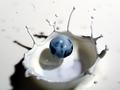
| 12/14/2002 01:29:55 AM | Blueberry Splash by JackoComment: ...from Critique Club...
Hi Jacko (fellow Canuck)
FIRST IMPRESSION:
WOW with a capital Wh!
COMPOSITION:
Jacko, I think it works nicely. The elements all come together in the frame and keep the shot very balanced as they are. I wonder what it would have looked like if there was a bit more of the image on the bottom. :)
TECHNICAL:
Great. Focus is good on the BBerry. The directional lighting is superb and I love how it creates the shadows. :)
ARTISTIC:
This is where you take the cake, buddy. This is simply incredible. Great patience to create this shot. I would not even attempt it. :)
OVERALL:
Deserving of first place? Sure! This is one of the few 'WOW' shots one comes across here on DPChallenge.
CONGRATULATIONS FROM THE CRITIQUE CLUB!
Cheers. |  Photographer found comment helpful. Photographer found comment helpful. |
| 12/14/2002 01:21:38 AM | abstract blueby shutterflyComment: ...from Critique Club...
Hi Wendy
FIRST IMPRESSION:
Good gosh, where is this suppose to be inserted into??? :)
COMPOSITION:
Awesome! No matter where you look first, you end up following every curve on this 'probe'. :)
TECHNICAL:
I would have prefered for the tip to be in focus, but it still works nicely this way. Lighting really brings out the shapes. Very nice. :)
ARTISTIC:
Meet the challenge? Duh!...of course. Interesting subject? Well, if I don't know what it is, then it sure is interesting. :)
OVERALL:
Great shot. Works well with the white background. I didn't get to vote on your photo, but if I had, I'd give it a strong 9.
Cheers. | | Photographer found comment helpful. |
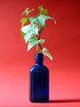
| 12/14/2002 01:16:16 AM | Blue Ivyby NHCameraManComment: ...from Critique Club...
Hi
FIRST IMPRESSION:
Where's the blue?
COMPOSITION:
I am not a big fan of centered subjects...sorry. Placing your subject to either side of the frame (probably to the left) on a horizontal oriented frame would show more of the shadow (try the shadow at a diff angle, too) and make for a more interesting comp...IMO :(
TECHNICAL:
Focus is pretty good. Lighting seems to be a problem, as you have overexposed the left leaves quite a bit. I would try diffusing the light. :(
ARTISTIC:
I think I understand what you were trying to achieve and I think it's a great creative idea. I would...for this challenge...try a more neutral background though, as red is the predominant color and not blue :)
OVERALL:
I didn't find this photo to be good at all (sorry :( ...mainly because of the composition and lighting.
Cheers. |
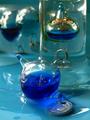
| 12/14/2002 01:07:31 AM | Left out, feeling Blueby gerardComment: ...from Critique Club...
Hi Gerard
FIRST IMPRESSION:
Cool...looks liquid. :)
COMPOSITION:
I think the composition could be a bit better. There is so much going on on the photo, that it's hard to focus on one thing only. Eliminating some elements, or shooting at a different angle could help. :|
TECHNICAL:
Pretty good. I think a bit more DOF could help...especially for those who don't quite know what they're looking at. Focus on the front 'ball' is good, and I guess that is what you wanted. I guess you used whatever lighting was available, the problem, I find is that it reflects quite a bit off the glass. :(
ARTISTIC:
Awesome. I think you picked out a very interesting subject whose physical properties make it almost liquid like. I love the shapes and sofness of the shot. :)
OVERALL:
I would love to have one of these so I could shoot a ton of shots. I think you would be suprised at the potential of this subject...especially using the colors you have chosen for this one.
Cheers. | | Photographer found comment helpful. |
| 12/12/2002 01:21:33 AM | Little Boy Blueby mitzie9Comment: ...from Critique Club...
Hi Mitzie9
FIRST IMPRESSION:
Great smile on a cute kid :)
COMPOSITION:
I think composition is probably the weakest point in this photo...and I'm going to picky. 1. The window in the background is very distracting. 2. the framing of the photo seems a bit tilted to the right...try rotating the image CCW a bit. 3. The straw he's holding has to go. 4. He's too cute to have such an elaborate, bulky chair 'growing' out of his head which distracts. 5. Place the boy more to the left of the frame (rule of thirds), or IMO close in on him and make him fill the frame more. :(
..sorry if I'm being too picky, it only get better from here on, though :)
TECHNICAL:
Great! The lighting is soft and even on his face. Focus is good. I would try lighting him with something other than the on-board flash. :)
ARTISTIC:
Funny, cause I did a shot similar to yours and used the same technique...and a cute kid :) I think you did a great job in desaturating the colors, and leaving the blue shirt. It seems like everyone is now doing that same thing to their photos. I still like the effect though. :)
OVERALL:
This could make for a cute portrait of this boy...I like the expression on his face. You'll need to be a bit more conscious of his 'surroundings'...IMO.
Cheers. |
| 12/12/2002 01:09:27 AM | A Blue That Burnsby paully2k1Comment: ...from Critique Club...
FIRST IMPRESSION:
Out of focus!
COMPOSITION:
I actually find the composition quite attractive. There is a nice balance between the white and blue. The position of the cig packs actually makes this an interesting shot. :)
TECHNICAL:
This is where we have a major problem. I like soft focus images when it adds to the photo, but in this case it ruins it...big time. Closing your aperture might help with this, so you get more DOF. If this is a result of you being so close to the subject, then try setting your macro, or shoot a wider shot from further away and then close-crop. Lighting seems fair. :(
ARTISTIC:
I think you did a fair job in observing the contrast on the packs' colors and the pattern they formed. Nothing interesting about cig packs, but you managed to play on geometry and color and did a fairly good job. :|
OVERALL:
Interesting composition of a 'boring' subject that had potential to be quite good, but lost point on it being out of focus. Worth trying again, and perhaps make a series with diff color packs.
Cheers. |
| 12/04/2002 08:04:22 PM | |
| 12/04/2002 08:02:54 PM | |
| 12/04/2002 08:02:09 PM | |
|
Showing 101 - 110 of ~408 |
Home -
Challenges -
Community -
League -
Photos -
Cameras -
Lenses -
Learn -
Help -
Terms of Use -
Privacy -
Top ^
DPChallenge, and website content and design, Copyright © 2001-2025 Challenging Technologies, LLC.
All digital photo copyrights belong to the photographers and may not be used without permission.
Current Server Time: 08/24/2025 03:59:57 AM EDT.
|