| Image |
Comment |
| 08/07/2005 12:39:38 AM |
wood and skyby turner1988Comment: ** Greetings from the Critique Club **
Very simplistic - but appealing. I really like the creativity. The focus on the clothes pins seems a little soft. The spacing of the pins is good - but perhaps shooting from a slight angle would have made this even more interesting.
- Linda |
 Photographer found comment helpful. Photographer found comment helpful. |
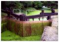
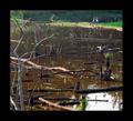
| 08/07/2005 12:36:25 AM |
The Last Lock Gateby ArtanComment: ** Greetings from the Critique Club **
Very interesting image. The colors are vibrant. DOF is good. Focus is soft - but is well suited for this image. Interesting that you entered this in the wooden challenge though as the subject does not strike me to be the pruple painted wood, but the algae filled stream itself.
- Linda |
| Photographer found comment helpful. |
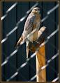
| 08/07/2005 12:29:58 AM |
my homeby sigrun_thComment: ** Greetings from the Critique Club **
Good DOF and focus on the bird and his perch, but the fence is awkward. I must say, you did well in at least blurring it and playing the light off it. The color balance is right on here. I also like the framing on this.
As for keeping within the realm of the challenge - I do think this was a bit of a stretch as the subject seems to be more the bird than the wooden perch.
- Linda |
| Photographer found comment helpful. |
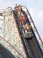
| 08/07/2005 12:09:36 AM |
The Thunderboltby BADDBOYY21Comment: ** Greetings from the Critique Club **
A really fun shot! The composition is excellent. You did a very good job of keeping the exposure settings under control, preventing any blown out areas. The sky - due to time of day most likely - could use a bit more color. Perhaps with an adjustment in color balance or saturation this would have given the sky more depth and blue tone - which in turn would have added pop to the rest of the image.
Your timing was great - good choice of shuuter spped!
- Linda |
| Photographer found comment helpful. |
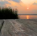
| 08/06/2005 11:02:01 PM |
Sittin on the Dock of the Bayby idnicComment: ** Greetings from the Critique Club **
The lack of focus, and detail really impairs this image. The colors also appear washed out across the horizon. You must have had to use a high ISO as there is a bit of noise througout the sky. A fill flash might have been nice to bring out colors in the grass.
- Linda |
| Photographer found comment helpful. |
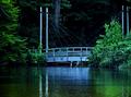
| 08/06/2005 10:58:07 PM |
Beauty Beneath the Pierby brianlhComment: ** Greetings from the Critique Club **
An excellent use of natural light. The softness of the light works well with the soft focus applied here. It was a little hard to pick up on the water at first though.
Congrats on your top 10 finish.
- Linda |
| Photographer found comment helpful. |
| 08/06/2005 10:53:45 PM |
In the Span of Sapphireby OlyuziComment: ** Greetings from the Critique Club **
At first glance this is a very grabbing image. But as you keep looking, the specks on the water become distracting from the beauty of the reflection. I love the composition and lines. As for the over-saturation, I am not a fan of this and even here I think you have pushed the limits a bit too much.
- Linda |
| Photographer found comment helpful. |
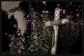
| 08/06/2005 10:46:09 PM |
Her wooden crossby jonasvalComment: ** Greetings from the Critique Club **
What an emotionally strong photo! I love the selective desat work you have applied. DOF and detail are wonderful. The purpels really pop and add a lot to this image.
- Linda |
| Photographer found comment helpful. |
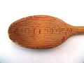
| 08/06/2005 10:40:54 PM |
The Spoonby mfairbanksComment: ** Greetings from the Critique Club **
Simple yet nicely executed. The top edge of the spoon seems a little soft focused, but the rest of the image has nice detail. The lower corners of this image have a blue cast - not sure what caused that but it is a bit odd.
- Linda |
| Photographer found comment helpful. |
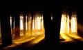
| 08/06/2005 10:17:58 PM |
Interlude in the Woodsby msdoubletroubleComment: ** Greetings from the Critique Club **
I love this photo - but the frame is much too heavy. Not sure black was a good color choice for the frame either. A rich brown frame - much thinner comes to mind as a better choice.
Colors within the photo are beautiful. Great DOF and focus. Excellent composition.
- Linda |
Home -
Challenges -
Community -
League -
Photos -
Cameras -
Lenses -
Learn -
Help -
Terms of Use -
Privacy -
Top ^
DPChallenge, and website content and design, Copyright © 2001-2025 Challenging Technologies, LLC.
All digital photo copyrights belong to the photographers and may not be used without permission.
Current Server Time: 08/18/2025 05:25:01 AM EDT.