| Image |
Comment |
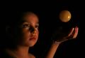
| 08/18/2005 02:44:19 PM |
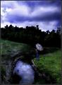
Little dreamerby rameviComment: ** Greetings from the Critique Club **
Focus seems a bit soft, alnmost blurry on face of girl. Seems to have focused on the hand and item being tossed in the air.
Good use of shutter speed to give the illusion of the item floating or stopped in mid-air. Lighting done nicely too in my opinion - really accentuates the gaze in the girls eyes.
Linda
|
 Photographer found comment helpful. Photographer found comment helpful. |
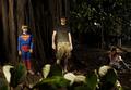
| 08/18/2005 02:33:41 PM |
Family Portraitby neomachinaComment: ** Greetings from the Critique Club **
Technical: Foreground is very distracting, almost to the point of obscuring the main subjects in the image. The lighting seems to be coming from the left primarily, leaving the two individuals along the right hardly noticeable. Seems a bright spot is on the guy in camo.
Composition: Foreground needed to be cleared before the shot. Subjects not balanced well within the photo.
Meeting Challenge: I do not see how this meets the challenge at all. I simply do not see any illusion here, unless the large tree is not actually one tree but either more than one tree lit to look as one, or a backdrop. I just don't see it. Sorry.
Linda
|
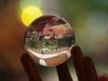
| 08/18/2005 02:24:11 PM |
The Jugglerby MPRPROComment: ** Greetings from the Critique Club **
Technical: Focus seems a bit soft on the edges of glass sphere and on wood holder. Very good bokeh. Nice color saturation.
Composition: Glass ball seems too far away, and would be better a little more off centered. Poosibly rotating image slightly ccw would make this more interesting. Due to the sphere being so far away, it is hard to see a clear image inside the glass. Seems a bit busy in the glass ball. Try waiting until not so many people are present, and have a more interesting subject in their place.
Meeting the Challenge: I feel you did this well as it presents the viewer with an optical illusion.
Linda
|
| Photographer found comment helpful. |
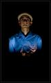
| 08/18/2005 02:13:01 PM |
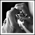
At the heart of it all...by fotodudeComment: ** Greetings from the critique club **
The first thing that stikes me is too juch dead space, particularly along the bottom third of the image.
The second thing is the 'double-exposure effect' - just looks off balanced. The I realized why....the hand is more visible than the upside down head, so at first you notice the hand which would not be in the ocrrect anatomiacal presentation to be shooting a camer. After really searching the image, you notice the head under the camera..
The wrinkles in the shirt are a bit distracting also.
Colors are nice - bright blue on black. And the color of the cap is perfect as it does not over-power the face, but accentuates it. I like the lighting and shadows.
Over all, while this was nto a favorite shot of mine, it was very creative and executed fairly well.
- Linda
|
| Photographer found comment helpful. |
| 08/17/2005 09:35:29 PM |
|
| Photographer found comment helpful. |
| 08/17/2005 09:34:14 PM |
|
| Photographer found comment helpful. |
| 08/17/2005 09:30:43 PM |
|
| Photographer found comment helpful. |
| 08/17/2005 09:24:03 PM |
- -by ralphComment: blurred flowers across top are distracting. Good shutter speed |
| 08/17/2005 09:22:45 PM |
|
| 08/17/2005 12:27:24 AM |
|
Home -
Challenges -
Community -
League -
Photos -
Cameras -
Lenses -
Learn -
Help -
Terms of Use -
Privacy -
Top ^
DPChallenge, and website content and design, Copyright © 2001-2025 Challenging Technologies, LLC.
All digital photo copyrights belong to the photographers and may not be used without permission.
Current Server Time: 08/18/2025 07:09:23 AM EDT.