| Image |
Comment |
| 06/10/2005 12:35:51 AM |
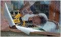
Beautificationby bladComment: My favorite image so far. Nice suble soft colors on the poster and then the hard lines and bright yellow of the construction behind make this image incredibly compelling. If it were possible to completely cut out the glimpse of wall at the bottom it might be even more unearthly. 10. |
 Photographer found comment helpful. Photographer found comment helpful. |
| 06/09/2005 01:37:36 PM |
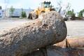
Constructionby KepowObComment: In this image the objects in the foreground take up too much fo the frame. I would have really liked it if you maybe fit the pipes into the bottom third of the frame and showed more of the construction equipment in the back. I like the idea, I just think the composition is a little off. |
| 06/09/2005 01:36:14 PM |
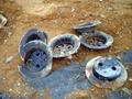
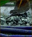
What's This?by lucid mindComment: I am not sure what I am looking at here, but I don't immediately connect it to construction. It would help if the image were more in focus. |
| 06/09/2005 01:18:14 PM |
|
| Photographer found comment helpful. |
| 06/09/2005 01:19:56 AM |
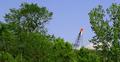
Cranus Noswayinbreezusby CEJComment: For me the focus of the picture (the crane) is too far away here, it is hard for me to make out any details on it. However, I like the fact that it puts construction in perspective, behind the forest. |
| Photographer found comment helpful. |
| 06/09/2005 01:18:32 AM |
|
| Photographer found comment helpful. |
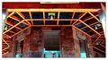
| 06/09/2005 01:17:19 AM |
Porch Frameby DeniseBernadetteComment: I would like to see a little more detail in this photo, it seems a little out of focus. It also seems a little red. |
| Photographer found comment helpful. |
| 06/09/2005 01:16:07 AM |
Still Life: Backhoeby shutterphunkComment: I can't decide what to focus on in this photo and for me that detracts from it a bit. The colors are great, although the green in the upper left is a little distracting, mostly because I can't figure out what I'm seeing. |
| Photographer found comment helpful. |
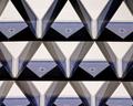
| 06/09/2005 01:14:49 AM |
House of Cardsby ChasSourekComment: I think this is a beautiful image. I love the shades of blue, shadows and symmetry. For me the only real negative is that I just don't associate with construction, although it certainly was "constructed" by someone. |
| 06/09/2005 01:13:33 AM |
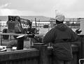
If you can't stand the heat..by NobodyComment: I like the composition and complementary colors in this image, the only thing that makes it less interesting is that there is not central focus. You can't see the guys face and there is no real attention grabber. |
| Photographer found comment helpful. |
Home -
Challenges -
Community -
League -
Photos -
Cameras -
Lenses -
Learn -
Help -
Terms of Use -
Privacy -
Top ^
DPChallenge, and website content and design, Copyright © 2001-2025 Challenging Technologies, LLC.
All digital photo copyrights belong to the photographers and may not be used without permission.
Current Server Time: 08/19/2025 08:04:03 PM EDT.