| Image |
Comment |
| 09/14/2005 02:29:59 AM |
A path into darkness...by trishialwComment: With the picture so small, it is hard to make out the details. This looks like an interesting photo with nice lighting...maybe a little oversharpened, but I can't really tell for sure. |
| 09/14/2005 02:25:39 AM |
Capital Moon Riseby nsmithComment: Nicely framed by the tree. Beautiful lighting, but just a tad too much yellow for my liking. |
| 09/14/2005 02:06:56 AM |
|
| 09/14/2005 02:02:33 AM |
|
 Photographer found comment helpful. Photographer found comment helpful. |
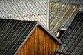
| 09/14/2005 02:01:00 AM |
Slate-roofby photomartynComment: Nice lines. You have a good eye. I'd like to see more detail, though...especially at the top of the picture. Perhaps adjusting the lighting and contrast a little in photoshop would bring out the subtle details more. |
| Photographer found comment helpful. |
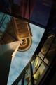
| 09/14/2005 01:56:08 AM |
What's upby cabaComment: I really like this perspective. Origional. I assume that this is the Space Needle in Seattle. I think I would have like to see the sky a little bluer and perhaps less yellow. You have a good eye. |
| Photographer found comment helpful. |
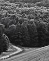
| 09/14/2005 01:51:02 AM |
valley roadby dragonladyComment: Could use more contrast. Would have liked to see this in color, I think. |
| Photographer found comment helpful. |
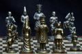
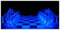
| 09/14/2005 01:49:20 AM |
Waiting for Ordersby A ShrubberyComment: Nice lighting. The white border is very distracting. Looks like you may have a hot pixel (2nd pawn on the left). I'm getting a little bored of photos with chess pieces, but this one is nice...just don't put white borders around dark pictures again. :-) |
| Photographer found comment helpful. |
| 09/14/2005 01:45:04 AM |
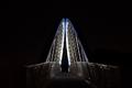
Bridgeby pfoyeComment: Nice lines. Interesting perspective. |
| Photographer found comment helpful. |
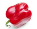
| 09/14/2005 01:43:46 AM |
Bottom's Up, Down, & Sidewaysby glad2badadComment: First when this photo popped up on the screen, I was thinking that the colors were not bold enough. However, after I've looked at it for awhile, I really like softer color. Goes well with the stark white background. Has the shape of a baby's bottom. I like the light reflections...not too harsh. Very good work. I see a winner here. 10 |
| Photographer found comment helpful. |
Home -
Challenges -
Community -
League -
Photos -
Cameras -
Lenses -
Learn -
Help -
Terms of Use -
Privacy -
Top ^
DPChallenge, and website content and design, Copyright © 2001-2025 Challenging Technologies, LLC.
All digital photo copyrights belong to the photographers and may not be used without permission.
Current Server Time: 08/04/2025 05:25:58 AM EDT.