| Image |
Comment |
| 05/04/2005 01:08:05 AM |
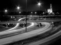
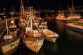
Night Trafficby jduffettComment: The second night traffic scene so far, and I'm only half a dozen pictures in. The lighting on this is good, though due to the sheer number of lights, the flaring effect on all of them adds up to quite a distraction. The lit building in the background is a nice touch, but overall the scene strikes me as very ordinary. I may just be very jaded to this sort of effect. |
 Photographer found comment helpful. Photographer found comment helpful. |
| 05/04/2005 01:06:18 AM |
Reading at nightby j3zzComment: The massive saturation of red into all elements of this shot hurts it significantly, and it doesn't help that the odd color and sudden drop in intensity draw the eyes somewhat to the trees, which seem out of focus. This is probably from focusing on the lights, and then using too low an aperture. If this was tripod-based and there was no wind, you might have tried shooting at f/11 or even f/22 to see if you could get the entire scene. I think you were going for drama with all the red, but it doesn't really work for me. |
| Photographer found comment helpful. |
| 05/04/2005 01:02:41 AM |
Night Fallsby beamsclanComment: Pretty, but although I have no doubt that you took this at night, it doesn't really evoke any sense of nighttime, I think partly because the conversion to black and white conceals it. Leaving this shot in color might have helped.
I like how the falls are slightly off-center. |
| Photographer found comment helpful. |
| 05/04/2005 01:00:42 AM |
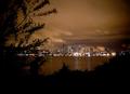
Lake Cityby fluxnComment: Pretty. The leaves make a very nice contrast against the sky. My only complaint is that the lights glare a bit, but there is probably no way to have gotten around that with basic editing. |
| Photographer found comment helpful. |
| 05/04/2005 12:59:29 AM |
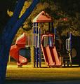
Waiting for the Childrenby msdoubletroubleComment: Interesting colors, but the scene seems slightly out of focus, the highlights on the left of the structure are blown and glare distractingly, and that lone red light also seems randomy misplaced. Having the tree cut off the shot like that also doesn't help. If you'd shot from a few feet to the right, exposed half a stop less, and then sharpened, that would have helped immensely. |
| Photographer found comment helpful. |
| 05/04/2005 12:57:22 AM |
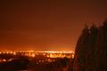
Waiting for our owners...by hvellurComment: The scene seems weighted a bit heavily to the left, and the yellow glow doesn't really seem to fit the scene, though I suspect it may have really looked that way. |
| Photographer found comment helpful. |
| 04/29/2005 01:44:46 AM |
Hiddenby Mr_PantsComment: Hidden is not so good in a minimalism challenge, where the eye should be naturally drawn to the subject. That's kind of the point of minimalism. |
| Photographer found comment helpful. |
| 04/29/2005 01:43:47 AM |
sunset sailby echo68phComment: Bizarre, surreal colors, noisy background, and slightly out of focus image. Try using Noise Ninja or some equivalent to clear up the background, and hue adjustment if the shot actually came out this way normally. |
| Photographer found comment helpful. |
| 04/29/2005 01:41:41 AM |
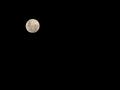
Moon Riseby AlanBesComment: The pure black background is dull. Having at least a slight hint of cloud light or some dim stars would have helped break it up without being too distracting. On the other hand, that's a really nice shot of the moon. |
| 04/29/2005 01:40:20 AM |
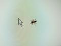
Walk this wayby NRRonComment: A very nice concept, and amusing. The color glare on the screen provides an interesting background without being distracting or too harsh, and the spider is in good focus, with interesting colors and translucency. |
Home -
Challenges -
Community -
League -
Photos -
Cameras -
Lenses -
Learn -
Help -
Terms of Use -
Privacy -
Top ^
DPChallenge, and website content and design, Copyright © 2001-2025 Challenging Technologies, LLC.
All digital photo copyrights belong to the photographers and may not be used without permission.
Current Server Time: 08/19/2025 01:56:06 PM EDT.