| Image |
Comment |
| 06/27/2006 11:50:18 AM |
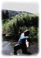
Why Do You Forsaken Me?by littlegettComment: Return Comment:
I really like the emotiveness of this. strong pose and composition.I like that you added the mountains and the sky. It gives a true "sense" of who it is hes yelling at. I think the added "speckles" hurt this image quite a bit. I would love to see the orginal. also for the dark shadow on the side of his face i would suggest using a flash set to "fill" to help lighten that spot up a bit.also If you up the #'s on your apeture it will help bring the blue of the sky into the photo. that would also help the highlights on your models arm to not be so overexposed. hope this helps.
~~~Cher~~ |
 Photographer found comment helpful. Photographer found comment helpful. |
| 06/27/2006 11:34:37 AM |
Light Nights 3by magnusComment: Return Comment:
I like this one best so far of the "theatre" ones. This one gives a sense of whats going one but still leaves you wondering. colors,focus and dof are all spot on! very well done!
~~Cher~~ :o) |
| Photographer found comment helpful. |
| 06/27/2006 11:29:37 AM |
Taniaby magnusComment: Return Comment:
Beautiful model, great focus. My only suggestion for this is to have her turn a bit more twords the light to get a bit more even look(maybe move the light a touch farther away) As is the lighting makes her nose look alot bigger than it really is(shadows).you did a great job on skin tones and the colors of her top is perfect!
~~Cher~~ :o) |
| Photographer found comment helpful. |
| 06/27/2006 10:33:31 AM |
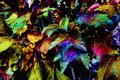
Autumn Satin Goldby elee3009Comment: Return Comment:
I like this one better too because it still has some natural color tones to it. and the gold really sets off the blue tones really well. great job on this!
~~Cher~~ :o) |
| Photographer found comment helpful. |
| 06/26/2006 06:07:04 PM |
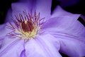
Purple Passionby brizmamaComment: Return comment:
I love the softness of this color and you captured the detail wonderfully! I have tried to photograph this flower myself and you did way better than me. only suggestion is to burn(or color) the purple at the top from another flower and it would be perfect. |
| Photographer found comment helpful. |
| 06/21/2006 11:32:22 AM |
A sweeping graceby arpitaComment: such a greaceful image...love the lines and colors!!!! thanks for the fav...hope to one day go here myself. |
| Photographer found comment helpful. |
| 06/21/2006 07:40:41 AM |
Poor Man's Yachtby maestroComment: hee hee...i like this! great warm tones and the peaceful look of it. wonderful capture!
~~Cher~~ :o) |
| Photographer found comment helpful. |
| 06/09/2006 02:59:20 PM |
Studyby RMyers1314Comment: Greeting from the critique club :o)
you did a good job on this and I see you have a new personal best, Congrats.
First thing Im going to address is your lighting. I noticed that some of the comments you already recieved talk about the lighting being too "even" and I have to agree here. for the desk lamp as lighting there had to be someother light source comming in to light the right side of the photo the way that it is IMHO. for this challenge people want to see proof that there was only one light and I think thats where you might have lost a few votes. maybe try setting the light at the corner and just above your stack of books so it shines a bit more on your face and will create a bit of shadows but not so harsh that you would lose votes there. To combat the "hotspot" lighting on your right shirt sleeve try putting a white plastic grocery bag between you and the light. It will work as a filter in a pinch. I also have to agree that the books are way too organized looking compaired to the Mt.Dew cans sitting about.next time try making them a little more uneven looking to go along with the rest of the photo or leave out the cans all together. Next is the editing: you have a good focus to begin with and a sharpen/USM would greatly increase what you already had. DPC prefers a crisp sharp focus. I also think this wouldve scored alot better with a levels adjustment applied. your black levels are a bit on the grey side. also if you use photoshop, selective color can be very useful in removing a yellow color from white(on book titles) and for fine tuning colors as needed.
I think you did an excellent job with the focus and composition. If you have any questions please dont hesitate to PM me and ask. hope this helps you. have a great day and good luck on future challenges
~~Cher~~ :o) |
| Photographer found comment helpful. |
| 06/08/2006 09:49:21 AM |
Milkweedby goldenhawkofkyComment: nice shot! so far i havent seen any here in harlan county kentucky but now that i know its blooming I'll keep an eye out. I think i would probably crop out that BG milkweed but i do tend to be a bit of a cropaholic ;) |
| Photographer found comment helpful. |
| 06/07/2006 07:01:23 AM |
color blindby charliebakerComment: This one definately caught my attention! even got a giggle outta me..creative. good composition,great strong color, focus is spot on...heeee~heeee...good luck!!!
~~Cher~~ :o) |
| Photographer found comment helpful. |
Home -
Challenges -
Community -
League -
Photos -
Cameras -
Lenses -
Learn -
Help -
Terms of Use -
Privacy -
Top ^
DPChallenge, and website content and design, Copyright © 2001-2025 Challenging Technologies, LLC.
All digital photo copyrights belong to the photographers and may not be used without permission.
Current Server Time: 08/04/2025 01:44:37 PM EDT.