| Image |
Comment |
| 07/18/2007 01:21:02 PM |
Soaring on Wings of Silver by scalvertComment: Congrats on making it to the finals of DPL. You produced some great pictures this week. I think this was my favorite of them. It looks like it's embossed. |
 Photographer found comment helpful. Photographer found comment helpful. |
| 07/18/2007 08:56:51 AM |
|
| 07/18/2007 08:55:01 AM |
nymphby lowonenergyComment: I like the light around her hair. I would just like to have seen some more light reflected onto her face. |
| Photographer found comment helpful. |
| 07/18/2007 08:53:58 AM |
untitledby romysreeComment: Too much detail is lost in the darks. I can't see where here hair ends and the background begins. Also could be a tad sharper. The arm is a bit too prominent in the foreground like that. Nice eye contact. Her shirt is also a bit distracting. Just my opinion on seeing the picture for the first time. Hope you find it helpful and not just critical. |
| Photographer found comment helpful. |
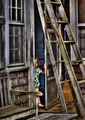
| 07/18/2007 08:50:58 AM |
83 Years Young.by ThaiComment: I like the closeness of the crop and his eye contact. It makes the picture feel very intimate. The only nitpick is the pipe? next to his ear on the left of the picture. I wish you could have cloned that out. The window on the other side doesn't bother me at all, in fact I think it adds to the picture. Overall, I like this quite a bit. 8. |
| Photographer found comment helpful. |
| 07/16/2007 09:10:28 PM |
broken wing.jpgby Deb_SComment: This is beautiful. I love the dichotomy (yes I've learnt a new word, and by golly I am going to use it) between the dark background and the angel. |
| 07/16/2007 08:50:23 AM |
Youth & Decayby Bear_MusicComment: I love this picture. Maybe if you hadn't made the decay look so beautiful, it would have been more of a dichotomy. :) Congrats on top ten and an excellent picture. |
| Photographer found comment helpful. |
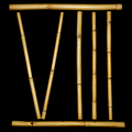
| 07/11/2007 03:45:55 PM |
Bamboozledby jemisonComment: I'm confused. Why does it say 8? Aaahh now I get it. OK very clever, but too clever for me :) |
| Photographer found comment helpful. |
| 07/11/2007 10:57:45 AM |
Soaring on Wings of Silverby scalvertComment: What a good idea. I love the white on white. The creases in the sheet look like something out of an old painting. Overall I think this is fantastic, actually. |
| Photographer found comment helpful. |
| 07/11/2007 10:54:09 AM |
big cityby boysetsfireComment: This is great. Breaks a lot of rules, but I like it a lot. I bet you wish you could have got rid of the white spots on the woollen hat. They are a bit distracting, but what can you do in Basic. Everything else is just perfect. |
| Photographer found comment helpful. |
Home -
Challenges -
Community -
League -
Photos -
Cameras -
Lenses -
Learn -
Help -
Terms of Use -
Privacy -
Top ^
DPChallenge, and website content and design, Copyright © 2001-2025 Challenging Technologies, LLC.
All digital photo copyrights belong to the photographers and may not be used without permission.
Current Server Time: 08/24/2025 01:51:44 PM EDT.