|
|
|
Showing 101 - 110 of ~288 |
| Image |
Comment |
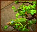
| 09/18/2005 09:46:04 PM | Branch and shadowby HVGB_photosComment: **Greetings from the Critique Club!**
I like the crop, and how you chose to include the shadow of the branch as an integral part of your photo. This adds a great deal of interest to it, without taking anything else away.
What I would work on: Your center of focus seems to be the intersection of the branches that are in the middle of the photo. Because it is so near the center, this is what draws my eye. The next thing I want to look at is the grape, because it is out of character with the rest of the photo. However, the grape is not in focus and this really takes away from the overall effect. A wider DOF would work to include the grape and other leaves into the entire photo.
Overall, it was a great idea, and as I said, I like the fact that you chose to include the shadows, rather than trying to darken them or avoid them. I just wish more of the branch, leaves, and the grape were also as in focus as that center branch.
Hope this helps!
Tara |  Photographer found comment helpful. Photographer found comment helpful. |
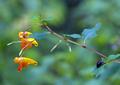
| 09/18/2005 09:30:35 PM | Hanging on a Limbby stekComment: **Greetings from the Critique Club!**
Wow ... now that's green! :) This is a great idea, and I'm not adverse to reptile photos. This one has those really cool eyes that look in all directions. I think what happened here is your selective color and the hue/saturation. Sometimes when you bump the sat level too high, you get artifacts that are hard to get rid of. Also, this green (on the lizard and the leaves) looks really unnatural, and takes away from an otherwise nice photo. The leaves in the foreground that are OOF are a little distracting. My eyes want to wander over to them instead of looking at that awesome specimen of a reptile.
Overall, I think you had a great idea. Composition is good, as well as focus and interest. I just think you over-did the green a little in your attempt to make it stand out more. Hope this helps! :)
Tara |
| 09/18/2005 09:18:10 PM | Branching Outby bucketComment: **Greetings from the Critique Club!**
Now this has everything ... including the Cuteness factor! The colors and contrast are great, and I love the composition. As you noted in your own notes, you know that her face is not well lit. It's awesome that you love it anyway, and so would I. It is a clear, sharp photo, that meets the challenge and beyond.
Overall, this photo is pleasing in every way. The only thing I would correct (the shadows), you already know about. Keep up the good work!
Tara | | Photographer found comment helpful. |
| 09/18/2005 06:21:58 PM | Gorgon's head on my ceilingby MontagueComment: **Greetings from the Critique Club!**
The second thing I do when I take a photo for a challenge (the first is think up something that will fit the challenge) is think of something that will be interesting. You really have something with this interesting chandelier, and it fits the challenge. On the other hand, the composition could use some work. I can imagine how difficult it is to photograph something on your ceiling, but I think a different angle along with less of a centered composition could have helped this out a lot. The shadows (presumably caused by a flash), are so dark that they take away from the interesting curves of the fixture. After all, those curves are what make the object, and they should be enhanced.
Overall, the subject is great, and fits the challenge, focus is good, and it's a clear, clean photo. I would just work with your composition and lighting a little more. Good luck!
Tara |
| 09/18/2005 05:55:25 PM | Branch of Jewelby mcrochipComment: **Greetings from the Critique Club!**
Very nice! The DOF is great, the colors are nice, as well as the contrast. Great composition. The only thing I would have to say is going against it is the beetle. Having it there confused me, because your title tells me the subject is the Jewelweed, but the beetle draws my eyes away from the yellow blooms. Along with this, the focus seems more on the beetle than the branch.
Overall, this is a very pleasing photo, technically and compositionally. Keep up the good work!
Tara | | Photographer found comment helpful. |
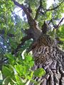
| 09/18/2005 03:17:57 PM | When the Tree is Deadby jseyerleComment: **Greetings from the Critique Club!**
I really love the colors, the textures, and the contrasts in this photo. The blue of the waters is awesome, and really works as a background for your capture. Technically, the image is sharp and clean, and very pleasing to the eye.
A few things to work with: The roof in the bottom right corner is a distraction, making my eye wander to it over and over. I also want to look at the blue of the water, rather than the man with the thatch in his hand. As for meeting the challenge, I like to give credit for "eye candy", and I don't generally vote down if it's a stretch on the challenge. However, I can see how people would vote you down, due to the challenge being "Branch" not "Wood", and the two are not the same.
Overall, this photo is definitely an attention getter. Keep up the good work!
Tara | | Photographer found comment helpful. |
| 09/18/2005 02:59:15 PM | New Lifeby wardComment: **Greetings from the Critique Club!**
Technically, this is a good photo. You have good DOF, it's sharp, clear, and focused. There is just a few recommendations I would make:
The photo seems to have a green tone to it, but I think it's just the moss that is covering the tree. The sprout, which I assume is your focal point, is in shadow, leaving the tree using up most of the light. A different angle would have worked better, maybe less tree, and less of a distracting background (such as the building). I also think a black and white would have worked well, to help tone down the colors and bring more of a contrast to the foreground from the background.
Overall, a nice, clear, crisp photo, and a great idea. Keep up the good work!
Tara |
| 09/18/2005 02:43:15 PM | Branching to the heavens...by CalamitysMaster00Comment: **Greetings from the Critique Club!**
Wow! I almost did one just like this! :) I love the angles and the textures. You really captured the age and the feel of this tree. The angle of the shot is great, as I'm sure you were trying to get as much of the tree as possible in the photo.
Some things I would work with: The lighting seems a little flat, probably from the over-exposed areas at the top. Also, the leaves in the left bottom corner really take away alot from the overall photo. It would be a much more powerful photo without that distraction.
Overall, I really like it, and I think you did a good job. Keep up the good work!
If you have any questions or comments, please do not hesitate to PM me.
Tara |
| 09/18/2005 02:25:08 PM | Young Branchby TwylaComment: **Greetings from the Critique Club!**
The DOF for this photo is excellent. This really represents the challenge, and you did a good job.
A few things I would work with: The colors of the needles blend in too much with the background. The large cone seems to be slightly out of focus. A bump in contrast would be good, to really separate the foreground from the background.
In your description, you say that you used USM and resized. As I have learned, it is best to resize first and then sharpen, that way you have less artifacts in your completed photo. Also, you should do all editing first, and then resize, and sharpen (if necessary).
If you have any questions or comments, feel free to PM me. :)
Tara | | Photographer found comment helpful. |
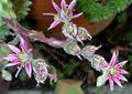
| 09/18/2005 12:57:55 PM | Bursting Outby dphillipsComment: **Greetings from the Critique Club!**
I love the colors and the contrast between the greens and purples. I also like the texture and feel of the "fuzzies" along the stems. However, I get the feeling that it is slightly out of focus, whether it is from the harsh lighting, or the fuzzies giving a blurry feel to it. The DOF is good, the background blurred enough for the blooms to stand out. Seeing as how your title is "Bursting Out", I would have liked to see more "bursting" closer up, the detail in the ready-to-bloom flowers is lost in the fuzzies.
Overall, the photo does have an ethereal feel to it with the colors and contrasts, but I'm afraid the lighting, the lack of focus, and the fuzzies take too much away from it. However, I would like to see these flowers again with more detail.
Tara |
|
Showing 101 - 110 of ~288 |
Home -
Challenges -
Community -
League -
Photos -
Cameras -
Lenses -
Learn -
Help -
Terms of Use -
Privacy -
Top ^
DPChallenge, and website content and design, Copyright © 2001-2025 Challenging Technologies, LLC.
All digital photo copyrights belong to the photographers and may not be used without permission.
Current Server Time: 08/03/2025 08:02:43 PM EDT.
|