|
|
|
Showing 801 - 810 of ~1231 |
| Image |
Comment |
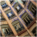
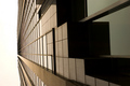
| 06/06/2006 05:04:52 PM | La Pedreraby AndrewTOComment: Hey there from the Critique Club
Camera Work/Technical: I like the tilt you chose here, and your focus is spot on. The white balance you chose yielded some very nice coloring and tones.
Lighting: The lighting looks a bit flat and uneven. A slight curves adjustment would have helped a great deal. There seems to be more light at the top of the frame than at the bottom. This is probably based more on the colors in the building than actual lighting.
Composition/Content: Your composition is this image's greatest strength. The angle paired with the repeating patterns provide the eye with lots to look at, thus keeping it flowing throughout the image.
My Opinion: This is a fine image that met the challenge very well. With slightly altered lighting or a crop that lost the bottom of the frame, I think you'd have jumped into the 6 range.
Eric
|  Photographer found comment helpful. Photographer found comment helpful. |
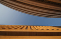
| 06/06/2006 05:00:17 PM | Light & Shadow...by photoleonComment: Hey there from the Critique Club
Camera Work/Technical: Great focus and excellent depth of field use. Everything is nicely viewable with very little noise.
Lighting: Very nice. The shadows and highlights on similar colored objects play well together to provide wonderful contrast.
Composition/Content: Wonderful and dramatic composition. The shadow and highlight paired with the clue sky works very well to move the eye through the frame. My only change would be aligning the bottom portion of the image with the frame. This slight tilt looks more accidental than intentional.
My Opinion: I believe that you met the challenge very well, and you did it with a very strong image. I think that the voters were looking for more angles and a dramatic background. Still, I like this one better than many that finished ahead of it.
Eric
| | Photographer found comment helpful. |
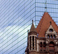
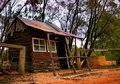
| 06/06/2006 04:54:51 PM | House of godby TheMegalomaniacComment: Hey there from the Critique Club
Camera Work/Technical: It is very difficult to determine if this image is focused or not. There is a great deal of noise in the capture, but the focus looks off to me.
Lighting: Very nice, very even lighting. Nothing is overexposed, and the shadows work nicely to provide contrast to the image.
Composition/Content: I like what you were after here. Old and new together and the tug or urban renewal v. history. I'd really like to see the rest of the church, so backing out from the tight crop would have looked a little better.
My Opinion: A nicely seen image, but the technical side needs some work. The good news is that technical aspects are the easiest to remedy. I think that this one scored pretty close to its potential.
Eric
| | Photographer found comment helpful. |
| 06/06/2006 04:50:48 PM | Old Glory...by ACheltonComment: Hey there from the Critique Club
Camera Work/Technical: Very sharp focus and nice settings to keep everything in the frame in crisp focus. Your burn tool was set too strong during post-processing. You started with a nicely exposed sky, but I can see your tool marks that were left with the burn.
Lighting: Very nice. The only issue is that the bottom is just a hair too dark.
Composition/Content: I think that the centered composition works very well for this particular image.
My Opinion: I think that you met the challenge, but the main subject is more the flag that the architecture around it. You still produced a fine image, but ease up with that burn tool.
Eric
| | Photographer found comment helpful. |
| 06/06/2006 04:35:02 PM | Vanishing Pointby fotodudeComment: Hey there from the Critique Club
Camera Work/Technical: Crisp focus and very nice depth of field. The crop is nice, and the angle you chose for presentation makes the image nicely dramatic.
Lighting: The sky is too much here. Perhaps a graduated natural density filter would have you maintain some of the sky's detail. As it is, you're left with a blown out white area that is fairly distracting.
Composition/Content: The composition is strong. You left just enough sky to really draw the eye up and into the frame.
My Opinion: I think that you met the challenge very well. With a more detailed and less exposed sky, this one would have pulled a better mark from most voters.
Eric
| | Photographer found comment helpful. |
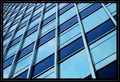
| 06/06/2006 03:27:03 PM | Architextureby fatLouieComment: Hey there from the Critique Club
Camera Work/Technical: Great focus and very nice depth of field, keeping all patterns in the image well focused.
Lighting: Very nice and very even. There are no harsh shadows or blow highlights. I think I would have liked it better exposed for just a little longer to brighten it up a bit, or some slight RAW adjustments made at post-processing.
Composition/Content: The composition is the main strength of this image. You did a terrific job with angles and perspective to create an image that draws the eye very well into the vanishing point.
My Opinion: I like it and I think that it should have scored better. I think it met the challenge, but perhaps would have scored better in a pattern or rhythm challenge.
Eric
|
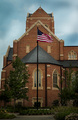
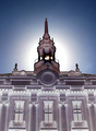
| 06/06/2006 03:21:56 PM | Buckingham Palace it is!by JudiComment: Hey there from the Critique Club
Camera Work/Technical: Nice focus, but I think that I'd like to see the background blur a bit. The reds look a little over-saturated, but easily remedied with a bit of post-processing.
Lighting: You picked a perfect time of day. The lighting is nice and even, with no harsh shadows. I think that the sky would have benefited from a graduated natural density filter, as it lost a little detail.
Composition/Content: Great choice for the challenge and very humorous. I think it would have fared better with a slightly tighter crop.
My Opinion: I like it, and I think you went outside the envelope to meet the challenge very well. I think it scored pretty close to its potential, but with some slight changes, would have done even better.
Eric
| | Photographer found comment helpful. |
| 06/06/2006 02:43:52 PM | Ray of Hope?by GeneralEComment: Hey there from the Critique Club
Camera Work/Technical: As far as I can tel everything looks nicely focused. This reminds me of the negative image challenge, as well as the hope that I would never again have to look at negative images. Your post-processing provides a very interesting effect, only rendering part of the image as a negative. I like it, and its much easier to look at.
Lighting: Wonderful use of natural light to produce a great foreground, and a background that is very interesting despite a little of overexposure. The time of day that you chose worked very well for this image.
Composition/Content: The composition feels a little crowded. I do like the perfectly centered composition, but I think I;d rather see a bit more of the building. Perhaps this exact setup, but turning the camera to landscape rather than portrait.
My Opinion: What you produced here is not something that I normally prefer, but I strongly disagree with the score. There is no way that this is a sub-5 photo. Nicely seen and interestingly processed.
Eric
| | Photographer found comment helpful. |
| 06/06/2006 09:49:49 AM | Failure to captivate today's youthby enasniogComment: Hey there from the Critique Club
Camera Work/Technical: Everything appears nicely focused, and the colors work very well together to give a very nice feeling of failure.
Lighting: As I mentioned during the challenge, the background light of the sky is too strong. If the light were behind you, you'd have a much more powerful capture.
Composition/Content: You have a great composition started, but it still needs some work. The fence comes in and a terrific spot, but I'd like to see the building up and to the left more, getting it out of the center. As it is, the fence provides a great leading line, but just plops the eye into the middle of the frame with nowhere else to roam.
My Opinion: I think that you did a very nice job meeting the challenge. With some lighting and composition changes, this one surely would have scored higher.
Eric
|
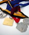
| 06/06/2006 09:44:39 AM | Athlete\'s Acheivementsby meganoComment: Hey there from the Critique Club
Camera Work/Technical: As you mentioned and everyone that commented noticed, the medals are not focused. Keep in mind that the Photographer's Comments are not visible during voting. Without those, it just looks like the focus problem was an accident rather than a design.
Lighting: The lighting is nice and even, but has a flat feel to it. I think that this one could have used a slight curves adjustment to give it some needed contrast.
Composition/Content: I like the composition that you created here. The ribbons and medals work very well together to draw the viewer's eye in and around the frame. Starting with the medals, everything flows very well deep into the image.
My Opinion: Most of the time voters here like vivid colors, crisp focus, or images from a third world country. As it is, I think that this one scored pretty close to is potential. With better focus and a bit more contrast, your score would have greatly improved. You did a nice job with composition, as well as meeting the challenge.
Eric
| | Photographer found comment helpful. |
|
Showing 801 - 810 of ~1231 |
Home -
Challenges -
Community -
League -
Photos -
Cameras -
Lenses -
Learn -
Help -
Terms of Use -
Privacy -
Top ^
DPChallenge, and website content and design, Copyright © 2001-2025 Challenging Technologies, LLC.
All digital photo copyrights belong to the photographers and may not be used without permission.
Current Server Time: 08/09/2025 11:44:17 AM EDT.
|