|
|
| Image |
Comment |
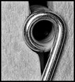
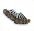
| 09/17/2009 04:57:21 AM | Nine on the Line- Clothespin by Jaded_HousewifeComment: Awesome macro and a nice fit into the challenge topic. I like the tonal range you captured here. Yo have tons of grays, but also some nice black and some popping whites in your subtle highlights. This has been the best duotoned image that I have ran across in the challenge thus far. I would like to see a bit different composition, though. I think a taller rectangular composition would serve it better. As it is, it is almost square, but awkwardly not square. I would have gone a little more one way or the other. Even still, nice capture. It gets a 6 as my vote. |  Photographer found comment helpful. Photographer found comment helpful. |
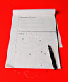
| 09/17/2009 04:53:27 AM | Lunar Lindaby VitaminBComment: It works for the challenge, but it would also work for a 5 challenge. I get the idea, but the 9 gets lost in the sea of busyness and other subjects that compete for my eye's attention. 5. | | Photographer found comment helpful. |
| 09/17/2009 04:53:22 AM | Determinedby jegerComment: It works for the challenge, but it would also work for a 5 or a 10 challenge. I get the idea, but the 9 gets lost in the sea of busyness and other subjects that compete for my eye's attention. 5. | | Photographer found comment helpful. |
| 09/17/2009 04:44:14 AM | Dozing off...by InnaNComment: Very creative. My only complaint would be your general composition. I like the subject matter and the overall layout of your elements. I would, however, either compose this one on center or obviously off center. There is a slight angle in your point of view that gives the composition an awkward look. Again, very creative, but pay a little more attention to your setup and composition. 6. | | Photographer found comment helpful. |
| 09/17/2009 04:41:07 AM | Ninefinityby BuddyBaumComment: Very dizzying. Interesting take on the subject and I like several aspects of the image. I did the leading lines you created, and I like the transition into bright white. The depth of field also does a good deal to add interest to the image. Outside of the relatively mundane subject matter, I have no ideas for improvement and score growth. From me, a 6. | | Photographer found comment helpful. |
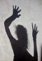
| 09/17/2009 04:38:32 AM | Nine by brittulmerComment: While not a bad idea, this image could have benefited from some better execution and post-processing. First of all, the shadow at the bottom right corner strongly competes with your subject. As my eye wanders the frame, it is captured in attempting to figure out what that shadow is. Secondly, the tonal range is fairly flat. I'd like to see the shadows deeper and darker without losing much of the detail that is there. I'd also like to see the whites with a little more pop. As it is, there is far too much gray over the entire image. Last, I'd like to see a more straight-on capture of the shadow. The angle of the shadow adds a great deal of distortion to the figure that I know to be human. Again, nice idea, and with some more time spent in shooting, I think that this one had greater potential. As it is, I score it a 5. |
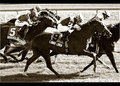
| 09/17/2009 04:29:49 AM | Ode to Trent Reznorby tfarrell23Comment: I really like your shallow depth of field, composition, subject matter, and crystal clear focus where the focus belongs. I have been fairly critical in the challenge thus far for images using nine objects without all the objects in focus, but this one works very well. I dare say it, but I will be surprised if this one doesn't ribbon. Though, DPC seems to surprise me with nonsense almost every single day. Great capture and good luck with the voters. A solid 9 from me. | | Photographer found comment helpful. |
| 09/16/2009 11:43:19 PM | Naukuhby PhotologistComment: Interesting silhouette. Great, transitioning and complimenting complementing colors in your sunset. I think that I'd like to see it even a bit more offset in the crop. 5. | | Photographer found comment helpful. |
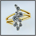
| 09/16/2009 11:43:13 PM | Girls prefer nine best friendsby mbish7373Comment: I like the idea, bu the execution seems to be a bit lacking. The shallow depth of field works well for the image, but the muted colors detract from the pop and sparkle that the image should/could have. Your border also takes away from the overall quality of the presentation. I like a clean, thick, white border with a small, 1-2 px back line separating the image from the white border. That's all a matter of personal preference, but a clean look would have served this one much better. I like the square, centered composition. It plays nicely with the symmetry of the subject. I am going to go 5 here, but there is tons of room to grow this vote. |
| 09/16/2009 10:51:55 PM | Nineby davidwComment: Great idea and a nicely seen macro, but this one is way too dark. 5. | | Photographer found comment helpful. |
Home -
Challenges -
Community -
League -
Photos -
Cameras -
Lenses -
Learn -
Help -
Terms of Use -
Privacy -
Top ^
DPChallenge, and website content and design, Copyright © 2001-2025 Challenging Technologies, LLC.
All digital photo copyrights belong to the photographers and may not be used without permission.
Current Server Time: 07/30/2025 05:55:40 PM EDT.
|