| Image |
Comment |
| 02/23/2007 05:34:15 AM |
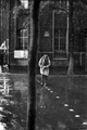
Crossingby DPC-SystemComment: Whoa! That tree takes too much focus off your subject and he/she is a bit too centered. I do like the angle of the ground paint. It serves nicely to draw the viewer right into the main subject. That is only after we get beyond that big tree in the foreground. A different angle would have done wonders for this one. Your lighting and tonal range are both pretty strong, so you had a nice scene that fit well into the challenge. |
| 02/23/2007 05:34:06 AM |
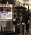
Nick was right - Kerry & Edwards were best.by quiet_observationComment: This one would have worked better in landscape orientation. With his feet nearly touching the bottom of the frame and chopping off the price list, this one feels too tense. I also tend to steer clear of art geared toward political statements. Even still, you had a great start here. With a simple flip of the camera, I think that this one would have been a great deal stronger. |
 Photographer found comment helpful. Photographer found comment helpful. |
| 02/23/2007 05:34:02 AM |
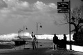
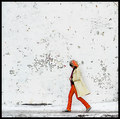
Waiting: not homeless but defiantly hopelessby Elvis_LComment: I like the coloring here, but I'm not very fond of the composition. If your point of view were higher, the perspective of the arch could have been better. Or some perspective correction would have also made this one better. Even still, I think it would have been more interesting with a tighter crop. |
| Photographer found comment helpful. |
| 02/23/2007 05:33:58 AM |
Girl on Bikeby holdingtimeComment: Great colors and very interesting shadows, but I think that filling the frame with the house makes this one feel too crowded. Also, with the girl centered, I don't fell that there is really anything to grab my eye and lead it around the frame. |
| Photographer found comment helpful. |
| 02/23/2007 05:33:54 AM |
Anger for the stormby Rino63Comment: Nice capture, but I think that you lost a good deal of interesting detail in the sky with you conversion to black and white. I really like the scene here, but the shadow over the eyes of the subject is very distracting. I like the feel of anger from both he and mother nature, but that shadow really hurt. |
| Photographer found comment helpful. |
| 02/23/2007 05:33:49 AM |
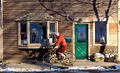
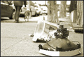
2007-2-12 10:46:27 AM - Thompson St, New Yorkby pineappleComment: Interesting subject and great depth if field use. I do feel a tilt to the image that seems more accidental rather than compositional. I'd also like to see the monitor off the image border. Overall, I like it. I agree with your assessment mentioned in the comment you returned. I do think that this one would make a nice wall-hanger. |
| Photographer found comment helpful. |
| 02/23/2007 05:32:46 AM |
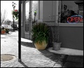
Street Cornerby FocusPointComment: You created a very interesting range of tones here. It almost looks like selective desaturation with the grey of the building and the neutral coloring of the vehicles parked along the street. I do feel that the large, colored flower pot is placed too much in the center of the image. With its coloring and the lack of colors elsewhere, the eye is drawn and held there, not giving the voter ample opportunity to explore the image. I think that you met the spirit of the challenge well, but the image could use a bit more interest. |
| Photographer found comment helpful. |
| 02/23/2007 05:32:30 AM |
Orange Sliceby HipychikComment: I really like you minimalistic-type of composition with this capture. The textured wall makes for an interesting background that gives my eye plenty to roam around the frame inspecting. I think that I'd like it better as a black and white. |
| Photographer found comment helpful. |
| 02/23/2007 05:32:24 AM |
Like Childrenby PeterPicComment: You captured a great expression and a terrific feel of joy with this image. It looks like the focus may be just a bit soft, and the background is a bit too busy. Your depth of field was nicely used, but the distractions are still a bit too much back there. Still, the expression makes the image. |
| Photographer found comment helpful. |
| 02/23/2007 05:32:20 AM |
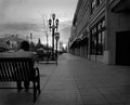
Waitingby sagestudioComment: When I open this one up, my eye is immediately drawn to the bright sky deep into the image. The problem is that there are no other elements that compete with that brightness to pull my eye away. I like your toning, but the image is a bit too dark overall to keep the voter's eye interested in the capture. |
| Photographer found comment helpful. |
Home -
Challenges -
Community -
League -
Photos -
Cameras -
Lenses -
Learn -
Help -
Terms of Use -
Privacy -
Top ^
DPChallenge, and website content and design, Copyright © 2001-2025 Challenging Technologies, LLC.
All digital photo copyrights belong to the photographers and may not be used without permission.
Current Server Time: 08/11/2025 10:55:51 PM EDT.