|
|
|
Showing 571 - 580 of ~1242 |
| Image |
Comment |
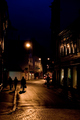
| 02/25/2007 04:27:01 PM | To The Lightby h0bbelComment: Nice idea that meets the challenge well, but I think its a little too dark. I know that it is street photography at night, but the highlights are awkwardly placed, and do very little to provide interest to the image. I'd like to see this one exposed a little longer to bring out some of the detail in the buildings, the color of that sky and the crispness of those cobblestones. Nice idea, and with better execution, this one would have been a great deal stronger. |  Photographer found comment helpful. Photographer found comment helpful. |
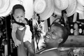
| 02/25/2007 04:24:06 PM | Our Future Hopeby PhantomEWOComment: Interesting capture, but, just looking at the image, I don't get the feeling that this one meets the spirit of the challenge. I am guessing that this is a street vendor of some sort, but it isn't blatantly obvious at first glance. It looks like this one is inside somewhere, perhaps a home in a third world country somewhere. I like your toning, as your darks and lights are all nicely processed. |
| 02/25/2007 04:20:58 PM | Boycottby EstimatedEyesComment: I took a people photography class some years ago, and the first lesson was geared toward awkward places to chop the human body. Cutting the body off at major joints almost always looks accidental rather than one's compositional intent. Every person in your composition is chopped in some awkward manner. I still think you could have pulled this one off simply by eliminating the two individuals in the foreground. The squinting lady and the quarter-person on the left of the frame are both very distracting. I do like your crisp focus and the terrific color you captured. With some work on your composition, this one would have surely been much stronger. | | Photographer found comment helpful. |
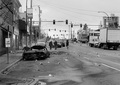
| 02/25/2007 04:14:28 PM | Violence in the streetsby kawanaComment: With the sky as bland as it was on this day, I think I'd like to see this one from a different point of view. Perhaps shifting your position over to the right, using a shallow depth of field with the buildings as your background would have made this one a bit less busy. I'm also interested to know the story behind this one, so it definitely grabs my interest. | | Photographer found comment helpful. |
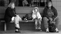
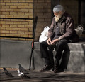
| 02/23/2007 06:00:14 AM | Waitingby nathankComment: Wow, what an odd trio. No one there looks like they are remotely related to the others. Nice eye and nice capture. I think that the crop is just a bit too tight on the right hand lady's head. I'd like to see it loosened up just a little. Also, I'd like to see your subjects more isolated from the background with a more shallow depth of field. The headless individual behind the window is a bit distracting and competes a little for attention. Pretty good toning, but your highlights look just a little too hot. |
| 02/23/2007 05:57:24 AM | Street Performerby RACostaComment: I love the performer and his instrument (didgeridoo?), but the composition needs work. First off, while I am no stickler for the 'rules' of photography, the performer is too centered inside the frame. That causes the eye to see him and stop, almost as if it were boxed in. Next, the lady on the phone, though nicely isolated with your depth of field, is very distracting. Her white shirt competes far too strongly for attention with your subject. Lastly, I'd like to see the end of the instrument. Chopping it off right there leaves more of an accidental feel rather than an intentionally composed image. I do like the strength in your toning. You did a fine job not blowing the highlights, outside of the near-impossible white shirt, as well as maintaining nice detail in most of your shadows. Great scene and fine work meeting the spirit of the challenge, but pay more attention to your composition. Even a poorly exposed frame can be great with strong composition. | | Photographer found comment helpful. |
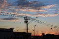
| 02/23/2007 05:52:40 AM | street birds at sunsetby 99PercentComment: Great color and I like the way the utility lines lead my eye into the image. I can see where you were headed with this one, but I don't really get the feeling that this one met the spirit if the challenge. While I can clearly see that this is just off the street, and that I'd obviously see this scene while on the street, I think I'd like to see more of what is happening ON the street rather than just above it. I also think that your crop is just a bit awkward. Chopping off the buildings above the ground make this one seem more of an accidental snapshot rather than an intentionally composed image. If you'd shifted the angle of the camera down a bit and included the bases of the buildings, I think that this one would have been a good deal stronger, even if the buildings and street remained in complete silhouette. | | Photographer found comment helpful. |
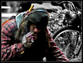
| 02/23/2007 05:48:45 AM | Smokin' Joeby BlackboxComment: Your post-processing makes this one difficult to look at. Everything ended up too soft, thus making it all look out of focus. I think I'd rather see all the color in the frame, though your use of selective color is nicely done. It looks natural outside the obvious lack of color in the background. I do feel that you met the spirit of the challenge, but this one just doesn't fit my taste in images. I'd like to see a bit sharper focus. | | Photographer found comment helpful. |
| 02/23/2007 05:46:10 AM | Jack Marvin's Lifeby SandyPComment: Nice composition, though I'd like to see a little more space to the left of the frame. With the bird facing that way, the crop is just a little too tight. If the birds were looking toward the right, this one would have worked out just fine. I like your use of vertical and horizontal lines in the frame to lead the viewer's eye in and around. It looks like you used a little too much dodging on his shadows, as I can see some pixelation and odd highlights. Nice work meeting the challenge, and the title plays well with this one. I like that you gave him a name, thus sharing a little more of his life with us. This adds a great deal of interest and emotion to the image. Strong work, just work on the post-processing a little more. | | Photographer found comment helpful. |
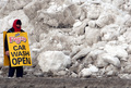
| 02/23/2007 05:42:13 AM | Open For Businessby GolferDDSComment: I like this one. I think that the man could be a little more off the side of the frame, but it still sends a funny message. I can just hear his mind thinking "what the hell" as he stands by the pile of snow advertising for car washes. I'm not sure, though, if he'd rather be standing there or out washing cars. I like the colors that you captured, giving this one an oddly warm feeling. Nice eye and nice capture. | | Photographer found comment helpful. |
|
Showing 571 - 580 of ~1242 |
Home -
Challenges -
Community -
League -
Photos -
Cameras -
Lenses -
Learn -
Help -
Terms of Use -
Privacy -
Top ^
DPChallenge, and website content and design, Copyright © 2001-2025 Challenging Technologies, LLC.
All digital photo copyrights belong to the photographers and may not be used without permission.
Current Server Time: 08/11/2025 08:04:37 PM EDT.
|