|
|
|
Showing 561 - 570 of ~1242 |
| Image |
Comment |
| 03/04/2007 01:13:34 PM | "I love a sunburnt country"by super-daveComment: Hey there from the Critique Club
Camera Work/Technical: Superb. Your colors are vivid, hinting that your white balance was properly chosen and adjusted, and your focus is nice and crisp. Your depth of field use nicely isolates the droplets while still allowing us to feel what you have in your background.
Lighting: Your lighting is also very nice. You have achieved a very nice, evenly lit image with no blown highlights or detail loss to shadows.
Composition/Content: I agree with you that a smaller flag would have worked much better, or perhaps moving the glass farther from the flag when shooting.
My Opinion: I am sure that it is me missing something, but I don't understand the title. Also, I just don't get the feeling of love jumping out at me when the image loads. While the score is on the high side of average and the image is well-done from a technical standpoint, I think that this type of refraction image is a bit overdone. While refraction is a valuable tool in the photography tool chest, the ongoing struggle for us photographers is finding new and creative ways to photograph refraction. This one in particular is too much of an emulation of Setzler's "Liberty and Justice" from 2002. I added it to my favorites back in April of 2006.

Eric
|  Photographer found comment helpful. Photographer found comment helpful. |
| 03/03/2007 10:14:17 PM | | | Photographer found comment helpful. |
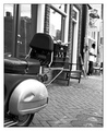
| 03/02/2007 02:11:46 AM | Carroll Street Deliveryby elemessComment: I think this one was a bit underscored. I like your point of view, and I love the composition. This is exactly what I think of in a street scene. It does look a little washed out, though. I think a curves adjustment would have fixed that right up, though. Still, very nice work. | | Photographer found comment helpful. |
| 02/28/2007 01:20:54 AM | icy lollipopby Jelena73Comment: I do notice the ice as soon as I look at your image, but I don't think that your ice is as large of an element as it needed to be. I will not say that you didn't meet the challenge, but I think you just squeezed it in there. |
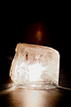
| 02/28/2007 01:13:51 AM | Inner Glowby pix-alComment: I like this type of shot a lot, as the lighting potential with these is endless. You produced some terrific color here, but the hot spot on the center of the ice is too strong. It grabs my eye and just holds it there. I did a similar shot, and I'll give you a not so secretive secret. Light it from the bottom. I punched a hole in a black cloth, put in on some glass, set the ice of the hole and put the flash under the table. The ice lit much more evenly, and without so much of a hot spot. Great start, and nice job meeting the challenge. | | Photographer found comment helpful. |
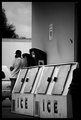
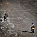
| 02/25/2007 04:56:41 PM | An Icy Discourseby Jaded_HousewifeComment: You had a great start with this one and it had amazing potential, in my opinion. I really, really like the strength in the horizontal and vertical lines that you captured. From the ice storage machines to the wall to the building in the background, all these play well in taking my eye and gently leading it through the frame. The gentleman on the phone adds nice depth to the image, as well as adds a potentially interesting story. It makes me wonder who he's talking to and why he isn't using his mobile phone. Everyone has those these days, right? So, what prevents this one from being great? In my opinion, its the darn truck filling up the empty space in the background. It causes a distracting highlight that this one just doesn't need. Still, a nice image, but I think I'd try to get out to re-shoot it without that truck there. I may also crop the right side of the frame right up to the ice storage machine, but I'd have to play with it to be sure. From me, a score of 6. Without the truck, an easy 8. | | Photographer found comment helpful. |
| 02/25/2007 04:49:35 PM | Directionby GiorgioComment: I like your general composition, but the car in the background makes the frame feel very crowded. I am not very fond of your choice in post-processing here. In my little opinion, the object of post-processing is to make the capture look more natural, more as the eye would interpret it. Here, your choice to highlight the gentleman on the right hurts the overall image. It draws my eye directly to him and the darkness in the remainder of the frame prohibits my eye from exploring. I like a photo that draws me in and leaves me looking for more. This one draws me to the one subject and then my eye notices the irregularities of the dodging you used. Great start, but I think its just over-processed. | | Photographer found comment helpful. |
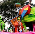
| 02/25/2007 04:43:18 PM | Catch! Mardis Gras 2007by shadowdoc31Comment: Very interesting, but shot a half second too soon. I'd like to see this one cropped in a manner to get the gentleman at the top completely out of the frame. If the ball were just a little lower in the frame, cropping him out would have been fairly easy. Your sky in this one is also overexposed. While it isn't very distracting, but the large, pen spot just behind your subject really competes for the eye's attention. Strong colors and an interesting scene. With a slightly different composition or a slightly different point of view, it could have been even better. |
| 02/25/2007 04:37:00 PM | Troubleby GatorguyComment: Nice color and terrific, crisp focus, but I can't tell what's going on in this shot. I can tell that the two are teens or just before teen, and, by the title, I assume that they are up to no good. Beyond that, it is really hard to tell what the duo is up to. Your composition is also a bit cramped, with both of your subjects crammed too close to your frame edges. Its also a bit awkward slicing off the right-hand subject's shadow the way you cropped it. Great start, and I like the square crop, but I'd like to know more about this one at first glance. | | Photographer found comment helpful. |
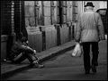
| 02/25/2007 04:30:38 PM | Because Gas is Too Expensiveby colorcarnivalComment: I like it. I'd be willing to bet that you've gotten a comment or two about this one looking washed out or a bit overexposed in the background. While it may be a hair on the hot side, I think your chosen exposure works very well to isolate your subject and make him pop right off the screen. I also like your composition, placing him almost against the right side of the frame. It gives the viewer great insight into the entire scene. Nice work meeting the challenge, and a very strong capture in my opinion. | | Photographer found comment helpful. |
|
Showing 561 - 570 of ~1242 |
Home -
Challenges -
Community -
League -
Photos -
Cameras -
Lenses -
Learn -
Help -
Terms of Use -
Privacy -
Top ^
DPChallenge, and website content and design, Copyright © 2001-2025 Challenging Technologies, LLC.
All digital photo copyrights belong to the photographers and may not be used without permission.
Current Server Time: 08/12/2025 01:53:06 AM EDT.
|