|
|
|
Showing 551 - 560 of ~1242 |
| Image |
Comment |
| 04/18/2007 11:58:11 PM | ~ B O N D I N G ~by gocComment: Hey there from the Critique Club
Camera Work/Technical: After staring at the image, then taking it into PhotoShop, I think that I agree with trevytrev in that the chain could be just a little sharper. At first glance, it looks crisp to me. Only when I stare at it do I notice that the sharpness is a little off. The depth of field that you chose to use works particularly well in this image. Your Bokeh-type capture serves very well to isolate your subject from your background. The colors further work to set the subject apart from the rest of the image.
Lighting: Your lighting is the strength of this image. From the lighting on the subject to the relative darkness of the background, your lighting is very nice.
Composition/Content: I think that the voters hit you on your composition. While you nicely used the rule of thirds, the image feels a bit uncomfortable and off-balance. In keeping your subject entirely on the left of the image, there is nothing else that grabs the eye and leads it throughout the frame. Also, chopping the chain and the web where you did gives the image an overall cramped and uncomfortable feeling. I think that your find and idea were both superb, but you execution could use a little more work.
My Opinion: I think that your find and idea were both superb, but you execution could use a little more work. 5.987 is a very respectable score, and I think that it is an appropriate score for this capture. With some compositional adjustments and a little more sharpening, this would have soared well into the 6 range.
Thank you for the opportunity to provide a critique on your entry,
Eric
|  Photographer found comment helpful. Photographer found comment helpful. |
| 04/04/2007 02:03:27 AM | | | Photographer found comment helpful. |
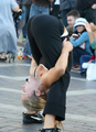
| 03/21/2007 05:03:40 PM | Circles of the Essenceby UbersteinyComment: Hey there from the Critique Club
Camera Work/Technical: You have a great portrait here with excellent focus and a great depth of field.
Lighting: Near flawless lighting with great catchlights. You did a tremendous job controlling both shadows and highlights.
Composition/Content: A very nicely composed portrait, but I don't think that your circles were enough a part of the composition to really meet the spirit of the challenge.
My Opinion: I think that with more emphasis on the circles, this would have scored well into the 6.xxx range. As it is, I think that the voters were fairly generous. Very nice portrait work.
Eric | | Photographer found comment helpful. |
| 03/21/2007 04:54:50 PM | Baseballby picturehappyComment: Hey there from the Critique Club
First of all, welcome to DPC and congrats of breaking that first entry barrier. 5.59 is a pretty respectable score around here and its a great place to start.
Camera Work/Technical: Very nice. You did a terrific job with your depth of field use to isolate your subject from your background. Your focus on the circle is spot on and your white balance setting captured excellent color and tones.
Lighting: You were also pretty strong here, but I think having the child just a hair darker would have isolated your subject even better.
Composition/Content: I think that this is where the voters struck you down a bit. I have to disagree with cb16 in that I don't believe the child needs to play any more of a role. However, I do think that the ball is positioned a bit awkwardly in this capture. I think that if you'd have covered that right eye more or let us see about half of his face, this one would have done much better.
My Opinion: Very nice work and a great way to start your DPC life. Now you'll never be the same...and I think that's good...maybe. Either way, you did a fine job meeting the spirit of the challenge and you did it with a nice image. With a slight adjustment to your overall composition, I think that this one would have scored a bit better. Again, welcome, and I look forward to seeing more of your work.
Eric
|
| 03/07/2007 05:07:00 PM | Shiverby BrielleComment: This was one of my favorites in this challenge. I like what you accomplished with low key here, and it is good to see that someone has a grasp of that technique. Beyond that, your placement of the curves inside the frame give this one a terrific composition that grabs the eye and leads it through the frame, almost as if hands were massaging. The placement of the ice near the center of the frame also gives the eye a nice focal point and leaves no doubt that the spirit of the challenge was indeed met. Congrats on your highest score to date. This one was well-deserved and I am sure that there are higher ones to come. I like your take on the human form and the way you present and offer that to the rest of us. To grow the vote, I think I might have left a little more negative space at the top of the frame. While the composition is suiting, I think a more traditionally sized image may have done a bit better. Nice work. | | Photographer found comment helpful. |
| 03/07/2007 04:50:15 PM | |
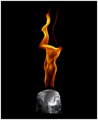
| 03/07/2007 12:10:33 AM | Heat Releaseby ericwooComment: Guess I should move closer to the Aroura Borealis, huh? Message edited by author 2007-03-07 00:11:37. |
| 03/05/2007 10:10:29 PM | To hold is to comfort. To comfort is to love.by SimmsComment: Hey there from the Critique Club
Camera Work/Technical: This is a hard photo to pull off. I do like your depth of field use here, but everything still blends together. These colors are tough to capture, especially when lit this harshly.
Lighting: Your lighting is very harsh. This created some deep shadows that lost a great deal of detail. You did a nice job not blowing the highlights, unfortunately that darkened the shadows even more.
Composition/Content: The frame also looks cluttered the way you cropped off the animal on the right, as well as the way you have the foot touching the bottom.
My Opinion: I think that this one scored very well, most likely on the cute factor. While the image is nice for what it is, shooting at a different time of day would only make it stronger.
Eric
| | Photographer found comment helpful. |
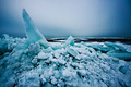
| 03/05/2007 06:37:11 AM | Invernoby tateComment: The colors that you captured are tremendous, but the sky is a bit too bright for your subject. My eye is drawn directly to the washed out portion of the sky and held there. Perhaps a graduated ND filter would have helped and made this one near-flawless. Even positioning the ice spire more over teh bright spot would have helped a bit. | | Photographer found comment helpful. |
| 03/04/2007 01:27:39 PM | Mother and Sonby dahvedComment: Hey there from the Critique Club
Camera Work/Technical: My eyes are immediately drawn to the catchlights in the child's eyes, which is initially a good thing, but the catch lights give the image an overall out-of-focus feeling, as do the other highlights on the image. This may have been a result of your post-processing. I have found, through much trial and more error, that a better result is usually yielded by running Neat Image before any sharpening is done. I'd also like to see a little more contrast to the image.
Lighting: Nicely lit, but I'd like to see the entire catch light in the child's right eye instead of it bleeding to the edge of his eyelid. I do like your use of lighting to isolate the child from the mother, thus making him the emphasized subject.
Composition/Content: I believe that your composition would be stronger if you had left his ear in the frame or either cropped a little closer to his eye.
My Opinion: Excellent job meeting the challenge. I definitely get a feeling of love as soon as the image loads. I think with more crisp focus and a little more contrast, this one would have finished even better.
Eric
| | Photographer found comment helpful. |
|
Showing 551 - 560 of ~1242 |
Home -
Challenges -
Community -
League -
Photos -
Cameras -
Lenses -
Learn -
Help -
Terms of Use -
Privacy -
Top ^
DPChallenge, and website content and design, Copyright © 2001-2025 Challenging Technologies, LLC.
All digital photo copyrights belong to the photographers and may not be used without permission.
Current Server Time: 08/11/2025 05:50:52 PM EDT.
|