| Image |
Comment |
| 09/16/2009 05:08:04 AM |
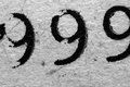
Pa9esby paperpagesComment: Clever titling, but the 9s fall off into the comparatively huge frame. 4. |
 Photographer found comment helpful. Photographer found comment helpful. |
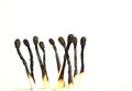
| 09/16/2009 05:07:18 AM |
Burned landby keyzComment: I like the idea, but the depth of field feels too shallow for this particular capture. It looks like the back matchsticks are falling off into softness. In my opinion, of you are using nine objects in a challenge that is titled Nine, all nine subjects should be in crisp focus. I like the composition. 5. |
| Photographer found comment helpful. |
| 09/16/2009 05:05:13 AM |
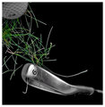
Emergency Detourby dtremainComment: The challenge subject is 9. Here I see a 69. It also feels like a simple snapshot that required very little thought. The composition needs a lot of work, and the lighting is very uneven. It is possible to give simple, everyday subjects great interest and drama as they are turned into an image, but this one falls short. 2. |
| 09/16/2009 05:02:24 AM |
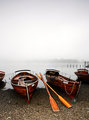
Pearl Dawnby Ecce_SignumComment: I really had to search for the overall relation to the challenge subject. This is a neat image, but it is a shoehorn entry into the challenge. Nice technicals, but this one would better serve you in a different challenge. 3. |
| Photographer found comment helpful. |
| 09/16/2009 05:01:06 AM |
Fore...by LutchenkoComment: I get that its a 9 iron, but at first glance, I see a 6. I like the deep black you capture in your background to make your subject pop, but the ball needs to be a bigger part of the frame and better lit. Good start, but it could definitely use more time in the setup and lighting. 5. |
| Photographer found comment helpful. |
| 09/16/2009 04:59:12 AM |
Old Schoolby krafty1Comment: Not a bad idea beginning, but the image is lacking interest and draw. For a macro, it is nice. I like the detail you captured in the typed numbers, as well as the paper itself. The tilt seems so slight that it was more accidental than composition, and the overall crop feels tense and awkward. 4. |
| Photographer found comment helpful. |
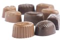
| 09/16/2009 04:57:17 AM |
9 pralinesby hajekaComment: A different and composition would serve this capture a good deal better. The high key background works with the subject(s), but the shallow depth of field detracts from the overall appeal of the image. I feel like the subject is 9 little candies, so there should be 9 little candies in crisp focus. Also, the chopping crop on the right hand side seems more accidental than composed. I'd like to see this one executed better. 3. |
| Photographer found comment helpful. |
| 09/16/2009 04:54:07 AM |
Corner Marketby ChadHComment: A seemingly common subject for this challenge. It took some time of searching through the busy frame to find the actual subject of the challenge. While the idea works for the challenge, this one needs to be tighter on the subject. 4. |
| 09/16/2009 04:52:59 AM |
I'm still standingby snafflesComment: I definitely do not understand your title. The colors you captured are true and appealing to my eye, but the frame feels very, very jumbled. 3. |
| Photographer found comment helpful. |
| 09/16/2009 04:51:51 AM |
The 9th Letterby jaeckel46Comment: Without the title, this one would have been completely lost on me. The uneven crop feels awkward and there are some odd color casts and gradients all around the letter. 2. |
Home -
Challenges -
Community -
League -
Photos -
Cameras -
Lenses -
Learn -
Help -
Terms of Use -
Privacy -
Top ^
DPChallenge, and website content and design, Copyright © 2001-2025 Challenging Technologies, LLC.
All digital photo copyrights belong to the photographers and may not be used without permission.
Current Server Time: 07/31/2025 01:01:58 PM EDT.