|
|
|
Showing 1011 - 1020 of ~1226 |
| Image |
Comment |
| 05/16/2006 11:25:33 AM | Walk with careby loickComment: Hey there from the Critique Club
First off, always try to include some info about the shot in the Photographer's Comments section. It really helps out when we know what the photographer was thinking and what equipment/lighting/etc. were used, especially when you request a critique. Secondly, welcome to DPChallenge!
Camera Work/Technical: This capture is nicely seen, and well captured for what it is. I think it may have done better in a different challenge.
Lighting: The lighting on the left of the frame is a bit harsh, and it distracts from the subject of the sign.
Composition/Content: There are enough areas of detail to hold the viewer's interest briefly, but you really have to look to see them. The various paint colors, the rivets and the aged lettering are interesting elements. I think cropping off the some of the overexposed area of the pole would have provided for a better composition.
My Opinion: I think that this one scored appropriately. I don't think that it fits well into this particular challenge, as I have never heard this expressed as a cliche. There are two things to consider when submitting images to a challenge here. First, make sure you meet the challenge. You will get eaten alive if your image depends too much on the title, or if its a stretch from what the challenge details ask for. I know this from experience. Second, voters here look at each image a for a very small amount of time. There are usually about 600 or so images to vote on each week, so it really takes a powerful image to grab the average voter and keep them longer. Vivid colors and strong contrast tend to do better in most challenges. Just some food for thought. Again, welcome, and I look forward to future submissions. |
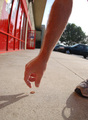
| 05/16/2006 11:14:32 AM | See A Penny and Pick It Up...by island_girl1Comment: Hey there from the Critique Club
First off, always try to include some info about the shot in the Photographer's Comments section. It really helps out when we know what the photographer was thinking and what equipment/lighting/etc. were used, especially when you request a critique.
Camera Work/Technical: You achieved an excellent depth of field here, allowing the viewer to recognize the background, but allowing it to blur enough so its not a distraction. The direction of the reaching arm provides a strong guide that draws the viewer down onto the photograph and onto the penny. The moment is such that it provides a level of expectation that the fingers will close at any second.
Lighting: Excellent choice of positioning to capture this shot. Natural light is always my favorite for shooting, but often difficult to control during harsh times of day. You did a fantastic job with the harsh light to provide a nicely back lit subject with balancing shadows and terrific detail.
Composition/Content: Reading the earlier comments, I tend to disagree with the ones that see the background as too busy. I think that shooting at f/2.8 rendered it recognizable, but not distracting. I do have two small concerns with the composition. First, and the most distracting is that foot with its shadow on the right of the frame. It pulls attention away from your subject and provides a distraction that the eye returns to over and again. Also, but much, much smaller, is the very top, right-hand corner, where the knee crept into the frame. Again, distracting. A little cropping would have taken care of this one. Repositioning that foot and the camera would have helped the overall composition.
My Opinion: I like the concept, but would have liked to have seen a better execution. This would have pulled a 5 from me based on the distraction. It meets the challenge well, and you did a great job with difficult lighting, but that foot pulls you down. With a slightly different composition, I would have voted 6 or 7. Nice work, but there is always room for improvement. |
| 05/16/2006 10:58:02 AM | At the Crack of Dawnby TwylaComment: Hey there from the Critique Club
This is funny, and that's one smooth bum! I am surprised that this one didn't score better on the humor factor alone. Very unique and creative, but the sky is a little too strong here. It provides a nice edge, but just a little over powering. I agree with you that a little more lens flare would have made this an even stronger image. Great work with creativity and great cliche for meeting the challenge. |
| 05/15/2006 11:48:37 PM | |
| 05/15/2006 01:54:00 PM | Dark Prophecy's Childby notesinstonesComment: Amazing shot!! DQ or not, you put together an amazing image here. Your composition is terrific, exposure control is nice and your post-processing is top notch. Very, very well done. No need for embarrassment. I am sure that it will eventually happen to us all. |  Photographer found comment helpful. Photographer found comment helpful. |
| 05/15/2006 12:16:18 PM | |
| 05/15/2006 12:15:36 PM | Rub-a-Dub Dub; Three Men in a Tubby tembaComment: Hey there from the Critique Club
Congrats on your highest scoring photograph to date, as well as a nice top 15 finish. This is a well seen and well composed photograph that is deserving of its high finish. When I critique shots, I try to look and see what could have help them finish higher in the challenge. With this one, I am lost. I think you have a capture here that is both technically and aesthetically better than some of those that finished ahead of you. Your composition is strong, focus crisp and exposure near-perfect for the scene. I think that you would have pulled an even better score if the three men were a bit more dominant in the photo. As it is, they almost get lost in the beauty of the sunset, but they are the subject of the cliche. Nice work, and my vote would have been in the 7-8 range for this one. One other note...I appreciate the level horizon. It drives me nuts if they tilt even a little. Nice job. | | Photographer found comment helpful. |
| 05/15/2006 12:01:08 PM | Coming rain will pour and pourby quindeComment: Hey there from the Critique Club
First off, always try to include some info about the shot in the Photographer's Comments section. It really helps out, especially when you request a critique. That said, I really don't see this as a sub-5 photograph. The focus is very crisp and the composition of the rain drops is such that it pulls the viewer's eye into and around the frame. I do get more of a sense that the storm has passed rather than pouring rain, as the cliche suggests. As mentioned before, the background is a little boring, and improving that would no doubt improve the score. I think that this one came close to its potential without making major scene changes, but still should have scored a little better. | | Photographer found comment helpful. |
| 05/15/2006 10:53:20 AM | Pulse of Lightby ParkerComment: Hey there from the Critique Club
My favorite element of this capture is your excellent depth of field use. The blurred colors also play well to make this a very interesting photograph. I don't think that it really hits the challenge of rhythm very well, thus I think the score suffered a bit. I do see some pattern to the shot, but I don't get a very rhythmic feel from it. I also like the centered composition here. It really adds to the interest of the shot, and the background lighting draws the viewer into the frame. The only spot of the photo that is off from a technical viewpoint is the one bright light over the head of the subject. Other than that, you have a very nice photo. I think this one would have fared better in a different challenge, but as it is for this one, it scored about as high as it could have. Nice capture and very well seen. |
| 05/15/2006 02:57:38 AM | "When The Rubber Hits The Road"by holdingtimeComment: Hey there from the Critique Club
Nice composition and great depth of field, but I think that this one is a bit washed out. As arnit mentioned, the direction of the sun gives this effect, but it is easily fixed with a curves adjustment. Giving it a slight s curve would also add the needed contrast and probably bump this one up a full point. Your composition works very well, drawing the viewer's eye down the path to the next biker, while still isolating the main subject. Your choice of subject and cliche make this fit into the challenge very well. Overall, nice work that could be even better with some slight adjustments. | | Photographer found comment helpful. |
|
Showing 1011 - 1020 of ~1226 |
Home -
Challenges -
Community -
League -
Photos -
Cameras -
Lenses -
Learn -
Help -
Terms of Use -
Privacy -
Top ^
DPChallenge, and website content and design, Copyright © 2001-2025 Challenging Technologies, LLC.
All digital photo copyrights belong to the photographers and may not be used without permission.
Current Server Time: 08/04/2025 04:06:04 PM EDT.
|