| Image |
Comment |
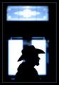
| 01/31/2003 11:30:13 AM |
Stetson Silhouetteby GordonComment: This is a nice silhoutte that should have been cropped too right above the window he is in front of. If you look closely it is a little off center so I would have cropped a little off the right side to even things out a bit. I like the border aournd this one. Nice work. |
| 01/31/2003 11:27:47 AM |
The Window of Truthby MiekaComment: Very abstract and almost too digital in my opinion. But it is very cool. I would like to see how this was done. Good luck in the challenge. |
 Photographer found comment helpful. Photographer found comment helpful. |
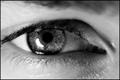
| 01/31/2003 11:26:32 AM |
Window to the Soulby SharQComment: This is a very nice macro of the eye. The use of B&W was a good choice. I really like the detail of the pupil. Great work, top 10 in my opinion. |
| Photographer found comment helpful. |
| 01/31/2003 11:25:05 AM |
Welcomeby greenem2Comment: Wow, I really like this photo. I think this one will be in the top 10. I don't like the border but because it isn't obtrusive I won't mark it down. I just don't think it was nescessary to use. Good job and good luck! |
| Photographer found comment helpful. |
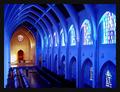
| 01/31/2003 11:23:30 AM |
The Sanctuary by RackatComment: This is a nice photo. I really like the bluish color. Couple of things to improve are the windows are a bit overexposed as is the area down next to the altar. Maybe a shorter exposure time or longer one with a small aperture? Good work and good luck in the challenge. |
| 01/31/2003 05:50:26 AM |
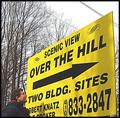
Over The Hill Estates for those in the state of being Over The Hillby LindaEComment: Greetings from the Critique Club.
First off I'd like to say if this was taken on the side of the road, it is a road sign. So whoever voted you down for that was wrong in my opinion.
This photo has potential to be much better. The sky seems a little overexposed. Try getting closer to the sign and eliminate the sky above it along with the telephone and powerlines.
I don't understand why you put the man in the picture. He doesn't look over the hill to me and doesn't add much to the photo. I would just not have put him.
I like the bright yellow on this. Again this photo had more potential to be better in my opinion. Good luck in future challenges. |
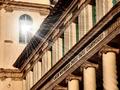
| 01/30/2003 05:49:45 PM |
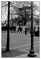
1600 Pennsylvania Ave.by iraeComment: Greetings from the Critique Club.
I agree. It is too bad about the tree. I'm not sure what time you shot this but the sky looks overexposed to me.
Despite the the trees and sky. I like the framing of this shot. I probably would have waited for the gentleman in the middle to move out of the frame. I'm not sure how much time you had to take the picture as I'm sure you the secret service guys may have been eyeing you down.
I think I am the minority by saying this but I'm not sure I would have gone with the B&W. I know its winter and there's not much color around but because of that I don't see a lot of contrast. An example is the tree on the left. It has nearly the same shade as the bushes and lawn behind it. I think the use of certain filters can bring certain colors out more even in B&W. You can also play around with that stuff in Photoshop as well.
I think the subject is cool. Not everybody can say the share the same address as the president. I hope this helps a little feel free to e-mail me if you have any questions. |
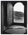
| 01/30/2003 05:32:16 PM |
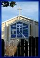
Heaven's Gate?by GeneralEComment: This is a nice photo. The border compliments the colors in the photo well. I don't particulary like the shadows on the gate. I don't like the little bit of tree sticking out of the left side either. But since you can't just chainsaw a tree down maybe waiting until earlier or later in the day depending on the direction to get the sunlight lower and not cast the shadows. Just a thought, still a very nice photo. Good luck in the challenge. |
| Photographer found comment helpful. |
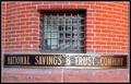
| 01/30/2003 05:26:32 PM |
Tighter Than A ...by albright1Comment: I don't know the saying so I don't understand the title. That has no affect on my voting though. I will say that the glare off the &Trust is quite distracting but other than that a nice photo. |
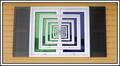
| 01/30/2003 05:12:55 PM |
Window to Infinityby JackoComment: One of the coolest shots I've seen this week. I don't know how this was done its neat. Good luck in this week. |
| Photographer found comment helpful. |
Home -
Challenges -
Community -
League -
Photos -
Cameras -
Lenses -
Learn -
Help -
Terms of Use -
Privacy -
Top ^
DPChallenge, and website content and design, Copyright © 2001-2025 Challenging Technologies, LLC.
All digital photo copyrights belong to the photographers and may not be used without permission.
Current Server Time: 08/02/2025 01:27:48 AM EDT.