| Image |
Comment |
| 02/10/2003 11:13:45 AM |
|
| 02/08/2003 03:36:41 PM |
|
| 02/06/2003 11:53:46 AM |
How do I get this little square in there?by STEINRComment: Greetings from the Critique Club.
This is a very creative approach to the challenge.
I think if you could have made this one a little sharper it would be better. I also think that photo itself is rather flat. Try adding a back light to seperate the subject from the back ground. The colors in the photo are very nice. I know this isn't much to go on but if you had added a backlight and had sharper photo this one would have done better in my opinion. |
 Photographer found comment helpful. Photographer found comment helpful. |
| 02/05/2003 04:23:27 PM |
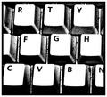
Keysby nathaliedooComment: Greetings from the Critique Club.
This is a nice photo that should have done better in the challenge. Unfortunately, many people feel that there are far too many keyboard shots taken on a regular basis. Most people don't look at the photo closely, just see it's a keyboard, score it low and move on. I like this photo because you show the keyboard differently the others. It has a gritty feel to it. Almost unreal looking aswell. The white of the keys is a little too bright in my opinion. I like the fact that it is too bright to see any texture on the key though. So if there is a way to lower the intensity of the white without adding texture to those keys than it would be great. I really don't have much else to add to improve the photo. I think it is very good and should have done much better. I hope this hasn't turned you away from submitting again. All the photos you have taken so far are very good and you should definately keep it up. Good luck in future challenges. |
| Photographer found comment helpful. |
| 02/05/2003 07:09:45 AM |
|
| 02/04/2003 12:21:22 PM |
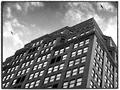
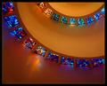
Helical Illumination by crabappl3Comment: Greetings from the Critique Club.
This was a great photo and well deserved win. Was a tripod and/or self-timer used? If not, I think this photo would be much better if you had. It may have led to a sharper look within the windows. I'm not trying to be too nit-picky but it looks like there might have been some very slight movement when the shutter was released. It could also be that some of the windows are more blurry than others because of the narrower depth of field. Maybe a longer exposure with a larger f-stop could have helped with focus. Again, I think this is a great photo. Nice colors, composition, lighting and great subject too! It deserved the win, Congratulations! |
| Photographer found comment helpful. |
| 02/04/2003 11:32:00 AM |
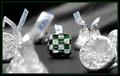
Dare to Be Squareby karmatComment: Greetings from the Critique Club.
This is a very fresh and creative approach to the challenge.
I like how you have the square stand out more by focusing just on it. I really don't mind the kiss in the foreground.
The compostion is nice and is very tight. You have very little negative spce, which I prefer. The only thing I would have tried to avoid is the Kisses label in the foreground. Maybe messing with your photo editor distorted it but I find it distracting. May removing that particular Kiss' label? I can't think of anything much to improve the photo. It is very nice but not I guess it just didn't stand out enough for some people to do better. Sorry I couldn't add more, please feel free to e-mail me if you have any questions. |
| Photographer found comment helpful. |
| 02/03/2003 06:08:11 AM |
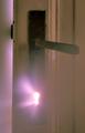
Through the Keyholeby jimmyn4Comment: I tried this same shot in B&W and it looked very flat. I adjusted the curves in PS to get a more violet looking light through the door. I'm especially proud of this shot because I didn't go insane with Photoshop. This photo could have been entered in a regular challenge legally. Thanks for all of the nice comments.
Just wanted to add that the reason the door isn't sharp is because of the steam. Message edited by author 2003-02-04 04:43:39. |
| 01/31/2003 11:33:18 AM |
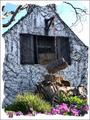
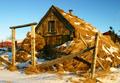
Cottageby GotchaComment: Very whimsical. Looks like a jogsaw puzzle. I think that this photo would have stood alone well without all of the effects added. Good luck in the challenge. |
| Photographer found comment helpful. |
| 01/31/2003 11:31:32 AM |
|
Home -
Challenges -
Community -
League -
Photos -
Cameras -
Lenses -
Learn -
Help -
Terms of Use -
Privacy -
Top ^
DPChallenge, and website content and design, Copyright © 2001-2025 Challenging Technologies, LLC.
All digital photo copyrights belong to the photographers and may not be used without permission.
Current Server Time: 08/02/2025 01:35:57 AM EDT.