| Image |
Comment |
| 06/14/2003 06:46:38 AM |
photographyby DustinComment: Too blurry. It would have been nice to see both of their faces - perhaps a different perspective on the shot would have worked better for me. Also, little items like the scratch on the door are distracting. |
| 06/14/2003 06:42:55 AM |
|
 Photographer found comment helpful. Photographer found comment helpful. |
| 06/14/2003 06:42:11 AM |
Home and Design by sherComment: Nice shot. I can definitely see this on the cover. A tiny bit grainy though. Of course, for ACTUAL cover shots they'd probably use medium format :) 9. |
| Photographer found comment helpful. |
| 06/14/2003 06:37:15 AM |
Playboyby iconsueComment: I don't think the angle would make this picture a candidate for a Playboy cover. The suggestiveness is a little too subtle - I'd wager something more direct would have worked better. People that buy Playboy don't want to think too hard (except those that buy it for the articles :)) |
| 06/14/2003 06:32:06 AM |
|
| Photographer found comment helpful. |
| 06/14/2003 06:23:50 AM |
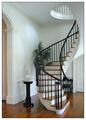
carpentryby kenboComment: More woodwork than straight carpentry, IMO. Nice high key exposure. |
| Photographer found comment helpful. |
| 06/14/2003 06:18:26 AM |
Better Gardensby pitsamanComment: Lovely colours. It looks more like a flower arrangement than a garden though. Perhaps a different perspective would have matched the magazine title better? 7 |
| Photographer found comment helpful. |
| 06/14/2003 06:17:01 AM |
Firehouse Magazineby DiversqComment: Nice work! I'm sure you'll get the odd 'should have been portrait not landscape' comments for this (and I tend to agree with them in general, but there ya go :)). More flames above would have lent itself well to a portrait crop. I think you could sell this for editorial use. 9. |
| Photographer found comment helpful. |
| 06/14/2003 06:13:14 AM |
|
| Photographer found comment helpful. |
| 06/14/2003 05:55:43 AM |
|
| Photographer found comment helpful. |
Home -
Challenges -
Community -
League -
Photos -
Cameras -
Lenses -
Learn -
Help -
Terms of Use -
Privacy -
Top ^
DPChallenge, and website content and design, Copyright © 2001-2025 Challenging Technologies, LLC.
All digital photo copyrights belong to the photographers and may not be used without permission.
Current Server Time: 08/01/2025 08:54:49 AM EDT.