| Image |
Comment |
| 11/05/2006 11:40:44 AM |
...And I Approve This Message.by alanfreedComment: You haven't been the one calling me all weekend asking for my vote, are you??? Seriously though, good shot. I think it may be cropped in a little to tight as I would have liked to see the hair not cut off. Cool look in the eyes though... it really draws attention. |
 Photographer found comment helpful. Photographer found comment helpful. |
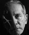
| 11/05/2006 11:39:04 AM |
Time Warpby graphicfunkComment: Very cool idea. I think the transition from face to clock is a bit harsh... I would have left a little more opacity in the face so that it showed through the clock a little bit to give more of an 'overlay' feel instead of a 'replacement' feel. |
| Photographer found comment helpful. |
| 11/05/2006 11:38:00 AM |
24 hours!!! Let Me Outa Hereby tooterComment: A creative idea... I like the composition and use of the screen to do a 'double self portrait'. I think the lighting needs a bit of work for the surrounding areas. I am sure you meant the screen to be the center focus but the rest is distracting because it is not prominant enough. |
| Photographer found comment helpful. |
| 11/05/2006 11:36:37 AM |
Coke is Itby cryingdragonComment: This is pretty cool but I do not like the border at all. If you want the border I would shrink it down and use a lighter tone of red... sample it from the lighter parts of the can. I would also play with the lighting a bit to keep the burnout from appearing on the can like that as it takes away from the logo. All those things said and this could be a composition for a coke ad! |
| Photographer found comment helpful. |
| 11/05/2006 11:34:53 AM |
Feeling Darkby QartComment: Very interesting. I think lowering the camera a little would create an angle in which the subject would be stronger (due to him 'towering' over the camera) and emphasize his strength and tough look. |
| 11/05/2006 11:33:48 AM |
trash artby annahComment: I think there is too much brightness on the trash and not enough on the subject. It is like a picture of trash with a girl instead of a picture of a girl with trash. |
| Photographer found comment helpful. |
| 11/05/2006 11:32:42 AM |
The Thinking Man, Different Capby BrianRComment: To me this looks like a simple picture with a photoshop lighting effect added. There really isnt anything in the composition that really grabs the eye or pulls the attention. Moving the angle to either give the viewer a better look at his face OR a better look at what he is looking at will really help the viewer understand the feeling and meaning behind the photo. |
| Photographer found comment helpful. |
| 11/05/2006 11:30:01 AM |
Fallby xantangummiComment: Nice DOF and pose. The look in the eyes help to captivate the viewer. Some may complain about the slight burnout on the right side of the face but I think it fits. |
| Photographer found comment helpful. |
| 11/01/2006 01:47:55 PM |
|
| Photographer found comment helpful. |
| 11/01/2006 01:47:24 PM |
Continental Moonby BlackboxComment: This must have been tough to get it just right but very nice composition. Any time spent on this was well spent. |
| Photographer found comment helpful. |
Home -
Challenges -
Community -
League -
Photos -
Cameras -
Lenses -
Learn -
Help -
Terms of Use -
Privacy -
Top ^
DPChallenge, and website content and design, Copyright © 2001-2025 Challenging Technologies, LLC.
All digital photo copyrights belong to the photographers and may not be used without permission.
Current Server Time: 08/04/2025 02:19:10 AM EDT.