| Image |
Comment |
| 04/06/2009 06:25:55 PM |
partytimeby HeidieComment: I might have been able to score this a little bit higher but the reflections and flash hotspots in the balloons are distracting. Some quick work in photoshop could have quickly eliminated those. |
| 04/06/2009 06:19:43 PM |
Postcard from the Edgeby AmmieComment: Great shot! I like that the cow is a siluete but that the surounding flowers still have details. |
 Photographer found comment helpful. Photographer found comment helpful. |
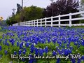
| 04/06/2009 06:16:38 PM |
Drive Texasby jerseyjimComment: I think this shot would have been better served by having the bluebonnets in the foreground in focus as opposed to what looks like the fence being the focal point. |
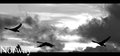
| 04/06/2009 06:12:42 PM |
Norwayby BJokerudComment: Great shot! Your placement of the word Norway is very distracting and hard to read but then again this isn't a page layout contest. 7 |
| Photographer found comment helpful. |
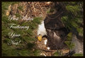
| 04/06/2009 06:10:32 PM |
BEST WISHESby riderComment: That must of have been a tough shot to get. Would really like to see more detail in the eyes. |
| Photographer found comment helpful. |
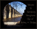
| 04/06/2009 06:07:41 PM |
Welcome to Harrisburg!by NikonJebComment: I like the idea you where shooting for here with the bridge and arches framed within another arch. I think though that the vine really hurts this composition by pulling my eyes away from the bridge and towards what looks like trash on the beach. |
| Photographer found comment helpful. |
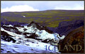
| 04/06/2009 06:03:35 PM |
Glacier Walkby GlanniComment: The sky looks a little odd. It almost looks like it came from another photo. |
| Photographer found comment helpful. |
| 04/06/2009 06:02:00 PM |
The City That Never Sleepsby Dano6Comment: I like your use of b/w and color in this scene. The only thing that bothers me is that the color to b/w transitions that are not on the waterline make the buildings appear to be cardboard. Also not so sure about the purple sky. But still overall I like it. |
| Photographer found comment helpful. |
| 04/06/2009 09:39:16 AM |
|
| Photographer found comment helpful. |
| 04/06/2009 09:28:45 AM |
Wish you were hereby JC_HomolaComment: Nice composition.
I think that overall the image could use a little more depth of field and an eye could be much sharper. |
Home -
Challenges -
Community -
League -
Photos -
Cameras -
Lenses -
Learn -
Help -
Terms of Use -
Privacy -
Top ^
DPChallenge, and website content and design, Copyright © 2001-2026 Challenging Technologies, LLC.
All digital photo copyrights belong to the photographers and may not be used without permission.
Current Server Time: 06/28/2026 05:40:35 AM EDT.