| Image |
Comment |
| 05/27/2003 04:45:55 AM |
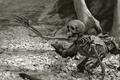
Bone crushingly bad dayby YomiComment: I'm not really sure what sort of scene this is depicting, but it is pretty interesting. It looks like legs from some very large creature smashing this person, but I can't be sure. I like that the skeleton is dark and not white. He has very good contast with the stones underneath. The tonal quality makes it a little cold and desparate, which is really what a photo like this needs. very well done! |
 Photographer found comment helpful. Photographer found comment helpful. |
| 05/27/2003 04:43:11 AM |
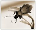
Beatleby JackoComment: Very good macro. The beetle is definitely crisp and very clear. The duotone of this really makes for great contrast with the background, but the beetle is not jet black where we can't see any of his detail. Nice choice of subject and very good camerawork. |
| Photographer found comment helpful. |
| 05/27/2003 04:41:23 AM |
In Her Roomby progersctComment: This is a very nice portrait. Its sort of candid, and pretty flattering. If the background were more uniform, this is a 10 all the way. As it is, its a very solid 9. Very well done. This is one of my fav's for the week if not my fav. |
| Photographer found comment helpful. |
| 05/27/2003 04:38:20 AM |
Just Beyondby mbardeenComment: This is a really nice shot. The white background is really a nice capture but then you've also put these silhouettes in front of it. There is some nice contrast going on in this photo. great capture. Nice work. |
| Photographer found comment helpful. |
| 05/27/2003 04:36:29 AM |
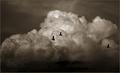
Three Ducksby DennisFComment: This photo is just amazing. To catch these guys up here, more or less just to be up here is awesome. I'm not sure how this was done or what means were used to take it, but it is really cool and very well done. What I really like is the dark silhouettes against the clouds. That's really neat. - 9 |
| Photographer found comment helpful. |
| 05/27/2003 04:34:32 AM |
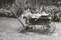
That Old Wheelbarrowby nathaliedooComment: The effect of looking like an 80 year old photo has been achieved with this photo. The subject looks vintage and the background is something that could be seen in any photographable era. Nice job - 9 |
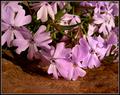
| 05/26/2003 08:40:45 PM |
Creeping Beautyby pncowleyComment: Greetings from the Critique Club
By Inspzil
Composition - I think this one suffered from the colors you chose for the composition. Not the traditional orange, green, and violet that we have all grown accustomed to as our "secondary colors". I am in agreement with the masses here though. The overwhelming pink is hard to overlook in such a challenge. I gotta say the pink flowers look rather fake, whether they are or not. They seem very regular, kind of stiff too. The green part of them also looks artificial.
Technical - I'm surprised the DOF is so shallow at f4.7. Maybe if you were around f8 with a slower shutter you could've gotten the same exposure values with more DOF. You didn't use a tripod nor do I think it was very necessary. The shutter was plenty fast enough to accomodate in this situation. The focus on the front stuff is pretty good, but there is so much more to this picture where the focus is inherent due to the placement of the other flowers.
Overall - You didn't get much help on this one in the comments, that's for sure. I think that the shallow DOF and the choices of colors in this picture resulted in the low score. If the flocks were purple, it might've been an easier sell to the viewers. Purple and green would've been a nice combo for this challenge. It's not a poorly taken picture, but there are elements of it that I think could be improved. As I look at the picture one last time, I think you probably could've cropped some more of the dirt out of the bottom to make the whole thing a little more colorful. Sorry this didn't work out so well from you. Hope I could be at least a little help since your comments didn't do much for you. Good luck in the future. - Inspzil
|
| Photographer found comment helpful. |
| 05/25/2003 07:22:54 AM |
Waiting For The Sunby cpanaiotiComment: Greetings from the Critique Club
By Inspzil
Composition - I gotta tell you this looks like a combination of my last 2 flower shots (my ONLY 2 flower shots). The water is always great on flowers to show sharpness in my opinion. I'm going to guess this is a tulip too because of the textures on the petals, which is what my last challenge subject was, showing the same textures. The crease in the flower is a good idea, but I might not have taken this quite so close. Its a very nice combination of colors. I got ripped for not showing all 3 primary colors for my tulips photo, so I bet some of the people probably felt the same away about your entry too. I don't feel that way though. Its a quality composition.
Technical - I like the shallow DOF on this macro. The focus seems just a touch soft, but is pretty good for the most part. I think a little more contrast would help to provide a little separation between the flower and the background. The exposure is pretty good, if anything it might be just a touch dark. I can really appreciate you putting all the things you did to the photo in your comments section.
Overall - A pretty nice picture overall. It needs a little sharpening, a little more separation between the flower and the background and maybe not taken quite so close. Its a good photo, but doesn't have a real compelling element to push it up the next level (and if I could do this, I'd tell you how in a heartbeat). Good job and good luck in the future. - Bob |
| Photographer found comment helpful. |
| 05/22/2003 12:58:32 PM |
Beach Hutsby hughletherenComment: Greetings from the Critique Club
By Inspzil
Composition - Good find for this challenge. I think the lines and regularity of the pattern work well for this not to mention the way the shadows go too. One thing with having this many lines, you wan't to keep this photo as vertical as possible. The top is definitely leaning to the left a bit. It's easy enough to check when you have a reference line very close to the edge of the frame. Generally speaking I think the composition is pretty good.
Technical - The photo is not as focused as it could be. I would've set the aperture as high as it would go. Judging by the shutter speed, you should be able to easily and still have enough light to effectively shoot this. As it is, I personally would've sped up the shutter a bit. Less exposure gives more saturation. This isn't necessarily over-exposed, but it would be a little more saturated with a quicker shutter. I'm not sure if you can sharpen this one a little more with no ill-effects or not, but you may want to try that if you haven't already. A little more saturation via Photoshop is always an option too.
Overall - I think its not a real compelling subject, but it is very fitting for this challenge. I think with a few minor changes to the colors via PS or a quicker shutter would be advantageous. Something else in the picture to give it a focal point might have been a good idea. Maybe even a person. Good luck to you in future challenges - Inspzil |
| Photographer found comment helpful. |
| 05/17/2003 10:40:19 PM |
Weird New Jersey... The Caves of Insanity...by WILDBLUEComment: Greetings from the Critique Club
By Inspzil
Composition - I'm going to look at this picture from the more "weird" perspective in lieu of my normal straight up straight laced approach to this. If I didn't read that you desaturated all the colors, I wouldn't know it. There really isn't too much here that is losing its apparent colors. The only thing I can see that MIGHT give it away are the tree trunks that are totally grey and not brown. The stones that make up the "cave" entrances look like they would be perfectly happy grey. I think it's effective for this picture, mostly because its not totally noticeable that it's been applied. The general part of this composition is a little weird maybe, but not that compelling. I see where you're going with this but I don't think you quite made it. I might have tried this shot at dusk or dawn, where there is much less available light. It would've really made this more dark and dreary, like Jeckyll and Hyde or something like that. As for the horizon of this picture, you probably should've made the openings run uphill from corner to corner. The other option is to level them. It makes the photo's mood more morose and serious which of course is a little more BORING. I think it's good to have it tilted, just maybe more tilted.
Technical - This picture is pretty well taken and exposed. But I think this is a picture where its more effective to be a little underexposed. A little out of focus probably is an option to you too. The text is a little thin and not as readable at the bottom of the card as I think it should be. Processing looks pretty good.
Overall - You needed to do something a little more drastic to get the viewers attention, whether it be with exposure, framing or something else. Being slightly out of level was detrimental. Being level with the horizon or drastically tilted is an option too. Good luck with your future shots - Bob |
| Photographer found comment helpful. |
Home -
Challenges -
Community -
League -
Photos -
Cameras -
Lenses -
Learn -
Help -
Terms of Use -
Privacy -
Top ^
DPChallenge, and website content and design, Copyright © 2001-2025 Challenging Technologies, LLC.
All digital photo copyrights belong to the photographers and may not be used without permission.
Current Server Time: 08/18/2025 01:29:16 AM EDT.