| Image |
Comment |
| 07/02/2003 04:57:16 AM |
|
 Photographer found comment helpful. Photographer found comment helpful. |
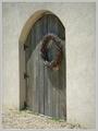
| 07/02/2003 04:55:55 AM |
Backdoorby casualguyComment: The door doesn't seem very level to me. Not a lot of interest for me. The tones are nice though. |
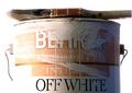
| 07/02/2003 04:54:51 AM |
Behr Paintby ChrisW123Comment: Looks like an advertisement more than anything. Not a bad picture though. I like how the word white is really dark. Good irony. |
| Photographer found comment helpful. |
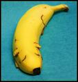
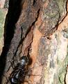
| 07/02/2003 04:53:27 AM |
Bug on Barkby dphillipsComment: Looks like most of an ant. Definitely would've been much more effective if you showed the whole thing. This would be almost effective if he were going up instead of down. |
| Photographer found comment helpful. |
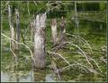
| 07/02/2003 04:51:33 AM |
Bayouby RuchartComment: This is a backdrop in need of a real subject. The stumps just aren't quite enough for me. The focus is a little soft too. |
| Photographer found comment helpful. |
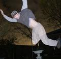
| 06/30/2003 11:40:56 PM |
Fallingby willsy66Comment: Greetings from the Critique Club
By Inspzil
Composition - I love this technique. I'll be trying this one in the future for sure. The picture however, I just don't get much out of it. It looks like fun for you, but I'm positive I'm not getting as much out of it as you did. I wonder if this would've looked better if you didn't cut your arm off. I like the way that you are corner to corner in the frame. I think that is working for you. Personally its just a little silly picture amongst scads of dead serious ones. Its a nice change, but that doesn't make the image any better, just the voting a little less boring.
Technical - I love this technique. I don't know if it's yours or you copied it, but I'll be working on this one for sure. Its like a photoshop trick without photoshop. This is well executed despite your disclaimer in the comments box.
Overall - This is a cool technique but not so much a cool picture. I think you really could've capitalized on this and done a better overall image. It has a real out-of-control element to it and not in a good way. Looks like the flash might have been too close and I'm almost positive the camera is too close, hence the cut of arm. Keep shooting these. This unique technique is really something to give you an advantage over most. Good luck - Bob |
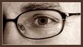
| 06/30/2003 11:25:40 PM |
In The Year 2003by TarbiniComment: Greetings from the Critique Club
By Inspzil
Sorry Tarbini, you get stuck with me again.
Composition - This totally reminds me of some propaganda ad (made up of course) by some extremist group who thinks the internet is the governments way of watching us. This is the eye of "big brother". It doesn't really do a lot for me in terms of visual impact or have any real highly emotive factors either. It looks like a bespeckled eye. Its pretty centered which isn't bad. I'm not sure adjusting the framing wouldn't help add a more mysterious tone to this photo or not. Just thinking "out loud" so to speak. It's hard to tell what you were going for here exactly, if there is anything you were specifically trying to do.
Technical - A little soft, but not unbearable. How about "tolerably soft"? People on the whole are not really meant to be super crisp all the time. Most of my shots I soften up with autofx dreamy photo or whatever that free plugin is called. This is no exception, even as a macro. The lighting is great, especially with no glares. Amazing. But judging by the shutter speed and aperture, you were probably working with existing light. Whatever you did to reduce the noise, it worked great. As for the border, in this kind of shot its warranted. It might be a little thick for my tastes, but I think you made the right choice.
Overall - Not a bad shot, but one that lacks something extra to grab the voters. This really isn't enough to make them even real curious. Executed pretty well but now wow'ing the average voters. You do nice work Tarbini, but this wasn't one of your greatest. There's always next time. I think a change in the lighting would've been the best thing to try to improve this. Its kind of flat (I just thought of this if you are wondering why its dead last). Good Luck with your future submissions. - Bob |
| Photographer found comment helpful. |
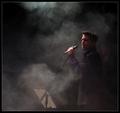
| 06/30/2003 12:10:31 AM |
Vocalist by KonadorComment: Great work. The fog really gives the extra kick to this photo. Congrats on the ribbon - Bob |
| Photographer found comment helpful. |
| 06/23/2003 03:11:22 PM |
Star Light Expressby donpramComment: Greetings from the Critique Club
By Inspzil
Composition - Interesting abstract type shot. Definitely has some appeal as a more modern art type piece with a nice focal point and the blackness broken up with little dots of light. There are 2 problems with this picture IMO. I think with this kind of photo, are you at any disadvantage to get it into portrait format, which would be more conducive to magazine covers in general? And secondly, this picture looks like an illustration as much or more than it looks like a photograph. There are no reference points to indicate what is up or down, left or right, so why not put it portrait? you could flip or rotate all you like legally to achieve this quite simply.
Technically - This is very sharp and well taken. I like that some of the light circles are overexposed, but not all of them. This was good technique used with this photo and favorable angles to accomplish the partial overexposures.
Overall - I don't know this magazine. I'm not sure what the cover would even look like. This is a cool picture. You almost have to sell people into believing its a photograph. Flipping it portrait would've been a logical thing to do, since the greater majority of magazines that I know of are in portrait format. Very interesting image that has a lot of appeal, but maybe not the greatest for this challenge. Good luck with future challenges. - Bob |
| Photographer found comment helpful. |
| 06/23/2003 12:24:21 PM |
Heart of a Flowerby K-RobComment: Quite honestly I'm stunned this finished this low. I thought this made for a wonderful abstract. Apparently 19 other people agreed with me. (your 9's and 10's). This was my only 10 of the week, all challenges inclusive. I did give the first place photo a 9. I think I only gave 2 of those. That is a gorgeous photo and a deserving winner. I just can't fathom how this pulled 28 spots lower than mine even. This shows some tremendous vision and I'm very disappointed at the voters this time. This is really a wonderful photo. |
| Photographer found comment helpful. |
Home -
Challenges -
Community -
League -
Photos -
Cameras -
Lenses -
Learn -
Help -
Terms of Use -
Privacy -
Top ^
DPChallenge, and website content and design, Copyright © 2001-2025 Challenging Technologies, LLC.
All digital photo copyrights belong to the photographers and may not be used without permission.
Current Server Time: 08/15/2025 07:55:02 PM EDT.