| Image |
Comment |
| 07/05/2003 07:19:28 AM |
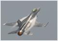
Danger Zone by DiversqComment: Great subject. Too bad about the sky color and the plane color being almost identical. More contrast would've been better, but still a good subject. |
 Photographer found comment helpful. Photographer found comment helpful. |
| 07/05/2003 07:17:49 AM |
Speed, Why Rush?by MartinComment: I'm wondering if you have a lot of extra background stuff to force you to crop this in a panoramic way. If there isn't a lot of stuff, I definitely would've made every effort to put this in a more normal aspect ration. |
| 07/05/2003 07:13:00 AM |
'NightSpeed'by fredrojComment: The yellow light trail is too faint. I think the picture is slightly overexposed and the yellow trail in the city does not show up as well as I think it should. With less exposure, the background would be darker and I think the trail would show a little moe. |
| 07/05/2003 07:10:48 AM |
Smokin'by Nickels549Comment: Not a bad photo. I'd reconsider the size and make every effort to make it larger, at least somewhat. It would definitely help your cause. |
| 07/05/2003 07:07:32 AM |
Wheeee !by cykhansenComment: You can't really see the speedy part in this photo as well as I think you should for the speed challenge. |
| 07/05/2003 07:06:35 AM |
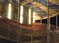
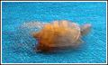
The Tortoiseby christeyComment: Difficult background to do longer exposures. Longer exposure backgrounds should be black or as dark as possible to avoid other exposures from light colored objects |
| Photographer found comment helpful. |
| 07/04/2003 10:54:19 AM |
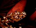
bowl of beans with a brown background :)by photogooComment: Interesting. I'd have like to see this picture bigger and shifted to the left. Too much dead space on the right side to have the beans cut off on the left. Actually might have looked better if it were just made bigger to fit the allowable frame size. |
| Photographer found comment helpful. |
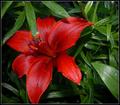
| 07/04/2003 10:52:50 AM |
A Single Blossomby kebmod54Comment: Don't like the lighting. Looks almost like you used the flash. The highlights on the leaves are just too much and there are too many of them. Good crisp clear picture, just don't like the lighting. |
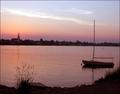
| 07/04/2003 10:51:52 AM |
Boatby nathaliedooComment: Overall this photo is just a little too soft. The boat is not sharp enough. If the boat were sharp and the backdrop a little soft, that would've been much much better. Looks to me like the focus just wasn't quite in the right spot. Very nice scene, one to go back and try this shot again, with maybe a little more light. |
| Photographer found comment helpful. |
| 07/04/2003 10:49:35 AM |
|
Home -
Challenges -
Community -
League -
Photos -
Cameras -
Lenses -
Learn -
Help -
Terms of Use -
Privacy -
Top ^
DPChallenge, and website content and design, Copyright © 2001-2025 Challenging Technologies, LLC.
All digital photo copyrights belong to the photographers and may not be used without permission.
Current Server Time: 08/15/2025 12:49:28 PM EDT.