|
|
|
Showing 631 - 640 of ~3109 |
| Image |
Comment |
| 07/06/2003 08:38:44 AM | Speed is relativeby ChezComment: Great picture. I'm not really sure where you are intending for us to see speed here. I like the silhouette and the warm color of the sky. |
| 07/06/2003 08:31:53 AM | Speed Boatby JackoComment: Good panning technique. A nice crisp shot. Looks a little underexposed, like the shutter was too fast (which in turn helped keep the shot crisp). Moving left to right is a more natural feel for the eye. Moving R to L is not as natural. I might have considered flipping the photo so the boat was moving L to R, if you can get away with it. |  Photographer found comment helpful. Photographer found comment helpful. |
| 07/06/2003 08:28:18 AM | Wind at homeby GalyNetComment: This photo looks grainy in a very unnatural way. It almost looks like it was added post. The idea is okay. The line cutting thru the middle of the pic diagonally is not helping the continuity of this pic. |
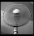
| 07/06/2003 08:25:34 AM | Wind Speedby Geo_GriffinComment: This is kind of a neat abstract. I have no idea what it is. Judging by the title, I'd say it was a MIG welder or something, but i see no connection to that in the photo. Not a bad pic. I think the title loses me more than the photo does. | | Photographer found comment helpful. |
| 07/05/2003 08:29:23 AM | In The Saddleby RuchartComment: Greetings from the Critique Club
By Inspzil (a fellow Michigander)
Composition - The angle of this shot is the selling point IMO. You really make John Law look like a bigger badder individual. He looks like he needs to make a few less trips to the donut store though. Color portrayal is exceptional. Good use of a polarizer.
Technical - Really I think there is only one thing that I could suggest for this picture and that's a little fill flash to light this man's face just a little more. The exposure for the most part is really good but his face is just a little dark. If you have flash intensity control on the G2, I'd have put the flash at its lowest setting and taken the picture, to "fill the face" so to speak. But the angle, perspective, and framing are making this picture.
Overall - Good portrayal of at work. Tough job, hanging around at a birthday bash. I've been to Allegan before, a couple times on jobs. Not a terribly exciting place from what I've seen. Back to the pic - I think you've done a good job with this picture. The fill flash is kind of a minor thing, but one of those little tricks that might have added a couple tenths to your score as a result. This is really good work. Best of luck in the future - Bob | | Photographer found comment helpful. |
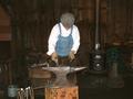
| 07/05/2003 08:17:46 AM | Smithing For Fun & Profitby JakComment: Greetings from the Critique Club
By Inspzil
Composition - This place looks like you could take a ton of pictures. There is cool stuff happening, neat tools, interesting atmosphere. Great choice of subjects is what I'm trying to say. Unfortunately in a place like this you can't set up lights and stuff to maximize the potential of your photos. The first thing I noticed is that the lighting looks like flash lighting, a little flat looking. The second thing I noticed was the angle of the shot. Dead on, centered, eye level, and landscape oriented. I see this shot being more successful shot portrait, from a lower vantage point, keeping the smith and the stove and the anvil as the 3 major things in the photo. I don't think there would be so much worry about what is in the background that way. And I also think that you really would've emphasized the smith better. Perhaps while he was swinging the hammer too... but that's starting to ask a lot. The white shirt is not helping matters one bit either. Light colored is definitely better for contrast. White is just a little too strong.
Technical - I think the exposure is about as good as you could hope for considering the circumstances. I'm guessing this place inside was fairly dark. Much brighter and you blow his shirt out. It seems pretty well focused to me. There weren't a lot of post shot adjustments, so nothing to worry about there.
Overall - You've found a great subject Jak. I'd have like to seen a little more creative approach to portraying this though. I won't for one second tell you I'm an expert at this, but as soon as I saw this picture, I was searching for an angle and perspective that would make the focus on this craftsman stronger. And that's not to say that you didn't take this from all angles. It may have been the case where those pics just didn't turn out as good as this one. Sometimes I have good ideas, sometimes I should learn when to keep my mouth shut. If I could differentiate between the 2 at any given time, I'd be an expert and probably a better photographer. But I'll lay it out like I'm seeing it. If it helps, I'm smiling and happy. If not, I'm still smiling and happy with you cursing me from a distance. Take care and best of luck Jak - Bob |
| 07/05/2003 07:54:10 AM | W. Farrell Edwards-Bright Mind for Physicsby sagestudioComment: Greetings from the Critique Club
By Inspzil
Composition - Nice mood in this shot. I think the lighting generally works, but I'd have tried to put the whole paper in the light instead of the streaks and shadows that overcome it. The other point about this picture that I don't really like is what the guy is wearing. It looks like a robe and slippers. Not that this is unacceptable attire around the home, for an "at work" theme, I'd have chosen something a little more work-like from his wardrobe. I like the angle you chose to shoot, over his shoulder looking in to what he's doing. I think that is the best part of this picture.
Technical - Great exposure. As for the lighting, its not a question of exposure but rather placement of the light. It is well focused and clear.
Overall - A little change in the lighting on this one might have made a pretty big change in your score. I don't know how many variations you tried on the lighting, perhaps backlighting this would've put more emphasis on the paper, showing us a little more silhouetted look, but with more emphasis on the paper. I think it was pretty well done with great mood. Nice work! - Bob |
| 07/05/2003 07:26:00 AM | Wake Zoneby TopQComment: Horizon looks like its running downhill right to left. Subject looks like he's having a blast and the picture aside from the horizon thing is very good. |
| 07/05/2003 07:24:38 AM | Roarrrrrrrrby drydocComment: Good panning technique. You have a lot of good motion blur and a clear subject. I would've liked to seen the aspect ratio changed to a squarer pic. But great shot here nonetheless |
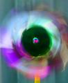
| 07/05/2003 07:21:41 AM | A bee's eye viewby dprentComment: I really like this effect. Great job with it, especially keeping the center flower centered and motion going all around. Nice work! |
|
Showing 631 - 640 of ~3109 |
Home -
Challenges -
Community -
League -
Photos -
Cameras -
Lenses -
Learn -
Help -
Terms of Use -
Privacy -
Top ^
DPChallenge, and website content and design, Copyright © 2001-2025 Challenging Technologies, LLC.
All digital photo copyrights belong to the photographers and may not be used without permission.
Current Server Time: 08/15/2025 09:26:28 AM EDT.
|