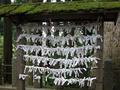
What are those white stuff and what for?by
kenboComment: Greetings from the Critique Club
By Inspzil
Composition - I've seen these things before. My mom has shown me pictures of them (she is from Tokyo originally) but for the life of me I can't remember what they are or what they are for. With that being said, challenge met. I don't find the composition of this pic terribly intriguing or compelling. There doesn't seem to be any unique perspectives or angles used to show us this in a different light. You are showing us things like we would normally see them (considering we ever saw them) and I don't think that's conducive to what we, as a group, are trying to accomplish. The lighting is pretty flat, the horizon seems off in every way I think. The bottom leans one way, the top another. This is not an easy picture to figure out exactly what, if anything, is the proper reference to level to.
Technical - technically there's nothing
wrong with it, but it really needs some drastic change in perspective or something to give it a little more interest. A little fill flash might have worked out for you, but that might've made the lighting even flatter. I'm not sure what to say here, so I'm moving on.
Overall - Not a terribly exciting picture. It doesn't have the sharp visual impact nor the good emotive grasp on me that is an ingredient in the superior photos. Sorry I don't have much more to say. A change in the composition would be a good place to start rethinking this. People might not be a bad option. If little kids put these on, it might've been in your best interest to capture that moment, with the right kid of course. Best of luck, sorry I couldn't be more helpful - Bob