| Image |
Comment |
| 07/31/2003 04:56:57 AM |
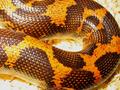
They are NOT Slimeyby freeride21aComment: If you could have literally filled the frame you'd have taken out your problem areas...the open background areas. Those seem to be just a little hot. nice colors in the snake. |
| 07/31/2003 04:55:24 AM |
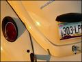
'67 Beetleby tfarrell23Comment: I'd have steered away from leaving the license plate in the frame. Cool car though in what appears to be immaculate condition. The license plate also disrupts the flow of the picture too. |
 Photographer found comment helpful. Photographer found comment helpful. |
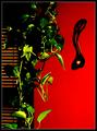
| 07/31/2003 04:53:33 AM |
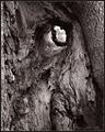
Never Forgetsby crabappl3Comment: A tree? I see where you get the connection though. It could be mistaken I suppose. The tone of the picture is fitting to the concept, kind of greay and depressed. Good luck! |
| Photographer found comment helpful. |
| 07/31/2003 04:49:10 AM |
Bannerby rickhd13Comment: The shadow in the bottom left corner is a shame. I'm not wild about this anyway, but the shadow takes a lot away from it. |
| 07/31/2003 04:47:19 AM |
Old treeby heidaComment: Unfortunate that branch or other thing in the center is so out of focus. I think as a choice of subjects, for this kind of challenge one with the least amount of depth is the most prudent choice. Good Luck! |
| Photographer found comment helpful. |
| 07/31/2003 04:44:59 AM |
My Children Fill it Upby PaigeComment: Very good idea and very cute kids. Wish I woulda thunk this one. I might have entered. I have 3 boys
|
| Photographer found comment helpful. |
| 07/31/2003 04:43:07 AM |
Green Goddessby ellamayComment: Great colors. The details are good. Excellent idea though but I think it could be just a little clearer |
| 07/31/2003 04:38:28 AM |
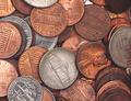
Pocket Change...by StevePaxComment: I think I'd have kicked up the contrast just a little on this one to take out some of the flatness. Love the concept for the pic and this is extremely well taken. |
| Photographer found comment helpful. |
| 07/27/2003 09:30:02 AM |
Welsh Love Spoonby BobsterLobsterComment: Oversaturated, oversharpened and honestly, a little underexposed. I'm a little confused on the contrast part but I'm assuming its light and dark? At anyrate, a little to much processing for my tastes. |
| Photographer found comment helpful. |
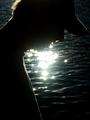
| 07/27/2003 09:28:22 AM |
Lakeside Silhouetteby PaigeComment: Best so far. Nice work. Star filter? Good example of contrast and I like that the model is very everyday joe looking. Good luck |
| Photographer found comment helpful. |
Home -
Challenges -
Community -
League -
Photos -
Cameras -
Lenses -
Learn -
Help -
Terms of Use -
Privacy -
Top ^
DPChallenge, and website content and design, Copyright © 2001-2025 Challenging Technologies, LLC.
All digital photo copyrights belong to the photographers and may not be used without permission.
Current Server Time: 08/15/2025 03:35:14 AM EDT.