| Image |
Comment |
| 09/27/2003 02:01:09 PM |
Baby Lichenby kavamamaComment: The background is really well done on this shot. The foreground looks just a bit out of focus. Did you use Neatimage with this shot? just curious, it sort of has that plastic look to it. |
 Photographer found comment helpful. Photographer found comment helpful. |
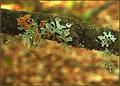
| 09/27/2003 01:59:59 PM |
striped... but not toothpasteby indigo997Comment: I think a little more exposure and this would be in the ribbons. Good creative shot. I really like the concept. Its just a smidge dark. Nice work 9 |
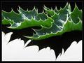
| 09/27/2003 10:20:34 AM |
Thistle Leafby JeanComment: very good pic. I really think the lighting is excellent.. I don't know how you did this, but I think its exceptional. Nice work 9 |
| Photographer found comment helpful. |
| 09/25/2003 05:35:09 AM |
What do I look like?by kenboComment: Just the feather would've been better. Reminds me of swashbuckler's photo for texture. I'd have left off the "cute" part of this and just concentrated on the macro part. |
| Photographer found comment helpful. |
| 09/25/2003 05:33:50 AM |
In Pinkby lionelmComment: This makes for a much cooler abstract than a macro. Good photo, just not the greatest macro. The colors are super. |
| Photographer found comment helpful. |
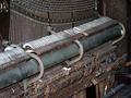
| 09/09/2003 08:02:05 PM |
Play Me A Tuneby OneSweetSinComment: Greetings from one of your own
By Bob
Composition - There are many good repetition photo candidates in this photo. I think choosing one aspect of the piano and not the whole thing would've been a more fruitful venture. The angle of this photo reminds me of a catalog shot, which isn't bad if you were selling it. This has the makings of some very good perspective type shots, like pseudo-abstracts or something along those lines. Even not so abstract with photos taken along its length. This 3/4 angle perspective has really flattened this subject. The lighting isn't helping that either.
Technical - Speaking of lighting, I think that being a little less liberal with the exposure and shortening the shutter would've provided a little richer tones. The overall colors of this aren't bad by any means. I think darkening the photo a bit would definitely make them a little warmer. Dropping the ISO down to 100 or lower (if possible) would've also helped the color saturation. At that shutter speed and Aperture, you definitely had room to do that without too much fear of camera shake unless you are recovering from a nasty heroin addiction or something :) My camera has a low end ISO of 64. I shoot about 0.01% of my pictures in an ISO above 64. It provides much better colors and there isn't much movement to speak of in this photo where a higher ISO would be recommended.
Overall - Not a bad subject, but a pretty bland shot. This subject has a lot of potential, but not from this angle nor this bright. I think you could've chosen one of the many repeating parts from this piano in lieu of the whole thing. It would've made for a more interesting shot. There's nothing really "wrong" with it, just not particularly appealing to the masses. 'nuff said. Good luck! - Bob |
| 09/08/2003 05:16:39 AM |
|
| Photographer found comment helpful. |
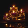
| 09/07/2003 06:08:29 PM |
Crystal Castleby lisaseiwertComment: Hm.... I think we have one of these. Partylight? The little overexposure of the flames is good. The photo for this challenge is not really fitting IMO. |
| Photographer found comment helpful. |
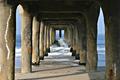
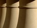
| 09/07/2003 06:07:31 PM |
threeby ursulaComment: Good study of texture, lighting, shadows and geometry. Not super interesting, but a very solid, sound photo. |
| Photographer found comment helpful. |
| 09/07/2003 06:03:02 PM |
|
Home -
Challenges -
Community -
League -
Photos -
Cameras -
Lenses -
Learn -
Help -
Terms of Use -
Privacy -
Top ^
DPChallenge, and website content and design, Copyright © 2001-2025 Challenging Technologies, LLC.
All digital photo copyrights belong to the photographers and may not be used without permission.
Current Server Time: 08/13/2025 03:47:48 PM EDT.