| Image |
Comment |
| 01/17/2004 11:07:30 PM |
Mouthwash From Aboveby jrs915Comment: Wow... I need to know how this was done. This is way cool. So far my favorite shot of the challenge. Unfortunately this is probably too abstract to make any waves in this challenge but I'll give you a 10 because this kicks ass. |
 Photographer found comment helpful. Photographer found comment helpful. |
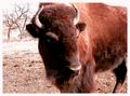
| 01/17/2004 11:05:08 PM |
Lunch Timeby ShannonComment: Tough shot. THe background is overexposed, the face of the beefalo or bison is underexposed. It's like a multiple choice question with no right answer. |
| Photographer found comment helpful. |
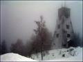
| 01/17/2004 11:04:00 PM |
Snow Wind And Fogby MonaComment: Good shot. I really like the grainy effect on this shot. I don't know if it is from fog or Photoshop, it works well here. I'd have like to seen a little more headroom on the building. |
| Photographer found comment helpful. |
| 01/17/2004 11:02:06 PM |
Baseball Trophyby saalwaechterComment: Grainy. THe point of focus is too high up on the trophy. Including the corner of the room in the background adds distraction. |
| Photographer found comment helpful. |
| 01/17/2004 10:59:42 PM |
View from insideby ShelleyComment: Great shot. Dirty trick trying to win us over with emotional shots dammit!! Great work. 9 |
| Photographer found comment helpful. |
| 01/17/2004 10:56:42 PM |
|
| Photographer found comment helpful. |
| 01/17/2004 10:54:57 PM |
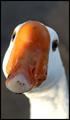
Honk!by moodvilleComment: Well taken. I'm not wild about the composition for this challenge, but it is well taken. |
| Photographer found comment helpful. |
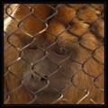
| 01/17/2004 10:52:10 PM |
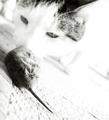
The Hunter, and the Huntedby SkamalComment: I feel that you had a great idea, but lost a lot with this photo when the cat's nose was lost behind the rodent. High key is good, but this might be just a little too hot. I like the angle however. |
| Photographer found comment helpful. |
| 01/17/2004 10:49:47 PM |
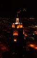
25th Floorby JoelHSmithComment: Good shot. Not just your average cityscape type shot.... there is actually a very picturesque focal point. I think just a little more exposure would've brought out some texture in the background though so it wasn't quite so black. Nice work 8 |
| Photographer found comment helpful. |
| 01/17/2004 10:47:43 PM |
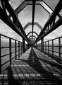
Geometry by kuarkComment: Finally something that I was expecting to see a little more of. I think I've voted on 30 in a row that were quite uninspiring. I really like this one. It reminds me of my bridge pic in a way. Nice job. 8 |
| Photographer found comment helpful. |
Home -
Challenges -
Community -
League -
Photos -
Cameras -
Lenses -
Learn -
Help -
Terms of Use -
Privacy -
Top ^
DPChallenge, and website content and design, Copyright © 2001-2025 Challenging Technologies, LLC.
All digital photo copyrights belong to the photographers and may not be used without permission.
Current Server Time: 08/09/2025 06:27:35 PM EDT.