DPChallenge: A Digital Photography Contest You are not logged in. (log in or register
 
Browse Settings
Currently viewing:
Registered Userinspzil

Show comments:

Per page:

Order:

Comments:


Comments Made by inspzil
Pages:   ... [223] [224] [225] [226] [227] [228] [229] ... [311]
Showing 2251 - 2260 of ~3109
Image Comment
acceleration
12/13/2002 05:25:01 AM
acceleration
by magnetic9999

Comment:
Great shot. I like the colors of this picture. They are very warm. Great angle used to to show quite a bit of this train. Some whch looks like it's moving very fast, and part of it looks like its standing still - Nice job - Inspzil
Photographer found comment helpful.
Wave in Motion
12/13/2002 05:22:49 AM
Wave in Motion
by waltoml

Comment:
Pretty good motion capture. It needs something though for the composition to make it complete. I feel like it is too colorless and could use a person or a pet - Inspzil
Liquid stick shift
12/13/2002 05:19:26 AM
Liquid stick shift
by kosmikkreeper

Comment:
If this wasn't so grainy I'd consider it one of the top 3 for this week. Good pic - Inspzil
Tight Race
12/13/2002 05:17:20 AM
Tight Race
by jimmyn4

Comment:
This is a nice pic. I'm not sure how well it depicts motion though. I guess I'm expecting to see some wake or some other sign of either of the boats moving. I see something in the water that might be on the left boat - Inspzil
Photographer found comment helpful.
Light Speed
12/13/2002 05:14:30 AM
Light Speed
by jenarom

Comment:
NIce shot. The tie fighter is really clear. The motion is well captured, even though I don't think it's moving. Great job. - Inspzil
Photographer found comment helpful.
Waves of my heart
12/13/2002 05:12:01 AM
Waves of my heart
by monrf

Comment:
The color on this is really drab. It could use a little brightening and some boost of saturation. I don't like the way it's framed either. It goes uphill considerably from L to R. - Inspzil
Too much candy before bedtime!!
12/12/2002 06:50:19 PM
Too much candy before bedtime!!
by evmariedogs

Comment:
Too dark. Maybe iron your background a little too. Concept is good, just the execution needs a little more refining. - Inspzil
Sitting on the Sidelines
12/12/2002 06:46:55 PM
Sitting on the Sidelines
by analogcereal

Comment:
I like this photo. The moving vs. not moving people makes the people moving look a little more... well moving. Good contrast in other words. - Inspzil
Forever In Blue Jeans, Even While I Sleep!!!
12/12/2002 01:47:54 PM
Forever In Blue Jeans, Even While I Sleep!!!
by tattoo

Comment:
Critique Club for #211 - Forever In my Jeans....

Composition - A pair of jeans on a bed with a quilt that looks like it has some denim patches. I get the name now. The biggest problem with this pic is that it is a little drab. The colors are not really standing out at me. The lighting is really flat. The only part of this picture that gives any sense of depth is the folded over leg. A little dramatic lighting might help this photo. The composition doesn't have anything to really grab the viewer.

Background - N/A

Camera work - Nothing fancy. Nothing bad either. Pretty run of the mill shot. No lighting tricks or fancy exposures.

Processing - A little more saturation on the blues would help a little. There is nothing that really NEEDS to be done to this though.

Overall - The bottom line is that this is not a terribly interesting picture. It is taken pretty well but seems to be lacking any lighting or other effects to make it intriguing or emotive to this viewer. - Inspzil
Old, Yet Reliable
12/12/2002 01:44:45 PM
Old, Yet Reliable
by sjgleah

Comment:
Critique Club #165 - Old Yet reliable

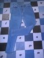
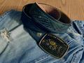
Composition - A belt and some nice "broke-in" blue jeans. I'm not sure what the title is referring to exactly here, but I'm going to think that it's the jeans. I don't see anything here that is bothering me, but also nothing that is intriguing. I don't know how to say this any different, but as much as it pains me to say this, this photo is just not terribly interesting to me. The lighting could be a little more dramatic for effect. As it is the lighting is pretty flat.

Background - The only background is this little bit of table underneath the jeans. This is pretty neutral and is not terribly distracting or anything. The only idea to change this at all is to put a bright colored flannel shirt or something western underneath it to provide a little more color to the picture but nothing neon fluorescent as to distract from it.

Camera Work - Focus, DOF, lighting all seem to be pretty good. I don't know of any other way to frame this differently. This looks pretty good to me.

Post-processing - I might have boosted the saturation a little to make it stand out a bit more, or even darkened it a little to make it a bit more dramatic, but really doesn't NEED anything done to it.

Overall - For reference purposes, I finished 157th probably for the same reason I've listed here- My subject wasn't terribly interesting. The alternative I've thought of to make this a more effective picture would dramatically change the composition of the picture. Most of them have to do with perspective changes. I apologize for not being more helpful here. - Maybe I can be more helpful in the future - Inspzil
Pages:   ... [223] [224] [225] [226] [227] [228] [229] ... [311]
Showing 2251 - 2260 of ~3109


Home - Challenges - Community - League - Photos - Cameras - Lenses - Learn - Help - Terms of Use - Privacy - Top ^
DPChallenge, and website content and design, Copyright © 2001-2025 Challenging Technologies, LLC.
All digital photo copyrights belong to the photographers and may not be used without permission.
Current Server Time: 08/13/2025 11:38:05 AM EDT.