| Image |
Comment |
| 12/27/2002 09:04:37 AM |
|
 Photographer found comment helpful. Photographer found comment helpful. |
| 12/26/2002 09:25:53 PM |
|
| 12/26/2002 09:25:08 PM |
Four colorsby ivanaComment: Looks oversaturated, especially on the red piece. - Inspzil |
| 12/26/2002 09:11:43 PM |
4by ndsComment: this is the most creative one I've seen so far. Nice job - Inspzil |
| Photographer found comment helpful. |
| 12/25/2002 11:54:40 PM |
|
| 12/25/2002 11:50:55 PM |
|
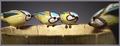
| 12/25/2002 11:47:43 PM |
Four Calling Birdsby daysezComment: I don't like the bird nearst the camera. Its more that he's much darker than out of focus. - Inspzil |
| Photographer found comment helpful. |
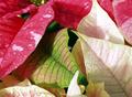
| 12/21/2002 09:19:53 AM |
greenhousejumbleby undieyatchComment: Critique Club for Greenhousejumble
Composition - This array of leaves leaves me looking for a real focal point. I think one of the red plants with the white spots would've been an effective focal point, placed where the green leaf is. The general arrangement is good, not too much open space between stuff. I don't like the shadow on the bottom right. The white leaf at the top right has a little burned out spot, but nothing major.
Background - N/A
Camera work - This picture might be better with just a hint less exposure. I also might have tried to make the crop not quite so tight. Other than that, it looks good to me.
Post-processing - I think the colored leaves could use a little more saturation to make the colors stand out better. As is though, there isn't anything wrong with it.
Overall - This is a nice picture. It doesn't have that WOW factor to it. Boosting the colors would help that a little, but I think finding that one unique plant amidst all the more "normal" looking plants would add to the visual appeal. The concept has potential but the composition would have to change some to give it some focal point for the viewers. - Inspzil
|
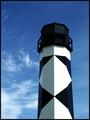
| 12/21/2002 09:07:09 AM |
Light Towerby FrooberComment: Critique Club for Light Tower
Composition - Really unique lighthouse. This is a great subject for a picture. It is really well taken and really well framed. The thing I like most about this pic is the light/shade contrast in the diamonds. I think I would've liked to have seen the bottom of it if the landscape was friendly enough to allow for that.
Background - Hard to go wrong with a nice blue sky like that. Polarizer? It looks like it to me. The sky is sort of dark blue which may be from the polarizer or just the time of day. It looks a little unnatural to me above the lighthouse.
Camera work - Couldn't be better
Post processing - Maybe a little work with the blue to make it look a little more like sky.
Overall - I really liked this picture when I saw it, and still do. You picked a great subject to shoot and did a nice job with it. The only thing I would change would be to move back a little and get the entire lighthouse with a little background stuff. I think it might add a little more color and verve to the image. - Inspzil |
| Photographer found comment helpful. |
| 12/20/2002 05:00:12 AM |
|
| Photographer found comment helpful. |
Home -
Challenges -
Community -
League -
Photos -
Cameras -
Lenses -
Learn -
Help -
Terms of Use -
Privacy -
Top ^
DPChallenge, and website content and design, Copyright © 2001-2025 Challenging Technologies, LLC.
All digital photo copyrights belong to the photographers and may not be used without permission.
Current Server Time: 08/14/2025 09:56:24 AM EDT.