|
|
|
Showing 1801 - 1810 of ~3109 |
| Image |
Comment |
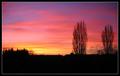
| 02/11/2003 04:53:23 AM | Winter Sunsetby ManicComment: Greetings from the Critique Club
by Inspzil
Composition - This wonderful sunset is all about color. The couple trees that are silhouetted are not the most picturesque trees on earth, but they add a little something extra to the picture so it isn't so flat. This must've been a tough one to get though, I didn't think the sun was scheduled to make an appearance in the UK till late April :o) The one thing I think this picture lacks is R-L balance. I'm not sure if thats a personal thing or not, but my eyes won't let me get past it, so I'll mention it. With the 2 tall trees plus a little extra on the right, I'm looking for some offset on the left, even if it's not as tall as the stuff on the right. It isn't really there to the degree I expect to see though with a little foliage slightly above the horizon. The buildings in the center are not helping anything, but aren't really hurting either. But like I said before, this picture is really all about color.
Photography - Exposure is perfect. The thing that I can't seem to get right on some of these pics that I take is the white balance. This one seems to be right on the money. Everything else seems fine.
Processing - Looks good to me. The colors look great here. If you did mess with them a little, it doesn't show.
Overall - This picture is the definitely cliche. It's a very nice calm peaceful picture with outstanding colors. The balance thing to me is the only thing I think could be improved on the picture really based on the things that are already silhouetted in this picture. I think if you had only trees and no buildings with a couple prominent nice shaped trees, it would improve it maybe a little, or maybe a lot. As it is though, it is still a really nice pic. - Bob |  Photographer found comment helpful. Photographer found comment helpful. |
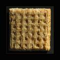
| 02/09/2003 11:30:05 PM | The Almighty Triscuitby bdshortComment: Greetings from the Last Minute Critique Club
by Inspzil
Composition - As a longtime fan of the Triscuit, I'll say that it is one of the best crackers on the market still and with a can of easy-cheese is one helluva snack. The composition is simple, uncluttered but detailed in the depiction of every minute detail in the cracker. There were a number of ways to depict the cracker in terms of angles, but you chose the direct straight on approach probably having something to do with the challenge title. The part of this picture I like the best is the lighting and exposure. Masterfully done.
Photography - Every grain of salt is accounted for on this one. Great crisp clear macro, and again, the exposure is excellent
Processing - Doesn't look like much was done with this. Which, if you did do a lot, is quite a compliment.
Overall - Simple, basic. I think you maximized your score with the subject you chose to use. I think nabisco should consider this shot on the front of its boxes. Well done - Bob
|
| 02/09/2003 10:54:32 PM | Skylightby KonadorComment: Greetings from the Critique Club Ben
by Inspzil
Composition - There are 2 things that sell this shot. The first is the color of the sky, the second is the framing. Angle has a little to do with that as well. The lightness around the window is a good lead-in to the scene behind the glass, which is fantastic, real or not. A lot of negative space around the window which I think is a matter of taste. I don't like it as well as I think you and others do. Probably explains a lot of why you got a 6.5 on this challenge and I got a 5.2. Well done!
Photography - Looks like I'm looking out my own window, except probably clearer since my spectacles are a little outdated in their prescription. Very very well taken picture and sharp as can be. Exposure is great.
Processing - Perhaps a little more of the bottom cropped to lose the crease in the wall going horizontally under the window, but aside from that, masterfully done.
Overall - A very solid shot all around. Great subject, well taken with great perspective and a good lead in with the light around the windows and a fabulous sky. Use of negative space makes this seem simple without distractions of any sort. Very well executed shot. - Bob | | Photographer found comment helpful. |
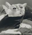
| 02/09/2003 10:30:26 PM | Laid Backby sahkoComment: I have a cat about this color, and just a little bit bigger. Definitely a personal favorite of this challenge. Very adorable, and a good picture to boot. I might have tried to take this with greater DOF if at all possible. - Inspzil | | Photographer found comment helpful. |
| 02/09/2003 10:29:08 PM | |
| 02/09/2003 10:24:00 PM | kabuki noren or curtainby kenboComment: Greetings from the Critique Club
by Inspzil
Composition - Being half Japanese, I can appreciate this kind of curtain. I've had a couple of them and I'm sure I still have them packed away somewhere. This is a little less ornate than the ones I have, but no less interesting. The first thing I notice is that this is not hanging very straight. There are large wrinkles that show around the perimeter of the curtain. Mine were quite stiff and would wrinkle only if kept improperly. The bigger problem with this composition is that it really is just someone else's art. There are ways to portray this as part of the composition but I don't think that's been done here. It can be something as subtle as the angle of the photo or the lighting. But this is flat lighting, flat curtain, and flat picture.
Photography - Well taken. Nice and sharp with adequate exposure. DOF is not an issue.
Processing - If there was any, it is very little and is well done
Overall - I don't like this kind of picture, which pains me because I do like these curtains quite a bit. If it were more than duplicating the image on the curtain, I think I would feel different. But this is a catalog type portrayal of the curtain and I don't feel that it is an appropriate subject for a challenge like this. I admit that I am a bit biased in this way, but I believe that as photographers we have some unwritten rules we follow every time we pick up the camera. This is one of mine. - Bob |
| 02/09/2003 10:49:22 AM | emotional distanceby jurasComment: Great DOF and nice color. I think you've done as well with these subjects as you can. Nice job - Inspzil | | Photographer found comment helpful. |
| 02/09/2003 10:48:26 AM | Look here dammit!:-)by ParentxComment: You've dumbfounded me with this shot. Not what I was suspecting. THat's one way to get the cat's attention! Wouldn't have recommended the negative thing. Makes it look more sadistic than it already does. |
| 02/09/2003 10:46:24 AM | Yellow tulipsby kiwinessComment: Vivid color. Great macro. Wouldn't surprise me to see this in the top 10 one bit. THis picture has a real softness to it that I wish I could give my photos. Nice job - Inspzil | | Photographer found comment helpful. |
| 02/09/2003 10:43:02 AM | Cowboy Photographerby sherComment: Not gonna get any flash on THAT pic. Cute snapshot. One to put in the album and treasure. | | Photographer found comment helpful. |
|
Showing 1801 - 1810 of ~3109 |
Home -
Challenges -
Community -
League -
Photos -
Cameras -
Lenses -
Learn -
Help -
Terms of Use -
Privacy -
Top ^
DPChallenge, and website content and design, Copyright © 2001-2025 Challenging Technologies, LLC.
All digital photo copyrights belong to the photographers and may not be used without permission.
Current Server Time: 08/18/2025 07:08:38 AM EDT.
|