|
|
|
Showing 1791 - 1800 of ~3109 |
| Image |
Comment |
| 02/15/2003 10:45:44 AM | Candid Shoe Tieby Hotshot132Comment: Greetings from the Critique Club
by Inspzil
Composition - My first impression is that this is a candid snapshot. The background is really cluttered and the light is probably coming out of a window near a table. The light is very nice and soft. If she wasn't hunched over her knees, her expression and the lighting provided would have made an outstanding portrait. Actually it is a very nice picture, but I don't really think its challenge material. That's just one person's opinion though. Where are the shoes she's tying? I guess we'll just have to take your word for it.
Technical - Not a badly taken photo aside from the arm that is probably moving to tie the shoes. Its nice and clear and properly lit. Exposure is good. Processing stuff really isn't too much of an issue
Overall - A nice snapshot, but not really challenge worthy stuff IMO. Actually not that far away from it though. The background is really a killer on this photo. Sorry I don't have too much to say about this. Honestly I think its not far away from being really good. - Inspzil |  Photographer found comment helpful. Photographer found comment helpful. |
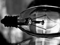
| 02/15/2003 09:49:36 AM | Tungstenby theonlysilentbobComment: Greetings from the Critique Club
By Inspzil
Composition - Good subject, I'm not so sure its good for this particular challenge, but for the purposes of discussion we'll say it is. Firstly, I don't like the mirror underneath. I think over white or grey would've been more effective. There's too much background shadows and stuff. The simplicity of the bulb should've really taken to the forefront and that cannot be effective in such a cluttered environment. The photo has some noise stuff happening in the left bottom corner that I see and have no idea what it could even be. But I think whatever it is, it should be somewhere besides posing for a photo. The black and white choice was a good one though. If it were me, I would've tried to frame this so the bulb was pretty much taking up the whole pic and shot it so it went corner to corner. I would've included the whole bulb as well. This strangely reminds me of an old x-ray film or something.
Technical - Focus is a huge issue with this pic. I could seeing being okay a little soft, but better sharper. I think the focus is what reminds me of old x-ray films. I think the lighting and the exposure of this pic are what really make it unique and really work for the pic well. Maybe a tripod would've helped as the shutter speed is fairly slow. As previously mentioned, I like the black and white.
Overall - The lack of focus and framing really hurt this picture. The background being too busy is also a contributing factor. This subject could make a good image, but it needs some refining and maybe some replanning. Good luck in future challenges - Inspzil |
| 02/15/2003 08:52:44 AM | Mirror? Twin? Your Guess!!!!by RaindropComment: Greetings from the Critique Club -
By Inspzil
Composition - Nice color on this pair of birds. I like the way they are arranged, looking like parakeet conjoined twins at the beak. The general composition is pretty good, the only thing I don't like is the really tight crop. It would be a little better if they weren't so crowded at the top of the pic.
Technical - This picture would've done much much better if it were just a little sharper. It's not bad, but anything but perfect on something like this with this much detail, like the feathers, is certain to bump you down a couple notches here on dpc. It may be from compression as much as anything else. The shutter speed at 1/50s may have some part of that too. I don't know why it needed to be that long with the flash firing. I prefer not to use flash unless I absolutely have to, but this picture looks like it couldn't have been taken without it. In terms of processing, it looks like you could've tried to sharpen the pic a bit to give it a little better appearance. It may have added a little noise but sometimes you gotta take the good with the bad.
Overall - Not a bad picture by any means, and actually a pretty good concept. I'm a little hesitant about calling this cliche, but I could see where that's coming from. The photography end of it is where this photo could use the most improvement. Maybe a tripod would've been more effective. Giving the birds a little more headroom in the pic would be better as well. Good luck in future challenges - Inspzil |
| 02/14/2003 02:30:25 PM | Kiraby RemieComment: Greetings from the Critique Club
By Inspzil
This is one of the most unique images I've seen on DPC
Composition - A little ankle biter dog holding something in its mouth. I don't know what the something is, but it doesn't really matter. I can kind of see where you are going with this image, and I think you were on the right track (if I'm thinking a little like you). I picture in my head a little dog's face and the rest of him fades into the light. Firstly, we need to see the whole dog's face for this to be effective. I like the background blown right out, it makes it uniform, but the face particularly around the muzzle being blown out is a pretty costly thing, scorewise. The trick is to keep that colored I think. This image has definite potential, but when working with animals or kids, you get limited to how well they want to sit still and pose and generally it isn't very long.
Technical - I'm a little befuddled by the lack of clarity in this pic. There are a few reasons why, at least in my speculation. The shutter speed is just too slow for this shot. The dog isn't dead so the potential for movement is still there. If the shot wasn't taken on a tripod, it could be camera shake. It could be a processing thing. The metering mode might not be on spot metering if it was autofocused. Maybe its just too close. I don't know exactly why, but I think these are the possibilities, in the order I think they are probable. The lack of focus is also a major major problem with this pic. The processing is very odd, as it is with anything using the curves tool in PS. I personally don't find it to be one of my top 50 useful tools in PS, but occasionally it is fun to play with a little. I think if you could've used it minimally as opposed to all out like this pic, it might have helped a little.
Overall - I think this has serious potential to be a really cool shot. The cutting off of the left eye, the washing out of the area around the mouth and the lack of focus are the major reasons. The image is very bright, as it was intended to be and could remain just as bright and be very effective if the other 3 things were fixed. Good luck in future challenges - Inspzil |
| 02/14/2003 01:07:04 PM | Faded Rose from 2002by vtruanComment: Greetings from the Critique Club
By Inspzil
Composition - Interesting choice for this challenge. Flowers are very cliche. I don't know about dead ones, but we'll pretend it fits. At this point, I think your choice of subject is probably the main reason for the not so good score. I think the background is the only real composition problem with this photo. The patterns and stuff in the background are definitely a factor there, but I'd say color is just as important. The flower doesn't contrast with the background, so it kind of blends in. Something to make it stand out of the picture (aside from the DOF) wouldve been preferred. But nothing in primary colors, or maybe even colors. I was thinking like a charcoal grey would be fitting if you were going for depressing, which is what I get out of this lifeless flower of yore.
Technical - Very well taken photo. Exposure is good, DOF is excellent, clear, sharp. Nicely done. Processing doesn't seem to be an issue.
Overall - In another challenge, this photo might have done better in terms of score. Changing the background would've helped some too. This is very well taken, so I don't think the photography was the issue in the score. Content is key, especially here. This probably threw people off after looking at flowers(live ones), kittens and babies all week long. I like it. good luck in future endeavours here and outside of dpc - Inspzil | | Photographer found comment helpful. |
| 02/14/2003 12:52:21 PM | picture perfectby Wheeler1992Comment: Greetings from the Critique Club
by Inspzil
Composition - Too much sofa. The picture is also not true to the horizon. It could use about a 1-2 degree tilt Clockwise. Probably 2. The idea is good, but it wasn't executed particularly well. I like cute stuff, I have 3 kids of my own, but I don't see a lot of potential or alternate ways to go to make this a way better pic. It looks like a picture taken with flash or something making the area around the kid very very bright relative to the rest of the wall. The "framing" no pun intended, is not particularly good. With him dead center of the other pics, and dead center in the pic, its a dead ringer for a "too centered" tag. I think the best way around this is not taking the picture from dead on, but at a bit of an angle. That also might have saved you some of the flash reflection or other light reflection on the wall. This pic is too snapshotty to do well on DPC.
Technical - This pic is not particularly clear. The bright part right around the kid is not good. A much softer light source would have been preferred with a little less exposure. This pic could've used a little post processing sharpening to help it seem a little clearer. The biggest strike against it though is that it was not taken particularly sharp.
Overall - In my opinion, this is a little humorous, a little cute, and belongs in your family album. Nothing against kid pics out of me either, just this one was not particularly well done starting from the general composition. The portrayal of this idea, though I do think it is a good idea, seems pretty difficult to adequately replicate on "film." Hope I didn't ruffle any feathers, but this is what I think one way or the other. GOod luck in future challenges! - Inspzil |
| 02/14/2003 12:36:31 PM | Weathered Perfectionby ShiiizzzamComment: Greetings from the Critique Club
By the least qualified person in CC
Composition - The second photo today I've critiqued taken in a paper bag. I'm going to remember this idea. Funky gourd. I think what makes this picture successful is the bag more than the vegetable. The gourd is cool, but its the rich color of the background that gives this photo its appeal. I think its the lighting in the bag that makes it so cool. The lighting with probably a simple overhead light is great.
Technical stuff - The photograph is pristine. Awesome color, stunning clarity and perfect exposure. If you did some processing, it was good too.
Overall - I don't have much to say. I don't know how to improve the photo. Its very good. The still-life thing is way cliche. The photography is exceptional. I even like the fold in the back of the bag. Great photo, underrated IMO. - Bob |
| 02/14/2003 12:27:02 PM | Morning has brokenby vcosmaComment: Greetings from the Critique Club
By Inspzil
Composition - Beautifully lit sky with contrasting clouds. My opinion is that this is more of an abstract. It does fit the cliche challenge because it is a sunrise, but without any subject per se, it is more abstract. I think cropping some of the grey out would not hurt this image a bit. By doing so and cutting off a little of the side with it, it gives more emphasis to the oranges and reds and not so much to the yellow and grey. Good capture, but I think with some sort of "subject" in the foreground, it would make this a much stronger image.
Technical - The camera you used is probably the best in color representation out there. The exposure is good. The picture is pretty clear and sharp. Post-processing looks like it might have really tried to favor the brilliant colors, where it might have been a little overdone. There is plenty of color here I'm sure, but this looks a bit oversaturated with colors to the point it looks almost fake. Maybe it isn't but my first impression is that it did not come out of the camera this way.
Overall - This is a pretty uneventful picture, but the saving quality is the very vivid color. I still see it as more of an abstract picture and would do very well as one. It is an intriguing pic. - Inspzil | | Photographer found comment helpful. |
| 02/14/2003 05:33:45 AM | Pretty as a Pictureby RLSComment: Greetings from the Critique Club
By Inspzil
Composition - Nicely arrange flowers for this shot. They didn't have anything more colorful? :) Brilliant colors, jumping off the page but not oversaturated. The green buds on the left side are my only complaint about the picture itself. I'm not so sure about the border but the image is a whole is very very strong except for the flower buds on the left. Not much else to say but well done!
Photography - If there was a camera just made for taking still shots with strong colors, you have it. Good crisp image.
Processing - Looks good. Color is strong but not too strong. I think cropping the buds on the left would've helped this picture possibly into a ribbon. Also good
Overall - Good good good good good pic. I don't know what else to say. Its hard for someone like me to be of much help on a pic like this. As I said many times before, crop the buds out of the left, and lose the border and you might've had yourself a ribbon. Very well taken pic. I can't believe you took the pic in a shopping bag to be honest though. Nice Job! - Bob | | Photographer found comment helpful. |
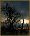
| 02/11/2003 05:18:30 AM | Sunset #16by zadoreComment: Greetings from the Critique Club
by Inspzil
Composition - Sunsets are probably the most cliche of all shots, outside of DPC. Suprisingly we don't see that many probably due to a lot of the challenge topics. The composition of this photo should have included the whole tree, and probably a little more "padding" around it. The fence post directly in front of the sun is detracting from this picture substantially. This particular sunset is not very camera friendly due to the darkness of the clouds and the brightness of the sun. I don't think this was the greatest day to be capturing a sunset. There are a lot of dark clouds covering stuff up and make this sky look a bit menacing. It doesn't have that peaceful feeling of a sunset taken somewhere like Maui.
Photography - The exposure is tough to hit on this one. Most of the photo is pretty dark except where the sun is of course, and there its ultra bright. The exposure was obviously set to that judging by the F-number and shutter speed at which the picture was shot. Its not crisp like I think it should be either which may be another side effect of exposure settings.
Processing - I'm not sure if this picture was oversharpened a little or its something else, but the branches don't look right. It may have something to do with the camera's perception of light and dark. My first impression of this though is that it was oversharpened.
Overall - The mood of this picture is not what I expect it to be with a sunset. Its very dreary for a sunset. The composition needs some refining and probably should've been taken from further back or cropped a little less tight to include the whole tree. The photo quality of this image is not really that great either, for the most part due to the difficulty of properly exposing a picture like this (if it could be done. I couldn't do it.) In all honesty and without trying to be offensive, I think you were very fortunate to pull 5.6 out of this picture. Good luck in future challenges Z. - Bob | | Photographer found comment helpful. |
|
Showing 1791 - 1800 of ~3109 |
Home -
Challenges -
Community -
League -
Photos -
Cameras -
Lenses -
Learn -
Help -
Terms of Use -
Privacy -
Top ^
DPChallenge, and website content and design, Copyright © 2001-2025 Challenging Technologies, LLC.
All digital photo copyrights belong to the photographers and may not be used without permission.
Current Server Time: 08/17/2025 10:07:46 PM EDT.
|