| Image |
Comment |
| 03/01/2003 08:52:30 AM |
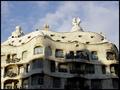
Barcelona: a city to discoverby bcncrazyComment: The shadows are killing me on this photo. Very interesting building and one that is picture worthy. The photo needs to be a little crisper too. |
 Photographer found comment helpful. Photographer found comment helpful. |
| 03/01/2003 08:50:54 AM |
Salt and Pepperby BigSmilesComment: I'm not sure how this would apply to stock photography too much, but I'll pretend it does anyway. The tight crop is not conducive to this angle IMO. I think the picture would work better from a slightly less direct angle. You could still keep the macro approach to it to some degree and still make it successful I think. I would've cleaned off the tops of them too to free them from stains and such |
| 03/01/2003 08:41:12 AM |
feeling a little under the weather these days?by tomzinhoComment: Oh boy, snow!! We've had our share. Looks like a photojournalism type pic. I think honestly its a little too dark tho. Snow is indeed white and as bad as we tend to want to tone it down so the dpc voters dont cry "washed out", its still white and I believe it should be represented that way. |
| 03/01/2003 08:37:50 AM |
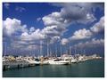
Storm Brewingby GraciousComment: Cool sky. Cool background. The boats really lack the crispness that I feel is essential in this type of shot. It is a good concept, just a point of clarity really. |
| Photographer found comment helpful. |
| 03/01/2003 08:35:53 AM |
laptopby kosmikkreeperComment: Good advertising photo here. I think the creative angle works well as well as the framing of the subject. I might've turned the laptop just a fuzz so the keyboard was at a better angle for we viewers to see tho. Nice pic |
| Photographer found comment helpful. |
| 03/01/2003 08:33:39 AM |
Think Globallyby alanfreedComment: Nice lighting and color tone choice. Not so sure I would've cropped this quite so tightly unless I was trying to illustrate one specific region. |
| Photographer found comment helpful. |
| 03/01/2003 08:30:57 AM |
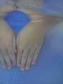
Hands Upby JeanComment: Unusual photo. I'm not sure what this has to do with stock photography really. I don't like the way the right hand is cut off either. The reflection above the hands is pretty cool looking tho. Good luck! |
| 03/01/2003 12:01:15 AM |
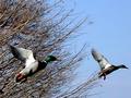
Flightby Frank BeckmanComment: Greetings from the Critique Club
By Inspzil
Composition - This is a really neat capture. I like the colors on the left duck. They seem a little underexposed but I don't think that's the case. I think they are just slightly out of focus due to their movement. They are really well framed. Both being in roughly the same position is a great touch and the biggest selling point of this photo IMO. The downside to this pic is the branches being out of focus. I think you probably would've been better off if the branches were moving a lot, then it would convey their motion better. You kinda got stuck in the in between, between a panning motion shot and a stop action motion shot where the background has to be a blur or crystal clear. Personally I think its pretty good as is, but could definitely improve if the background fit into one of the "approved" techniques on DPC. The panning shot is still under review (according to my shots anyway :) ).
Technical - This image lacks a little of the crispness that it needs. I don't feel it needs to be the clearest image we've ever seen on DPC but for the most part, voters in these parts generally frown on any less than crystal clear. The slight "underexposure" of the birds heads is probably not correctable within DPC rules. Some of the function might be a little bit due to the DOF if the camera is close to the subjects. I don't believe this to be true in this case.
Overall - I think this picture is pretty underrated. It's not a bad picture and I think it deserves a little better score. I think you took a lot of hits for the background not being totally focused which I don't think is totally justified. Unfortunately I can't change your score but I hope you found at least one thing in here that will help you on a future picture. Good Luck with your photos - Inspzil |
| Photographer found comment helpful. |
| 02/28/2003 09:53:44 PM |
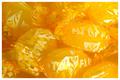
Sour Candyby RemieComment: Greetings from the Critique Club
By Inspzil
Composition - Very basic, very simple, very nice. Yellow candy.
A couple of highlights included to make it a little more vibrant too. GOod color, definitely without a doubt yellow. Looks like a good advertisement for this brand or kind of candy. I wouldn't change much about it either. Its nicely arranged.
Technical Stuff - Well taken macro photo. Nothing really of note (I can't see anything wrong with it). Yellow level looks like it might've been pushed up a little which is understandable for this challenge. Good job.
Overall - Not a bad photo really. Not terribly exciting but well taken. Would be a cough drop advertisement ideally. I think you really maximized your potential with this photo - Nice Job. Sorry I couldn't be more help to you. THere really isn't anything wrong with it. - Good Luck, Bob |
| 02/28/2003 09:40:56 PM |
Tabernacle Organby YomiComment: Greetings from the Critique Club
By Inspzil, again!!
Composition - I find this subject pretty appealing, but there are definitely some issues that I feel hurt the street value of this photo. I think the lighting being inconsistent from the bottom of the pipes to the top is a big issue. They look sort of blue on the bottom, true color with highlights in the middle, and sort of dull toward the top. The shadowed part at the top I think is the biggest sticking point for me. I'm not too crazy about the crop. I'm looking for something sort of framing them in, distinguishing these pipes from just the regular part of the wall. Its hard to tell if where they end on the pic is really the end, or just a spot where it was convenient to cut it. The pipes on the right being cut off at the top is a bit of a problem as well.
Technical stuff - Honestly, about as good as a person can take a picture. exposure, dof, focus, all there with bells on. Terrific.
Overall - The crop of this pic really leaves me hanging. This picture makes me think that its a much bigger picture, but here's the inset for the details of the pipe. It seems rather incomplete to me. The pipes are great as is the wood, but it needs something to make it whole. Interesting photo, but it lacks the visual impact it needs to be really successful - Good luck!! Bob (again) |
Home -
Challenges -
Community -
League -
Photos -
Cameras -
Lenses -
Learn -
Help -
Terms of Use -
Privacy -
Top ^
DPChallenge, and website content and design, Copyright © 2001-2025 Challenging Technologies, LLC.
All digital photo copyrights belong to the photographers and may not be used without permission.
Current Server Time: 08/18/2025 09:21:39 AM EDT.