| Image |
Comment |
| 03/04/2003 05:36:04 AM |
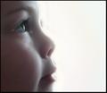
Our Futureby smellyfish1002Comment: Greetings from the Critique Club
By Inspzil
Composition - This is a wonderful shot. Very cute kid and you really capitalized on that for this shot. He has a great profile! I said a couple things in my comment during the challenge that pretty much still represent the way I feel about this. The frame should've been filled a little bit more. I think this would've help tone the lighting down a little. And the lighting is a little overpowering. I do think that it should be bright, overexposed to a lesser degree though. Tremendous idea though and honestly one that is a couple very minor things away from being a ribbon photo.
Technical - A little extra soft on the focus. I don't mind soft focus at all, when used appropriately. This is one that I think it can be very effective on, just that this needs to be a little less soft. Part of that might be the proximity of the subject to the camera. The ultra bright light cannot be helping that either. Exposure is obviously blown out purposely but I think a little too much here too. I would've toned it down just bit, but definitely kept it pretty bright.
Overall - I really liked this pic and still do. You've done a great job capturing this little guys innocence and sense of wonder in a remarkable picture. The eyes and eyelashes would sell this one in a heartbeat. Even with all the criticism here, I think this is one of the ten best from this challenge. Thanks for sharing it - Bob |
| 03/04/2003 05:22:30 AM |
Floating Aroundby GordonComment: Greetings from the Critique Club
By InSpZiL
Composition - Yet another great picture Gordon. Framing is very good. I like the corner to corner approach. I think if the heads and paddles were at the same angle, you might've won this week. The contrast between background and subject is really good and the green of the water really makes the red on the boat stand out. The water in itself is neat the way it accepts the sun on the top left and makes the frame sort of a gradient. Doesn't look like anywhere I'd want to swim though due to the odd color.
Technical - Crisp and mostly clear, only a slight fuzz on the paddles probably due to them rowing which is sort of the whole point of why they're out there so its an acceptable fuzz in my book. The exposure is perfect. The only thing I wonder about is if you cropped this pic that close to the back on purpose or if it was just taken this way. I don't see it being a huge problem, but if the back had a little more room I think it would only help.
Overall - A great example of how to take something not so exciting and transforming into a nice image. Very good capture. I really like the contrasting colors and the corner to corner portrayal of the boat in the frame. Very good shot! - Keep up the good work Gordon.
-Bob |
 Photographer found comment helpful. Photographer found comment helpful. |
| 03/03/2003 06:02:27 AM |
|
| 03/02/2003 08:02:27 PM |
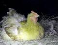
Henby GinaRothfelsComment: Greetings from the Critique Club
By Inspzil
Composition - Firstly, this meets the challenge by a thread, on a good day. That's my opinion anyway. The rooster is in pretty bad shape judging by his feathers. He doesn't look to pleased to have his picture taken either. If you took this in the day with no flash, I don't think he'd look terribly yellow. I think the flash is the biggest reason he has any yellow at all. He's framed pretty well.
Technical - The flash on his right breast is killing me. It's way too bright. The focus is okay and the rest of the lighting looks okay. Without better lighting, I think you did the best you could with what was available. Maybe during the day would've worked out better though. You could've done a little more in PS to make his color seem a little more yellow, if you didn't already try.
Overall - Not a strong picture. Not a very healthy bird by the way he looks. Doesn't have much appeal to the viewers IMO. Very hard to give much useful advice on this picture. It really just isn't challenge worthy material. Better luck next time. Sorry if this seems a little harsh. - Inspzil |
| Photographer found comment helpful. |
| 03/02/2003 07:48:51 PM |
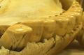
BC....Before Crestby autoolComment: Greetings from the Critique Club
By Inspzil
Composition - Cute title to go with this picture. Must be a sperm whale or some other toothed whale. Damn clear for a 1 sec exposure. Color is definitely sort of yellow. The subject is relatively interesting but unfortunately not something I would ever consider hanging on a wall in my home or garage. The detail of this photo is very good. The highlights on the tops of the teeth look great.
Technical - This is very very clear for a one second exp. but fairly shallow for f11. This may have something to do with the long exp. but I can't be sure. The white balance is probably the culprit of the yellowness of the pic. I keep blaming it for my pics anyway :) Framing is about as good as I think one can expect for a photo like this. For any other challenge BUT yellow, I would expect you'd mess with the colors a bit to make them a little less.... well, yellow. But for this challenge, it works.
Overall - Not a badly taken photo, but not a terribly interesting one. When I think, "would I hang this on my wall given any improvement that could be made were done?" The answer is definitely not as long as I am married. This is a picture that I could definitely see being used in something like a textbook though. It has some value methinks, just not as "art" in my terms anyway. Good luck in the upcoming challenges autool. - Inspzil |
| Photographer found comment helpful. |
| 03/02/2003 03:43:03 PM |
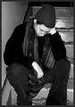
Untitledby lionelmComment: Looks like a security camera video. Reminds me of something from the crying game. I do think it shows despair and I think that the primitive look to this photo is fairly effective representing the point of the picture. |
| Photographer found comment helpful. |
| 03/02/2003 03:41:29 PM |
|
| 03/02/2003 03:39:21 PM |
|
| 03/02/2003 03:38:31 PM |
Please Help Me!by STEINRComment: Looks like they're napping to be perfectly honest. The contrast is a little too much judging by the whiteness of the hands and conversely dark clothes. |
| Photographer found comment helpful. |
| 03/02/2003 03:37:22 PM |
The Forgotten Onesby ed728Comment: Make this B&W and I bet your score would take a jump. A really good pic like this with many possibilities and much potential. Great find!! |
| Photographer found comment helpful. |
Home -
Challenges -
Community -
League -
Photos -
Cameras -
Lenses -
Learn -
Help -
Terms of Use -
Privacy -
Top ^
DPChallenge, and website content and design, Copyright © 2001-2025 Challenging Technologies, LLC.
All digital photo copyrights belong to the photographers and may not be used without permission.
Current Server Time: 08/18/2025 10:57:05 AM EDT.