| Image |
Comment |
| 03/11/2003 05:22:04 AM |
A Natural Fourby connieComment: THis is pretty good but I really don't like the large branch or vine running from the large trunk up diagonally thru the top of the 4 |
| 03/11/2003 05:17:48 AM |
A perfect three by mbardeenComment: Good lighting and exposure. The colors are nice too. I'm not sold on the framing and I think this is a little softer than it should be. Not a bad photo overall. |
 Photographer found comment helpful. Photographer found comment helpful. |
| 03/11/2003 05:15:05 AM |
|
| Photographer found comment helpful. |
| 03/11/2003 05:12:25 AM |
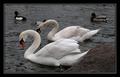
Just the 2 of usby agwrightComment: Awesome shot. Great contrast between the bird and the water further increases the effectiveness of this shot. Nice job |
| Photographer found comment helpful. |
| 03/11/2003 05:10:27 AM |
Eye of Time - [0]by rj324Comment: Great portrayal of textures and natural colors. This is especially impressive in a single piece of wood. I think the framing is good, but might improve the effect of the picture if the lighter brown circle was placed on the bottom right corner. It would give a little room for the circle to open up to. I'm not sure how to describe it exactly. Maybe I'm way off anyway... Nice shot whatever the case |
| Photographer found comment helpful. |
| 03/09/2003 08:46:54 AM |
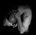
At Wit's Endby AnachroniteComment: Greetings from the Critique Club
By Inspzil
Composition - The composition of this photo is awesome. I really think this is a terrific idea and a great study of the human form. It also reminds me of something on the Twilight Zone TV show from days of yore. The hands over the back of the neck are great. The greyscale with totally black background build the mood masterfully. I wouldn't change a thing.
Technical - The soft focus works well here. This is not a photo that demands an ultra sharp perspective to be effective. I think this is where your score suffered a little, unfairly I might add. The lighting is really really good. The only thing that I might suggest for this pic at all is that the contrast be turned up a little to make the skin a little whiter and not so grey.
Overall - I think you've really done an excellent photo. I'm trying to think of reasons it didn't score better and I really can't think of anything except that it just doesn't immediately grab the viewer, but it has definitely grown on me. Great image and good luck in future challenges. - Bob |
| Photographer found comment helpful. |
| 03/08/2003 08:34:10 AM |
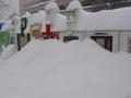
Bad Newsby brianedenComment: Greetings from the Critique Club
By Inspzil
Composition - Wow that's some serious snow!! I live in Michigan and we get our fair share too. We haven't had a lot this year, but it has been exceptionally cold. Oh wait, I'm doing a critique....sorry forgot.
The subject matter in this particular photo does not lend itself very well to the despair challenge. I think the snowy situation is inconvenient, but its difficult to judge despair without a more animate subject. In any challenge, I think this subject doesn't have the "WOW" factor we are constantly seeking. It's a little to busy in the background to be totally effective. The picture is pretty dark and I have mixed feelings about that. I think that it does add to the despair mood, but that it takes away from the overall picture quality.
Technical - Maybe the contrast could be boosted a little so it wasn't quite so grey. The photo seems to be pretty well focused. It does however seem a little underexposed. Snow shots are difficult to properly expose. A little higher EV and I think you could get the dreary feeling without being quite so dark. By turning the contrast up a little with the current photo, I think you'd see about the same effect.
Overall - Not a particularly good photo for this challenge. I think the photo is a little dark overall but not badly taken. Hope this was helpful for you. GOod luck in future challenges. - Inspzil |
| 03/08/2003 08:14:05 AM |
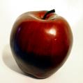
1 appleby boyte1Comment: Greetings from the Critique Club
By Inspzil
Composition - Good choice of subject for stock photography IMO. I think the simple aspect of this photo makes it very suitable. The subject is very centered in this photo and I think it has to be. You might have left a little more room at the top and bottom of the photo though. I don't like the little blue dot on the left side of the apple. It is pretty distracting and I can't think of what would cause it. This background might be a little light. I'll elaborate more in the technical section.
Technical - Most of the problems that I see with this picture have to do with exposure. The bottom half of this apple looks black. It is really underexposed IMO. I think the light needs to be brighter and moved perhaps a little more to the right judging by the highlight. I think with the background being so light, it would be difficult to properly light and expose this photo so as not to wash the background out or leave the apple dark. If the exposure was more the background would most likely was out. This might be a good place to use the grocery bag background trick. I think with that dark a background you could effectively light the subject and not wash the background out. As it stands I feel the apple is underexposed. The focus is good. The crop is a little too tight.
Overall - I like the simplicity of this photo and I think it meets the challenge. The pic needs a little less contrast so that the exposure could be increased without fear of washing the background out. The crop could leave a little more room on top and bottom. Hope this has been helpful to you. Good luck in future challenges Boyte - Bob |
| Photographer found comment helpful. |
| 03/08/2003 07:57:10 AM |
Wrestling With Coffee Addictionby SwashbucklerComment: Greetings Swash from the Critique Club
By Inspzil
Composition - Very unorthodox depiction of despair. I'm not real sure this meets the challenge as it was intended, but we'll say it does for the purposes of discussion. The expression is the first thing I notice and its good for this challenge. I'm a coffee-holic also so I can relate. I'd be wrestling with the EMPTY cup though. The background needs to be smoothed out, or not so brightly lit. The bright light on the bottom left corner really makes the wrinkles in the background stand out. The hand is also very brightly lit. I think the intensity of the lighting on the subject's face is pretty good, but it's generally too bright on the left side of the picture where I'm guessing the lighting source was held.
Technical - I think this photo was pretty well taken actually. Most of the problems I feel are due to the lighting. The exposure of the subject is pretty good though on the face and for this particular challenge a little on the dark side is probably beneficial. Processing stuff doesn't seem to be too much of an issue on this picture.
Overall - A humor photo more than a despair one. I think the lighting is the source of most of the other problems with this picture. The background needs to be smoothed out a little more as well. I'm not particularly fond of this photo for this challenge. I think there are other challenges for which it would be more appropriate. Good luck swash on future challenges. I look forward to your comments. - Bob |
| Photographer found comment helpful. |
| 03/08/2003 07:35:32 AM |
dying loveby tremeComment: Greetings from the Critique Club
By Inspzil
Composition - The single rose dying isn't really the greatest representation of despair, but for purposes of discussion, we'll say it is, for now. The framing of the picture is pretty good. There are several problems with this picture though. The picture is so small, something I don't recommend. The background is not terribly attractive either. There is something up in the lefthand corner that is pretty distracting.
Technical - The flash ring around the subject is not a good thing to have. The reflection on the table from the flash or other means of lighting is equally unsightly. The picture is not very well focused and that's one of the "don'ts" if you will of the DPC voters, sometimes even if it is on purpose. It definitely would've benefitted you to take this photo with ample light where the flash was not necessary or if you didn't use the flash, a tripod to hold the camera still. With the shutter speed as slow as it is, it is possible that you didn't use the flash and had other means of lighting. I have to think that little if any post processing was done to enhance this image. I think that the sharpen filter in Photoshop would've helped some, but not to the degree this photo needs to be sharpened. The color levels seem pretty good for the rose.
Overall - This is not a strong photo and was voted accordingly. I strongly suggest using something for a background like a posterboard or a piece of cloth. I've seen some excellent results from a grocery bag as a background. The next thing to tackle is the lighting so that the flower is amply lit without the reflections off the table or a ring around the flower. Sharpness and clarity of pictures is a must on this site the greater majority of the time. Perhaps a tripod would have been good if you didn't use one this time. The shutter speed is pretty slow to try to successfully handhold the camera still enough.
I hope this critique is helpful to you. Good luck in future challenges. If you have any questions or concerns about this PM me if you want to clarify anything or have me further explain something.
Inspzil |
Home -
Challenges -
Community -
League -
Photos -
Cameras -
Lenses -
Learn -
Help -
Terms of Use -
Privacy -
Top ^
DPChallenge, and website content and design, Copyright © 2001-2025 Challenging Technologies, LLC.
All digital photo copyrights belong to the photographers and may not be used without permission.
Current Server Time: 08/18/2025 03:02:21 PM EDT.


![Eye of Time - [0]](https://images.dpchallenge.com/images_challenge/0-999/73/120/Copyrighted_Image_Reuse_Prohibited_13773.jpg)