| Image |
Comment |
| 04/01/2003 12:58:44 PM |
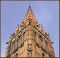
Symmetry Repeatedby LustreComment: This is a very nice image. I think intensifying the blue in the sky a little would really help to bring the colors out on the building |
 Photographer found comment helpful. Photographer found comment helpful. |
| 04/01/2003 12:56:29 PM |
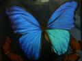
South American Butterflyby rickhd13Comment: Not terribly symmetrical. I think showing the butterfly true to vertical would improve the appearance. The image is not very clean either... there seems to be some noise on the window. The right wing is also quite a bit lighter at the bottom than the left one (I'm sure you've heard that a million times). The colors are beautiful, but the general image needs to be honed a bit to look a little more finished. |
| Photographer found comment helpful. |
| 04/01/2003 12:53:01 PM |
So Sadby jeeperComment: Nice Take on this strange photo. Good symmetry. The focus looks just a fuzz off but overall, I think it has little impact on the theme of this photo |
| 04/01/2003 11:43:28 AM |
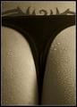
Seductive Symmetryby AnastasiaComment: <----------Male. 10
No really its a good concept and very well taken. I'm not giving it a 10, but I will give it a 7. The tattoo brings asymmetry with it. Very very nice. |
| Photographer found comment helpful. |
| 04/01/2003 11:40:26 AM |
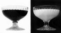
Green Green Glass Of Homeby MonaComment: Good title! The lighting is a bit too bright. I think the crop could've shaved off the top of the glasses at the bottom. |
| Photographer found comment helpful. |
| 04/01/2003 11:38:38 AM |
Black & Whiteby WILDBLUEComment: This looks like the negative vs. the symmetrical. a nice concept still and I like the style that this was taken. It looks like its from the '20s or something. Good image but not really symmetrical |
| Photographer found comment helpful. |
| 04/01/2003 11:34:04 AM |
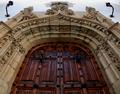
Front Doorby Pep VentosaComment: Great perspective. Love the color of the doors. Symmetry is good as well. |
| Photographer found comment helpful. |
| 04/01/2003 11:30:11 AM |
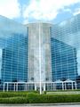
Architectural Harmonyby JeileenComment: A little bright. Maybe the contrast could be turned up a bit or the brightness down, or some combination of the two. Great Symmetry. Very nice image - 9 |
| Photographer found comment helpful. |
| 04/01/2003 11:21:56 AM |
Symmetricatby cathysappComment: Great idea. A bit flat with the lighting and a little too much stuff going on in the background. The reflection is suprisingly a little blurred too. Real close to being a very good image. |
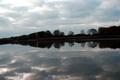
| 04/01/2003 11:20:10 AM |
Nature's Mirrorby rogerspaulComment: This looks very similar to my shot. Its sort of running downhill from right to left which I think affects this picture some. The trick that I did was I flipped mine upside down, so the "water" as it appears is really really clear (because it's really the sky). Actually I turned it 180 degrees and then I flipped it about the horizon. Good image though |
| Photographer found comment helpful. |
Home -
Challenges -
Community -
League -
Photos -
Cameras -
Lenses -
Learn -
Help -
Terms of Use -
Privacy -
Top ^
DPChallenge, and website content and design, Copyright © 2001-2025 Challenging Technologies, LLC.
All digital photo copyrights belong to the photographers and may not be used without permission.
Current Server Time: 08/24/2025 04:49:45 PM EDT.