| Image |
Comment |
| 04/04/2003 09:46:09 AM |
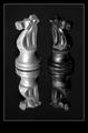
Black & Whiteby arnitComment: I'm glad I wasn't the only one thinking chess when it came to this challenge. I didn't use any of those pics, but I was thinking about it. Good reflections and nice clear shot. A bit cold I think but overall good |
| 04/04/2003 09:44:29 AM |
A leafby victorfComment: Tremendous macro. Great clarity and color. You must've backlit this, it looks awesome. The framing is great too. I like the corner to corner flow of the photo. -9 |
| 04/04/2003 09:42:51 AM |
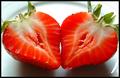
Heartsby pitsamanComment: Good idea and well shot. I wouldn't have cropped this so tight. Awesome colors and pretty good clarity. overall a really nice shot |
 Photographer found comment helpful. Photographer found comment helpful. |
| 04/04/2003 09:40:51 AM |
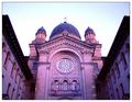
Mother Houseby mariomelComment: Outstanding color and clarity in this photo. Nice symmetry to boot. Perfectly framed. My only complaint is that the sky is stark white. Looks like it was trying to get blue on the edges, but unfortunately is mostly white. Great photo though - 9 |
| Photographer found comment helpful. |
| 04/04/2003 09:38:22 AM |
Symmetry in Natureby gigi922Comment: The lighting on this photo is very flat. This looks more 2 dimensional than it is. THe colors are nice and the framing isn't bad but the photo needs some depth and I believe lighting is the way to achieve that. I also don't like the little white things in the center of the flower. |
| 04/04/2003 09:35:52 AM |
rainbowby KAOSComment: Personally I don't see this as symmetry. It is a very well taken colorful cheery photo though. My compliments to that, but in regards the challenge, I don't feel this is a good example. |
| 04/04/2003 09:34:19 AM |
From Caos: Balanceby EJComment: Interesting lighting effects. The photo has a very grainy appearance to it that really turns me off to it. It looks like it was taken thru a window screen. The star filter effects look almost fake because they aren't 6 or 8 pt. filters. I can't say I've ever seen a 7pt. filter. This is a good idea for a pic but needs some work on the execution of the pic |
| Photographer found comment helpful. |
| 04/04/2003 09:30:53 AM |
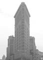
The Flatiron Buildingby tomzinhoComment: Interesting design of a building. I like the old look to the photo. It looks vintage '50s all the way. Pretty good symmetry too. |
| Photographer found comment helpful. |
| 04/04/2003 05:50:44 AM |
Double Takeby snsComment: Very well done by the model. Very well done indeed. The photo is way too noisy probably from the long exposure and slightly overexposure. Even with that it is a nice photo |
| 04/04/2003 05:49:02 AM |
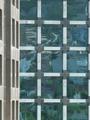
Reflextionsby bmarquezComment: This photo needs more contrast for sure. I'm not really seeing the symmetry part either. If it were supposed to be the windows, I'd have cropped off the side of the building on the left.
|
Home -
Challenges -
Community -
League -
Photos -
Cameras -
Lenses -
Learn -
Help -
Terms of Use -
Privacy -
Top ^
DPChallenge, and website content and design, Copyright © 2001-2025 Challenging Technologies, LLC.
All digital photo copyrights belong to the photographers and may not be used without permission.
Current Server Time: 08/25/2025 02:04:33 AM EDT.