| Image |
Comment |
| 04/07/2003 04:50:50 AM |
|
 Photographer found comment helpful. Photographer found comment helpful. |
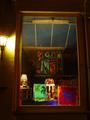
| 04/07/2003 04:49:13 AM |
Night walkby kblmComment: Nice colors, just needs to be a little clearer |
| Photographer found comment helpful. |
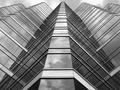
| 04/07/2003 04:48:24 AM |
Melbourne Skyline by GordonComment: This is a remarkable shot. I have no freakin' idea how I placed ahead of this shot. This blows me away, really. I think my during the challenge comment says it all. Congratulations on a terrific shot and a ribbon! - Bob |
| Photographer found comment helpful. |
| 04/07/2003 04:41:51 AM |
|
| Photographer found comment helpful. |
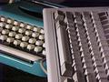
| 04/06/2003 11:20:46 PM |
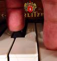
A 'Key' Advancementby ChuckieComment: Greetings from the Critique Club
By Inspzil
Composition - Actually a very interesting photo. I like the way you compared the old finger buster to the newly improved electic typewriter. The photo is grainy and not the clearest. You know, honestly I think I like it this way as a real throwback to something you'd see in life magazine in the late 60s when "Kodachrome" was becoming really popular. The colors are really good and very reminiscent of the era (although I'm not that old). I personally think it is well done (if your intentions were to make it look old).
Technical - This all has to do with the intentions part. If it was not supposed to be clear, then I think its slightly out of focus. If it was not supposed to be grainy, then I think the ISO was too high and you could have used a lower ISO and more light. DOF is good and the framing is really wonderful.
Overall - I think this is a great throwback photo to days of yore when the electric typewriter was the thing that was going to keep 50,000 secretaries from battling carpal tunnel syndrome. I think this photo is really underrated. Maybe I'm one of the few who understand it? Well done. At least if no one else thinks so, I'll go on the record and say I like it. Good job. - Inspzil |
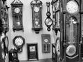
| 04/06/2003 11:13:31 PM |
Time on Saleby clues56Comment: Greetings from the Critique Club
By Inspzil
Composition - The first major photographic faux pas here I see is that the photo is not level with the horizon. This is especially troubling to photos where there is some substantial reference to what the horizon is, namely the pegboard in the back. The other thing I think is that too much was included in this pic. I'd have chosen one good corner and really focused on 6 or 7 clocks there where you could have a little control over their reflections in their faces. There is much potential here for good shots. There is a lot of potential for this shot to be good. Great subject(s) for this challenge. The only part I don't like in terms of what's in the picture is the grandfather clock on the right side with the bad reflections of the fluorescent lights in the face.
Technical - As far as photographic skill, its pretty well taken. The focus is off slightly. I think the angle could've been better and just choosing what to shoot could've been better. It isn't bad like this though. I like the exposure and DOF. It looks great in black and white too.
Overall - The score is probably lower than I would expect. Some folks are really picky about true to the horizon (I am too). I think in this case it would've made a pretty substantial difference in your score. Maybe 5.3-5.5 area in lieu of 4.8ish. A little better focused and it would've made just that much more of a difference. All in all I think you had the right idea, just maybe needed a bit more time to hone the shot or a little help in properly editing it so it wasn't so off kilter. Not bad though. Good luck in future challenges - Inspzil |
| 04/06/2003 12:09:38 PM |
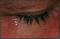
Overcomeby spidermanComment: Greetings from the Critique Club
By Inspzil
Composition - I think first off that this is too tight of a crop. The glistening all over the face is highly distracting. It doesn't look wet, it looks sort of oily and weird, like it shouldn't look like that. The tear itself is pretty believable. I would've left the damp towel off. I think most tears fall from the ear-side of the eye, or at least my kids do. Not being critical of that, just making an observation. Unfortunately this is showing a tear, not really any emotion. What if you called it "dicing onion?" The title would still fit the picture, but not the challenge. I think the tear is associated with emotion, but does not exemplify it.
Technical - Crop is too tight. Lighting needs a little boost. Focus and DOF are pretty good. Looks like you did a lot in PS. Doesn't really show. Which = good job with editing.
Overall - Not really a true display of emotion. i think it would've been more meaningful to have the facial expressions present to sort of justify the tear. Hope this will give you a little insight into what I'm seeing. Good luck in future challenges. - Inspzil
|
| 04/06/2003 11:46:12 AM |
|
| Photographer found comment helpful. |
| 04/06/2003 11:12:35 AM |
|
| Photographer found comment helpful. |
| 04/06/2003 11:06:52 AM |
Untitledby amonteforteComment: Excellent macro. Not sure about the framing, but I do really like the colors and the DOF of this shot. Nice idea |
Home -
Challenges -
Community -
League -
Photos -
Cameras -
Lenses -
Learn -
Help -
Terms of Use -
Privacy -
Top ^
DPChallenge, and website content and design, Copyright © 2001-2025 Challenging Technologies, LLC.
All digital photo copyrights belong to the photographers and may not be used without permission.
Current Server Time: 08/25/2025 07:54:06 AM EDT.