| Image |
Comment |
| 04/09/2003 10:28:00 PM |
Are you colour-blind?by ParentxComment: Um YES to that question. This is the best color photo I've seen yet. I can imagine seeing this for an add somewhere in a magazine for outerwear or Ray Ban or something like that. Nicely done. |
 Photographer found comment helpful. Photographer found comment helpful. |
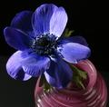
| 04/09/2003 10:26:26 PM |
Black and Blueby RgoldComment: Good color and dramatic lighting. Light could've been just a hare softer though and I'm not really sold on the vase either. |
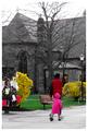
| 04/09/2003 10:25:38 PM |
On Locust Walkby JPRComment: Nice candid shot. I like the colors, but I think a better day would've done you well. The sky is very colorless. |
| Photographer found comment helpful. |
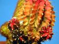
| 04/09/2003 10:24:14 PM |
Cactusby pikytoComment: Good colors with this one and interesting subject. DOF needs to be greater to make the whole thing in focus, or at least the red part on the bottom right side of the pic. |
| 04/09/2003 10:23:26 PM |
The Path of Loveby fas-ligandComment: Should've did this one for candy instead of color. I'm sure you've heard that a million times. Not wild about the idea. Photo is pretty good though. |
| Photographer found comment helpful. |
| 04/09/2003 10:22:29 PM |
Carnationsby PHOTOCHlXComment: Flat lighting makes this look like a funeral piece. The highlights on the greens surrounding the flowers are unsightly as well. Good subjects for this challenge really, but not particularly well executed. |
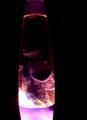
| 04/09/2003 10:21:05 PM |
Purple Light Studyby AnnidaComment: I think the majority of this photo is underexposed to the point of being unrecognizable. The angle that this photo was taken at could've been from the bottom up and helped shed a little light on the top of this. Maybe just better timing as far as where the lava was at the time the photo was taken. |
| Photographer found comment helpful. |
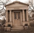
| 04/09/2003 10:18:58 PM |
Symmetry in the Cemeteryby PHOTOCHlXComment: Greetings from the Critique Club
By Inspzil
Composition - Definitely needs to be straightened up. That's a major qualm with the DPC voting population, me included. The other thing that is a killer is excessive background stuff, which is included on either side but particularly the left. I think the subject is a suitable one for the challenge, even though I'm sure some are doubting the true symmetry. Close enough for my money. The color tonality works for this photo really well. Nice job with that.
Technical - This is a little soft on the focus, which I don't thing really affects the picture that much. But DPC'ers hate things that aren't sharp. But the biggest thing about this photo IMO is the framing being crooked. I like how you did the color. It really makes the mood of this picture the way it was intended.
Overall - Straighten this out and crop it tighter to the building and I bet you add about 1 whole point to your score. Well maybe if you got it a little sharper too it wouldn't hurt. Personally I'm okay with it being a little soft. The idea was pretty good. It just needs a little better execution, which honestly is the easier of the 2 to fix. Good luck in future challenges - Inspzil |
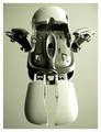
| 04/09/2003 10:09:58 PM |
intellimouse exploded insectorby bosniakComment: Greetings from the Critique Club
By Inspzil
Composition - Interesting twist to a mouse. I never realized it could look like a robot, or a bug for that matter. The dead center framing and the color tones of the shot are a bit cold and clinical. This might have been a little better served to be turned corner to corner or something to give it a little twist, so to speak. I think it needs a little more interest factor though. Perhaps a different perspective would enhance that too.
Technical - Well taken photo. Good focus, DOF is not really an issue. The exposure is a little dark and I think it was meant to be that way. I like the way its lit. The lighting could be a little less direct to give the left side a little less to the light and promote a few more shadows there. I see the comment on top about evening out the lighting and I disagree. The symmetry is there, we need a little interest methinks. I don't know if you added a little grain or that happened in processing but I see a little on the shaded side of the mouse. ISO 50 is definitely not the cause. Perhaps its intentional too. I don't think it bothers the image but may help it a little.
Overall - I think you had a great idea disassembling this mouse. It just needs a little something . Maybe a dark background would've brought the contrast more to the forefront. I think that's a lot of the reason I think "cold and clinical" is the white background. Its a technically sound image, just needs a little something to perk the viewers interest. Good job and good luck in future challenges - Inspzil |
| Photographer found comment helpful. |
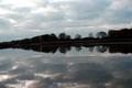
| 04/09/2003 09:57:43 PM |
Nature's Mirrorby rogerspaulComment: Greetings from the Critique Club
By Inspzil
Composition - A lot like my image. You left a comment that led me to believe that this was yours during the voting. And I was right in assuming that this was yours. Really the composition is about as good as you could make it. A better day would've been better. The only 2 things I think that separate mine from yours is weather, and that mine was a little more 2 dimensional and straighter across the horizon. Honestly I think the shoreline going back throws things a little out of whack. There isn't much I'd change about the general composition, it looks like you just needed a little better day.
Technical - The horizon problem is a biggie and I think the underexposure is another problem that could have affected your score. The reflection honestly is at least as clear as mine. I posted mine the right way in my portfolio if you care to look. I think that was the trick that put me where I finished. Everyone looks at the reflection first, so I made that the clearest by inverting it. Yours is really the same on both sides, even more than mine. I paid very close attention to my crop, making sure that the top and bottom were exactly the same, even if the horizon was not in the middle. You might've been able to lighten the picture up some in PS, but I think overall the photo is just a little too dark.
Overall - You did pretty much the same thing as I did, just didn't get quite as lucky with the weather thing. This is a pretty good pic for me to critique as I have some experience with these shots. Go to my profile page and there's a web page there with some pics on it. I've done a few other shots that have some good reflections too. Well hopefully the weather works for you next time you get nice calm water like this. Strangely when I shot this it was clear north of this and south of this. There was just this one band of clouds directly overhead. Good luck in your future challenges. - Inspzil |
| Photographer found comment helpful. |
Home -
Challenges -
Community -
League -
Photos -
Cameras -
Lenses -
Learn -
Help -
Terms of Use -
Privacy -
Top ^
DPChallenge, and website content and design, Copyright © 2001-2025 Challenging Technologies, LLC.
All digital photo copyrights belong to the photographers and may not be used without permission.
Current Server Time: 08/25/2025 07:53:32 AM EDT.