| Image |
Comment |
| 05/01/2003 11:36:43 PM |
Hibiscusby DennisFComment: I'd have changed the angle of the top pic and turned it toward the right more to keep it more consistent with the bottom 2 images. Great idea and almost really well done. |
| 05/01/2003 11:17:15 PM |
|
| 05/01/2003 11:14:58 PM |
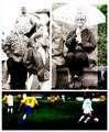
At the soccer gameby jjbeguinComment: I like the top 2 pictures ok. The bottom photo is just too dark and oversaturated. The dirt on the player is blue slightly. I'm rendering a guess as to who took this photo.... |
 Photographer found comment helpful. Photographer found comment helpful. |
| 05/01/2003 11:11:38 PM |
Daisy chainby marboComment: Greetings from the Critique Club
By Inspzil
Composition - What is it with you and these high key shots? I'm not objecting really, just seeing a trend here. Congrats on your candy shot btw. Back to this photo... I really like the arrangement and the framing of this shot. I'm not real keen on the high-keyness of it. Its cool as a high-key shot, but maybe this is too high-key, or at least it is for me. I think this is a great idea though.
Technical - Did I mention anything about high-key? I think that's one of the technical things that I don't agree with. I'm not saying its wrong, I just see it being better a wee bit less high key. The exposure is a little long. I think you lose a lot of viewers just in that aspect. The other thing is the DOF. I think this is a shot that should've used a greater DOF by cranking the F number. If there were more contrast between the flowers toward the end, it wouldn't be quite as necesary. As it is, I think it needs the DOF to clarify the boundaries of the flowers.
Overall - Cool shot as it is, but I can see where people get turned off by it. I don't care for the border on this photo either. That's just opinion though. Well good luck with the challenges to come - Bob |
| Photographer found comment helpful. |
| 05/01/2003 11:00:17 PM |
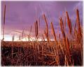
Sunset on Bog'O'Bodanby dacrazyrnComment: Greetings from the Critique Club
By Inspzil
Composition - Very nice colors with the blues and purples in the sky and the reds and browns on the cattails. The cattails have an especially rich color from the little sunlight that remains. I think with just a little more sunlight this would've been a little more picturesque even though some of the saturation of color in the sky and cattails would've been lost. There is some really nice contrast between the cattails and the sky which I think further enhances the color of the cattails. The perspective from which this was shot is very good. I keep thinking of it as "kid level" as it reminds me of being 10 years old hanging around marshy spots to catch frogs and turtles and all those fun things little boys do. This also reminds me of the Wild Bird Reserve that is adjacent to where I work. Its nothing but swamp grass and cattails for a few hundred acres. The only thing about this photo that I think would help it is a little more sun.
Technique - Very well taken, as most pics with Nikons are. Terrific perspective, good use of available light and exposure, well focused and generally crisp and clear in the areas that it should be. Great work.
Overall - This gives me a real peaceful feeling, especially about the springtime and the way the breezes blow making the cattails rustle. You really made the most of the contrast between the plants and the sky which does wonders for giving we viewers something prominent in the photo to focus our unnaturally short attention spans. This is a very nice photo taken very well. Nice work - Inspzil |
| Photographer found comment helpful. |
| 05/01/2003 10:59:35 AM |
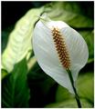
Peace lilyby RobroComment: Greetings from the Critique Club
By Inspzil
Composition - This is a very nice portrayal of the texture of this flower. I think the thought that really keeps coming back to me is Simplicity. This is really basic and very effective without too much background or potential multiple subjects. It really has focus, in terms of the viewers attention (as opposed to optically). There is no doubt what the viewer will be looking at when viewing this photo. I think that is something that is very often overlooked. I think myself as a viewer, I want to feel first and think later. You make me think first and chances are I will not be as apt to vote as high. But this is a feel first think later sort of picture.
Technical - This is a pretty well taken photo. Nicely focused. The slight angle is good. I think a little more angle would've been a little better and maybe if it went up just a bit higher too. The DOF is great. The background is a nice color except for the little bit of darkness in the top left corner. Nicely taken photo.
Overall - This is a really nice photo and I'm glad it did well for you. The texture of the single petal is very well portrayed. Good job and good luck in your future challenges - Inspzil |
| 04/30/2003 10:45:56 PM |
Purple Hillsby auroraComment: Greetings from the Critique Club
By Inspzil
Composition - There are some wonderful colors in this photo. The richness of the purple is very warm and springy. (I'm glad you used the color in the title as I'm color blind and have a heck of a time with blue and purple!) I think the part of this photo I like the best is the tree in the middle. It sort of divides the photo in 2 halves. The thing about this photo I don't like is the unevenness of the light throughout the photo. But overall I think this is a very nice photo.
Technique - This is a very well taken photo under these circumstances. The unevenness of the lighting makes it tricky to get the exposure just right, at the happy medium. The color would've shown up better if it were exposed just a little longer, but it definitely works as is.
Overall - I gave this photo a 7. I think its a pretty good photo with some great color. It is a good photo for this challenge. This is a nice pic. Good luck in future challenges. - Inspzil |
| 04/30/2003 10:24:10 PM |
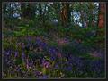
Disappearby jimmythefishComment: Greetings from the Critique Club
By Inspzil
Composition - I'm jealous that you have green plants. We really don't yet. This looks like a nice place to walk, but honestly really isn't a lot going on here. It's not that I feel this is a bad composition, just a little incomplete, like it needs a little something. I think if you used this as a backdrop for a photo it would've went over a little better. The board walk is a good leading line, but leading to what? My feeling about this scene is that it is lacking visual impact. The viewers really could use something to focus on and fill the role of "subject"
Technique - You mention something about being hammered for the shallow DOF. I have nothing against a shallow DOF if done right. This one could have worked for you. Lacking a subject really makes it hard. The reason I think its hard is that a shallow DOF is a technique of selective focus.... How do you select a point to focus in a photo where there is no dominant focal point? Am I making any sense? The technique to force the viewers to make the boardwalk the dominant focal point is to really key in on it at the closest point to the viewer. So let's say we'll shove the pic to the left 50cm and include the entire width of the walk in the entire width of the picture. Then we'll focus on the 2nd board in and take the pic. My personal rule about shallow DOF is not to let the foreground get too blurry as it will attract the viewers attention immediately. If it is a little blurry, I feel I can get away with it if the subject is compelling enough. Okay, this is getting long... The exposure is very well done and the framing could use the little adjustments that I stated above. That's the way I see this picture being the most successful.
Overall - At first I really thought you needed a subject, but looking at it, it has some similarities to my Transportation pic that i didn't get entered in time. //www.pbase.com/image/16096827 This may not be where you want to go with this pic. But maybe it is. Either way, good luck and keep that camera busy. - Inspzil |
| Photographer found comment helpful. |
| 04/29/2003 12:10:59 PM |
Goose Chaseby QuadrajetComment: Great shot! I like the motion of the wings vs. the rest of the body being very very clear, not to mention the water drops coming off him as he launches toward the heavens. This is a remarkable shot. Congrats on a great photo |
| Photographer found comment helpful. |
| 04/29/2003 12:04:36 PM |
Slumber Down Under...by andrewlrComment: This photo is absolutely adorable. I'm giving this a 9 for sure. I really like the fact that it's in its apparent habitat and pretty close. It is an exceptionally well taken photo too. I'm not totally sold on the framing. He might be a little better off being a little more toward the right, but regardless its one hell of a shot. |
| Photographer found comment helpful. |
Home -
Challenges -
Community -
League -
Photos -
Cameras -
Lenses -
Learn -
Help -
Terms of Use -
Privacy -
Top ^
DPChallenge, and website content and design, Copyright © 2001-2025 Challenging Technologies, LLC.
All digital photo copyrights belong to the photographers and may not be used without permission.
Current Server Time: 08/24/2025 04:01:20 PM EDT.