| Image |
Comment |
| 05/03/2007 02:21:51 AM |
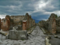
Pompeiiby annevComment: I love the detail of the brickwork - its all come out. It just needs better framing - less sky and a cut of the thin wall strip on the left. |
 Photographer found comment helpful. Photographer found comment helpful. |
| 05/03/2007 02:20:13 AM |
Phantom of the ruinsby thorgilsComment: I like the DOF of the walls here. And our main man seems to fit into his environment. It a bit of putting though that he is in clear focus but the wall that is also in clear focus is well behind him. |
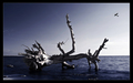
| 05/03/2007 02:17:22 AM |
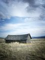
Abandonedby jodiecostonComment: I think this would have worked better in landscape orientation. The focus is too much on the bright sky and not the abandoned shed. |
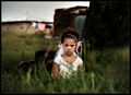
| 05/03/2007 02:12:09 AM |
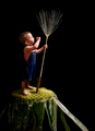
Birth of Imaginationby LeeDComment: This is an awesome juxtaposition. The detail of the plant and the realism of the kid are great. Maybe a little less black space on the right and some focus up the top would have been better. |
| Photographer found comment helpful. |
| 05/03/2007 02:11:41 AM |
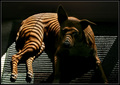
II(=)IIby DefyTimeComment: Needs some better lighting - esp on the dogs face. |
| 05/02/2007 10:57:46 PM |
itsmypartyby whiteroomComment: Great dof, pleasant colours, intense expression on the guys face. Just needs better framing - get rid of weed in front of girl - maybe swing around the left. |
| Photographer found comment helpful. |
| 05/02/2007 10:55:30 PM |
Shiverby andrewthomasComment: different alright. I love the textures and the soft colours. THe only problem I find is the shadow of the flash behind the guy. |
| Photographer found comment helpful. |
| 05/02/2007 10:53:45 PM |
|
| Photographer found comment helpful. |
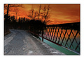
| 05/02/2007 10:53:05 PM |
Burning Bridgeby FauxtoemanComment: I think there's only room for one main colour in this photo - I would get rid of the blue and make it grey. |
| Photographer found comment helpful. |
| 05/02/2007 10:16:08 PM |
Touch Downby owenComment: Nearly looks like something out of an animation. Good use of space. |
| Photographer found comment helpful. |
Home -
Challenges -
Community -
League -
Photos -
Cameras -
Lenses -
Learn -
Help -
Terms of Use -
Privacy -
Top ^
DPChallenge, and website content and design, Copyright © 2001-2025 Challenging Technologies, LLC.
All digital photo copyrights belong to the photographers and may not be used without permission.
Current Server Time: 08/18/2025 07:38:16 AM EDT.