| Image |
Comment |
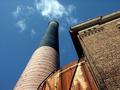
| 04/01/2004 06:56:14 PM |
Stackby corachaosComment: I like your composition. You put yourself in a good position to get a really nice wedge and bottleneck on the blue sky between the stack and the building. (7) |
 Photographer found comment helpful. Photographer found comment helpful. |
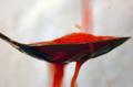
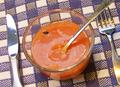
| 03/31/2004 06:34:51 PM |
Just a splash of orangeby Hax0rComment: This is a cool idea. I like the blur and motion in the drips above and below. The liquid rivulettes under the spoon are excellent. But like a lot of the other comments, I wish that the actual focus wasn't on the edge of the spoon, but more on the frothing Kool-Aid� in the spoon itself. I like the vertical angle, personally, because it shows the interesting stuff happening on the bottom of the spoon. But maybe a different horizontal angle, where the handle of the spoon is coming toward or away from the camera would add some more interest to the composition? (6) |
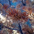
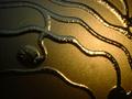
| 03/31/2004 05:40:04 PM |
Death Becomes an Evergreenby KatspetkatComment: Bark beetles are ravaging the forests in our neck of the woods too. You've managed to capture a beautiful shot in what might normally be viewed as an eyesore. The detail and color are great. The muted orange over the saturated blue is excellent. Composition is very pleasing, although I feel like I want to see a more distinct focal point. Except I'm having trouble pinning down what you could've done different with your angle without ruining what you've already got. (7) |
| Photographer found comment helpful. |
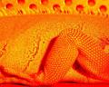
| 03/31/2004 05:11:44 PM |
iggi stardustby whiteroomComment: I like the composition you picked, and the way the holes in the background play off the pattern of the scales. The thing I don't like as much, is that there are very few real shadows to help add some dimension to the iguana. I could be wrong, but that might be a result of the way the levels or curves were adjusted. So it has more of a flat, jaundicy feel to it. I think it's mostly a matter of personal preference though that it didn't set so well with me. (5) |
| 03/31/2004 04:14:16 PM |
across the glassby xripollComment: Just a little squinting tells me that technically this falls safely within *my* definition of orange. Although the luminosity and context of the colors really subdues the impression of orangeness. My biggest problem is the smallish size, which makes it difficult to appreciate an otherwise interesting subject. |
| 03/31/2004 03:57:09 PM |
MMMMMMMMMMMMMMMMMMMMMMby GOLNAZZZComment: The 'nude' category got me chuckling. The orange has indeed been laid bare, albeit with a heavy blur to avoid offending the censors. Had to mark down because it is an orange after all, and the blur was done pretty bluntly. For some reason though, that same blur made it look really delicious, so I didn't mark it down all the way. (have to give credit for eliciting the gut reaction) |
| Photographer found comment helpful. |
| 03/25/2004 01:32:30 PM |
Waiter, There's a fly in my soup!by Prof_FateComment: Heheh, I hate when that happens. Nice idea. The orange on the purple and ivory tablecloth is a good color choice. But the photo comes across more like a snapshot to me. I think trying to get a sharper focus would be one thing that would help. Another thing might be trying some different angles or arrangements of the utensils so that it's less of a documentary shot and has a little more drama (arg, I hate drama, but in a photo I think it's fun). Maybe a lower angle where you're beginning to peer into the bowl and the fly carcass is just in view over the rim and the spoon is angled so it leads your eye to the fly, or something like that. Just a thought. Thanks for the chuckle and momentary grossout :) |
| Photographer found comment helpful. |
| 03/25/2004 11:37:53 AM |
Death by Produceby moviemanComment: This is hilarious. Oh man, the sliver of carrot peeking out of the nose...
Nice job. Good composition and lighting. I also like the darker, soft backdrop of spilled carrot framing the scene from the left. |
| Photographer found comment helpful. |
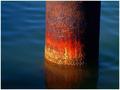
| 03/25/2004 11:29:18 AM |
Rusted Over Timeby JPRComment: You caught this shot at just the right time of day. The colors are stunning. Did you add some light of your own to bring out the fire at the bottom of the post? Even the ever-so-slight tilt of the post works for me. |
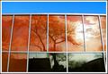
| 03/24/2004 07:45:26 PM |
Reflectionsby flip89Comment: This has a really cool Mondrian style to it. The blue sky and almost-neutral bottom windows are a great fit against the orange. I think it would be interesting to see what this would look if you took a shot from further away and zoomed back in so that the perspective isn't as strong. Just curious. It would probably ruin the reflections though. |
| Photographer found comment helpful. |
Home -
Challenges -
Community -
League -
Photos -
Cameras -
Lenses -
Learn -
Help -
Terms of Use -
Privacy -
Top ^
DPChallenge, and website content and design, Copyright © 2001-2025 Challenging Technologies, LLC.
All digital photo copyrights belong to the photographers and may not be used without permission.
Current Server Time: 08/03/2025 06:14:31 AM EDT.